EventTriggerを使用できればよかったのですが、それらはルーティングイベントに対してのみ機能します。使用するイベント " IsEnabledChanged " はルーティング イベントではないため、EventTrigger を使用することはできません。ただし、 VisualStateManagerを使用して、Disabled 状態と Normal 状態に独自のアニメーションを提供する別の方法があります。
VisualStateManager を使用する代わりに、コード ビハインドでアニメーションを実行したり、独自のカスタムRoutedEventを宣言したりすることもできます。VisualStateManager を使用する私のソリューションには、完全に XAML で実行されるという利点があります。
VisualStateManager を使用するには、ControlTemplateでスタイルを作成します。私の調査では、他の方法は明らかにされていません。そのためには、ボタンの表示機能のほとんどを構築する必要があります。サンプルの有効および無効状態のスクリーン ショットを次に示します。
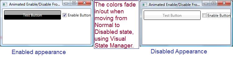
通常のボタンの外観を模倣するために、ボタンの外観に上下に 2 つの長方形を使用しました。上の左側を見てください。ボタンの上部が濃い灰色で、これは私の四角形の 1 つから来ており、黒い下の部分は別の四角形から来ています。右側の無効な外観では同じ 2 つの四角形が使用されていますが、アニメーションでは色が White と WhiteSmoke に変更されています。四角形ごとにColorAnimationを提供します。
VisualStateManager を使用するスタイルは次のとおりです。
<Window.Resources>
    <Style TargetType="Button" x:Key="AnimatedStyle" >
        <Setter Property="Template">
            <Setter.Value>
                <ControlTemplate TargetType="Button">
                    <!-- Define our button's border. Note that
                         the text color is inherited by child
                         elements, that is we give it a name, so
                         we can target it with the animation -->
                    <Border BorderBrush="Black" BorderThickness="1"
                            CornerRadius="2"
                            TextBlock.Foreground="WhiteSmoke"
                            Name="theBorder">
                        <Grid>
                            <Grid.RowDefinitions>
                                <RowDefinition />
                                <RowDefinition />
                            </Grid.RowDefinitions>

                            <!-- To match the appearance of a typical button,
                                 we use two rectangles -->
                            <Rectangle Name="topBackground" Fill="DarkGray"/>
                            <Rectangle Grid.Row="1" Name="bottomBackground"
                                       Fill="Black" />

                             <!-- The content presenter shows the
                                  button's text -->
                            <ContentPresenter Grid.RowSpan="2"
                                      VerticalAlignment="Center"
                                      HorizontalAlignment="Center" />
                        </Grid>
                        <VisualStateManager.VisualStateGroups>
                            <VisualStateGroup Name="CommonStates">

                                <!-- Here is where we define
                                    the disable animation -->
                                <VisualState Name="Disabled">
                                    <Storyboard>
                                        <ColorAnimation
                                              Storyboard.TargetName="topBackground"
                                              Storyboard.TargetProperty="(Rectangle.Fill).(Color)"
                                              To="White" Duration="0:0:.5" />
                                        <ColorAnimation
                                              Storyboard.TargetName="bottomBackground"
                                              Storyboard.TargetProperty="(Rectangle.Fill).(Color)"
                                              To="WhiteSmoke" Duration="0:0:0.5" />
                                        <ColorAnimation
                                              Storyboard.TargetName="theBorder"
                                              Storyboard.TargetProperty="(TextBlock.Foreground).(Color)"
                                              To="Gray" Duration="0:0:0.5" />
                                    </Storyboard>
                                </VisualState>

                                <!-- Here is where the enabled animation
                                     is defined -->
                                <VisualState Name="Normal">
                                    <Storyboard>
                                        <ColorAnimation
                                              Storyboard.TargetName="topBackground"
                                              Storyboard.TargetProperty="(Rectangle.Fill).Color"
                                              To="DarkGray" Duration="0:0:0.5" />
                                        <ColorAnimation
                                              Storyboard.TargetName="bottomBackground"
                                              Storyboard.TargetProperty="(Rectangle.Fill).(Color)"
                                              To="Black" Duration="0:0:0.5" />
                                        <ColorAnimation
                                              Storyboard.TargetName="theBorder"
                                              Storyboard.TargetProperty="(TextBlock.Foreground).Color"
                                              To="WhiteSmoke" Duration="0:0:0.5" />
                                    </Storyboard>
                                </VisualState>
                            </VisualStateGroup>
                        </VisualStateManager.VisualStateGroups>
                    </Border>
                </ControlTemplate>
            </Setter.Value>
        </Setter>
    </Style>
</Window.Resources>
スタイルを利用し、アニメーションの動作を示すいくつかの XAML を次に示します。
<Grid>
     <!--The button uses the style from above. Note that we control
         whether it is enabled by binding the Enabled property to the checkbox's
         property 'IsChecked', that way we don't need
         any code-behind -->
    <Button Content="Test Button" Name="btnTest"
            IsEnabled="{Binding ElementName=chkEnabled,Path=IsChecked}"
            Height="30" Margin="5"
            Click="btnTest_Click"
            Style="{StaticResource AnimatedStyle}" />

    <CheckBox Grid.Column="1" Content="Enable Button"
              Name="chkEnabled" IsChecked="True" VerticalAlignment="Center" />

    <Grid.ColumnDefinitions>
        <ColumnDefinition />
        <ColumnDefinition Width="auto" />
    </Grid.ColumnDefinitions>
</Grid>
最後に、ボタンが実際に無効/有効であることを証明するために、ボタンをクリックすると起動されるコード ビハインド全体 (定型コード以外) を次に示します。
    private void btnTest_Click(object sender, RoutedEventArgs e) {
        MessageBox.Show("You clicked the button, it must be enabled.");
    }