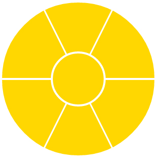
CSSで円形の扇形を作りたいです。セクターは完全な円を形成します。CSSでどうやって作るの?
サンプルを見つけたのですが、4分の1の扇形になります。完全な円を作る6つの扇形を作りたいです。どうすれば作れますか?
注:私は絵が苦手ですが、ここに私が欲しいもののサンプルがあります...
div {
  width: 50px;
  height: 50px;
  background-color: #ccc;
  background-color: #ccc;
  -moz-border-radius: 100px;
  border-radius: 100px;
}
#center {
  position: relative;
  margin: 100px 0 0 100px;
  border: solid #fff 1px;
}
#tl,#tr,#bl,#br {
  position: absolute;
  height: 75px;
  width: 75px;
  z-index: -1;
}
#tl {
  border-radius: 100px 0 0 0;
  -moz-border-radius: 100px 0 0 0;
  top: -50px;
  left: -50px;
}
#tr {
  border-radius: 0 100px 0 0;
  -moz-border-radius: 0 100px 0 0;
  top: -50px;
  left: 26px;
}
#bl {
  border-radius: 0 0 0 100px;
  -moz-border-radius: 0 0 0 100px;
  top: 26px;
  left: -50px;
}
#br {
  border-radius: 0 0 100px 0;
  -moz-border-radius: 0 0 100px 0;
  top: 26px;
  left: 26px;
}
<div id="center">
<div id="tl"></div>
<div id="tr"></div>
<div id="bl"></div>
<div id="br"></div>
</div>