したがって、ブラウザの互換性の問題が少しありますが、iPhoneとiPadのSafariブラウザでのみです:(
サイト: http ://s433108212.onlinehome.us
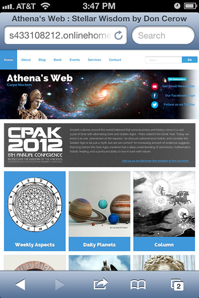
私のクライアントは、ヘッダーのスペースの背景を、ヘッダーに設定した1000pxの領域を超えて拡大することを望んでいました。したがって、私の解決策は、タイルに配置するスペースのbackground:repeat-xイメージを100%使用する別のラッパーを作成することでした。
それは、iPhoneとiPadを除いて、PCとMacのすべてのブラウザで機能します。下のスクリーンショットでは、space_stretch_bgラッパーのタイル状の背景画像が1)左に押し出され、2 )タイリングしないので3)その上の1000pxの固定バナーの後ろに白が表示されます:/

他の誰かがこれに遭遇しますか?
CSS:
body {
    width: 100%; margin: 0 auto;
    background-image:url('../img/clouds.jpg');
    background-repeat:repeat;
}
.wrapper_bg {
    position: absolute;
    width: 100%; height: 350px;
    background-image:url('../img/bg_tile.gif');
    background-repeat:repeat-x;
}
.space_stretch_bg {
    position: absolute;
    top: 100px; width: 100%; height: 250px;
    background-image:url('../img/space_banner_big.jpg');
    background-repeat:repeat-x; background-position:center;
}
.container1000 {
    position: relative;
    width: 1000px; top: -100px;
    margin:auto;
}
#content_container {
    position: absolute;
    overflow: hidden;
    top: 350px; padding: 20px;
    background: #fff
}
短縮されたHTML:
<body>

<div class="wrapper_bg">
<div class="space_stretch_bg">
<div class="container1000">

    <!-- nav_bar -->

    <div id="banner">
        <a href="http://s433108212.onlinehome.us/index.php" title="Athena's Web">
            <div class="logo">
                <h1>Athena's Web</h1>
                <h2>Carpe Noctem</h2>
                <img src="http://s433108212.onlinehome.us/img/athenas_web_logo_no_text.png" alt="Athena's Web Carpe Noctem"/>
            </div>
         </a>

        <div id="social_media">

            <!-- social_icons -->

        </div><!-- social_media -->

        </div><!-- banner -->
        <!-- End Header -->