0

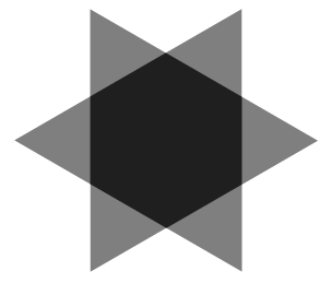
私は数学と幾何学が苦手なので、誰かが次の形を作成するのを手伝ってくれたらうれしいです:

形

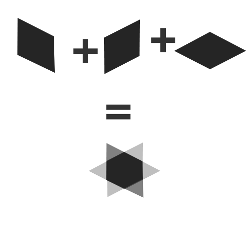
したがって、基本的に形状は3つの長方形から存在し、最初の2つは変換マトリックスで完璧に機能しますが、最後の1つを形状に一致させることはできません(imgについては上記のリンクを参照)

JSFiddle、これまでに試したこと、または以下のコードを参照

HTML

<div class="shape">
  <div class="shape-rect-one"></div>
  <div class="shape-rect-two"></div>
  <div class="shape-rect-three"></div>
</div>​

CSS

.shape {
  perspective: 1000px;
}

.shape div {
  width: 100px;
  height: 100px;
  opacity: 0.4;
  background-color: #333;
}

.shape-rect-one {
  z-index: 100;

  transform: matrix(1, -0.40, 0, 1, 0, 0);
  -webkit-transform: matrix(1, -0.40, 0, 1, 0, 0);
}

.shape-rect-two {
  z-index: 200;

  transform: matrix(1, -0.40, 0, 1, 0, 0);
  -webkit-transform: matrix(1, 0.40, 0, 1, 0, 0);
}

.shape-rect-three {
  z-index: 300;
}​
4

2 に答える 2

6

1 つの要素だけを使用して、はるかに簡単な方法でそれを行うことができます。

デモ

結果:

6 ポイント スター

HTML :

<div class='piece'></div>

関連するCSS :

.piece {
  width: 10em; height: 8.66em; /* 10*sqrt(3)/2 = 8.66 */
  background: rgba(0,0,0,.5);
}
.piece {
  position: relative;
  transform: rotate(-30deg) skewX(30deg);
}
.piece:before, .piece:after {
  position: absolute;
  width: inherit; height: inherit;
  background: inherit;
  content: '';
}
.piece:before { transform: skewX(-30deg) skewX(-30deg); }
.piece:after { transform: skewX(-30deg) rotate(-60deg) skewX(-30deg); }
于 2013-02-15T09:39:47.097 に答える
1

これにより、ダイヤモンドの形が作成されます。

transform: matrix(-0.965, 0.45, -0.965, -0.45, 0, 0);
-webkit-transform: matrix(-0.965, 0.45, -0.965, -0.45, 0, 0);
于 2012-11-09T19:36:45.807 に答える