
そのようなオプションがあればそれはクールだろう、そうでなければ私はborder-bottom別のdivとオーバーラップする必要があるだろう。
EDIT: What I'd do these days if there's a bit more in terms of the element's text content is use box-shadow and background-clip. Otherwise, see the last solution in my original answer.
div {
  border-bottom: solid .75em transparent;
  margin: 7em auto 1em;
  width: 10em; height: 5em;
  box-shadow: 0 1px 0 -1px black;
  background: dimgrey padding-box;
}<div></div>Let's dissect the above.
First off, border-bottom: solid .75em transparent.
The border-bottom area is going to be the gap area. That's why we make it transparent. Changing the width of this border changes the width of the gap.
The margin, width and height rules - nothing strange here, just positioning and sizing the element.
Then we have this bit: box-shadow: 0 1px 0 -1px black.
This box-shadow with no blur creates the bottom border. The y offset (second value) creates a 1px "border". Increasing this y offset increases the width of our "border". This is a black border, but we could change that to anything else.
We also don't want our box-shadow to show up on the sides, so we give it a -1px spread.
Finally, we set a background on our element. It's a dimgrey one, but it could be anything else (a gradient, a picture, whatever). By default backgrounds extend under the border as well, but we don't want that, so we limit it to the area of the padding-box. I've used the shorthand here. The longhand property is background-clip and you can find a detailed explanation for how it works and other examples similar to this one in this article (disclaimer: I wrote it).
Here is the original answer
You could use a pseudo element. Absolutely positioned, 100% width, offset below the bottom of the element.
HTML:
<div></div>
CSS:
div {
    position: relative;
    margin: 7em auto 1em;
    width: 10em; height: 5em;
    background: dimgrey;
}
div:after {
    position: absolute;
    bottom: -.8em;
    width: 100%;
    border-bottom: solid 1px;
    content: '';
}
Or you could use background-clip: content-box and you won't need to use a pseudo-element. But then your text will stick to the edges of the background (unless it's a small text and centred).
Relevant CSS:
div {
    margin: 7em auto 1em;
    padding: 0 0 .8em;
    border-bottom: solid 1px;
    width: 10em; height: 5em;
    background: dimgrey content-box;
}
パディングを使用できます。
padding: 10px; // push 10px the content
border: 1px solid #fff;
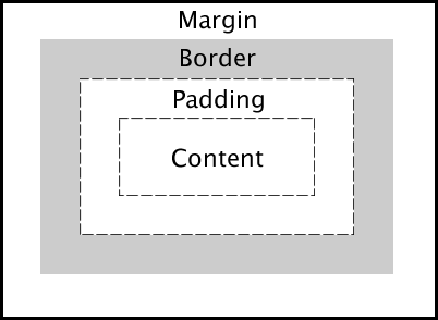
Margin and padding are white space around an image or an object.
As you can see in the image, padding is the space between the content and the border that you define, instead margin is the space outside the border, between the border and the other elements next to this object.
So in your case you can do something like this:
HTML:
<div id="box"></div>
CSS:
#box{
    background: url(image.jpg) no-repeat;
    height: 100px;
    width: 100px;
    border-bottom: 1px solid #333;
    padding-bottom: 10px;
}
Here you can find a simple example: http://jsfiddle.net/k7QcN/