0

私は水平スクロールを備えたモバイルレイアウトを開発してきました。

しかし今、私は問題を抱えています:

ページの下部に張り付いているNAV要素がありますが、問題ありませんが、上部と下部に「フレーム」が付いた「コルクボード」の効果を実現したいと思います。繰り返しになりますが、一番上のものはまったく問題ありませんが、一番下のものを一番下、そしてNAVバーの上にとどまらせようとすると多くの問題が発生します。

これは次のようなものです。 ここに画像の説明を入力してください

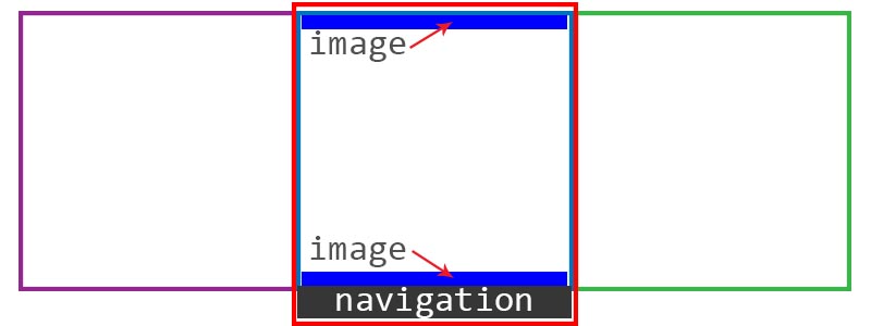
基本的に、赤い四角は現在のビュー/画面であり、ナビゲーションバーは下部に固定されたままです。別のセクションにスクロールすると、上部の青いバー(上部フレーム)と同様に、意図したとおりに画面の下部に留まります。

下部の青いバーを意図した/例示した位置に維持するにはどうすればよいですか?

HTML:

    <!DOCTYPE html>
<html>
<head>
    <meta http-equiv="Content-Type" content="text/html; charset=UTF-8" />
    <meta name="format-detection" content="telephone=no" />
    <meta name="viewport" content="width=device-width, user-scalable=no, initial-scale=1.0, minimum-scale=1.0, maximum-scale=1.0" />
    <title>Ptfolio</title>
    <link rel="stylesheet" href="css/style.css">
    <script src="js/less.js" type="text/javascript"></script>
    <link href='http://fonts.googleapis.com/css?family=Faster+One' rel='stylesheet' type='text/css'>
</head>
<body>
    <nav>
        <ul>
            <li><a href="#splash">Home</a></li>
            <li><a href="#next">About</a></li>
            <li><a href="#circuit">Circuit</a></li>
        </ul>
    </nav>
        <div id="wrapper">
            <section id="splash">
                <header>About Me</header>
                <div>
                    Lorem ipsum just testing things
                </div>
                </section>
            <section id="next">
                <div id="frame-top">
                    <header>Portfolio</header>

                    <div id="content">&nbsp</div>
                </div>
                <div id="frame-bottom">&nbsp</div>
            </section>
            <section id="circuit">
                <header>Contact</header>
                <div class="main">
                </div>
            </section>
        </div> <!-- wrapper -->
        <script type="text/javascript" src="cordova-2.3.0.js"></script>
        <script type="text/javascript" src="js/index.js"></script>
        <script type="text/javascript">
            app.initialize();
        </script>
</body>
</html>

およびCSS:

        /* --Meyerweb */
/* http://meyerweb.com/eric/tools/css/reset/ 
   v2.0 | 20110126
   License: none (public domain)
*/

html, body, div, span, applet, object, iframe,
h1, h2, h3, h4, h5, h6, p, blockquote, pre,
a, abbr, acronym, address, big, cite, code,
del, dfn, em, img, ins, kbd, q, s, samp,
small, strike, strong, sub, sup, tt, var,
b, u, i, center,
dl, dt, dd, ol, ul, li,
fieldset, form, label, legend,
table, caption, tbody, tfoot, thead, tr, th, td,
article, aside, canvas, details, embed, 
figure, figcaption, footer, header, hgroup, 
menu, nav, output, ruby, section, summary,
time, mark, audio, video {
    margin: 0;
    padding: 0;
    border: 0;
    font-size: 100%;
    font: inherit;
    vertical-align: baseline;
}
/* HTML5 display-role reset for older browsers */
article, aside, details, figcaption, figure, 
footer, header, hgroup, menu, nav, section {
    display: block;
}
body {
    line-height: 1;
}
ol, ul {
    list-style: none;
}
blockquote, q {
    quotes: none;
}
blockquote:before, blockquote:after,
q:before, q:after {
    content: '';
    content: none;
}
table {
    border-collapse: collapse;
    border-spacing: 0;
}
/* --Meyerweb */

html, body { 
    height: 100%;
    overflow-x: auto;
}

#wrapper { 
    display: table; 
    width: 350%; 
    height: 100%;
    -webkit-box-sizing: border-box;
    padding-bottom: 3em;
    position: relative;
}

#wrapper > section { 
    display: table-cell; 
    height: 100%; 
    width: 25%;
}

header {
    min-height: 2em;
    font-size: 2em;
}


section#splash {
    background: url("../img/bg_grey.png") repeat;
}

section#splash > header {
    font-family: 'Faster One', cursive;
}

section#next {
    background: url("../img/cork.jpg") repeat;
    z-index: 1;
    padding-bottom: 3.938em;
}

#frame-top {
    background: url("../img/frame.png") repeat-x;
    background-position: top;
    z-index: 3;
    width: 100%;
    padding-top: 1em;
}

#frame-bottom {
    background: url("../img/frame.png") repeat-x;
    height: 16px;
    background-position: top;
    z-index: 4;
}

#content {
    height: 100%;
    z-index: 2;
}

section#circuit {
    background: url("../img/circuit-tile-02.png") repeat;
}

.st-scroll {
    top: 0;
    left: 0;
    transition: all 0.6s ease-in-out;

    /* Let's enforce some hardware acceleration */
    -webkit-transform: translate3d(0, 0, 0);
    -webkit-backface-visibility: hidden;
}

nav {
    bottom: 0;
    position: absolute;
    background: -webkit-gradient(
        linear,
        left bottom,
        left top,
        color-stop(0.3, #303030),
        color-stop(0.5, #212121),
        color-stop(0.7, #575657)
    );
    height: 3em;
    width: 100%;
    z-index: 99;
}

nav ul {
    width:  50%;
    height: 100%;
    color: #FFF;
    margin-right: auto;
    margin-left: auto;
}

nav ul li{
    width: 25%;
    height: 100%;
    display: inline-block;
}

余白、パディング、高さ、最小の高さからすべてを試しましたが、意図した効果を達成することができません。誰かが私が間違っていることを私に指摘できますか?

編集:現時点でのページのスクリーンショット:Chrome- ここに画像の説明を入力してください

Safari- ここに画像の説明を入力してください

4

3 に答える 3

2

私が正しく読んでいる場合、問題は、背景が要素の下部ではなく上部にぶら下がっているということですか?

background-position: bottom;その要素のスタイル に追加します。


編集して私のソリューションcssを追加します:

  • HTMLは元の投稿から変更されていません
  • 「Meyerweb」CSSは変更されていません
  • 変更されたCSS:
html, body { 
    height: 100%;
    overflow: hidden;
}
body {
    overflow-x: auto;
    /* allows that horizontal scrolling */
}

#wrapper {  
    width: 350%; 
    position: absolute;
    top: 0px;
    bottom: 0px;
    /* ^-- these three lines replace height:100%
     * and correct some layout quirks */
}
#wrapper > section { 
    display: inline-block; 
    height: 100%;
    margin-left: -4px;
    margin-bottom: -4px;
}

#wrapper > section:first-child  {
    margin-left: 0px;
    /* combined with -4px margin above, eliminates gaps between sections */
}

#wrapper > section, section > header, section > div {
    width: 25%;
    /* not sure why 25%, since you seem to only
     * have three sections... but either way,
     * the same value is needed in multiple locations
     * so it's pulled out on its own here for
     * ease of maintenance  */
}

section > header {
    position: absolute;
    top: 0px;
    height: 3em;
}
section > div {
    position: absolute;
    top: 0px;
    height: 100%;
    padding-top: 3em;
    padding-bottom: 3em; 
    box-sizing: border-box;
}

section#splash { /*unchanged*/
    background: url("../img/bg_grey.png") repeat;
}
section#next { /*unchanged*/
    background: url("../img/cork.jpg") repeat;
    z-index: 1;
}
section#next > header#frame-top { /*unchanged*/
    background: url("../img/frame.png") repeat-x;
    background-position: top;
    z-index: 3;
}
section#next > div#frame-bottom {
    background: url("../img/frame.png") repeat-x;
    background-position: bottom;
    background-origin: content-box;
    z-index: 3;
}
section#circuit { /*unchanged*/
    background: url("../img/circuit-tile-02.png") repeat;
}

.st-scroll { /*unchanged*/
    top: 0;
    left: 0;
    transition: all 0.6s ease-in-out;

    /* Let's enforce some hardware acceleration */
    -webkit-transform: translate3d(0, 0, 0);
    -webkit-backface-visibility: hidden;
}

nav {
    bottom: 0;
    left: 0;
    position: fixed;
    background: -webkit-gradient(
        linear,
        left bottom,
        left top,
        color-stop(0.3, #303030),
        color-stop(0.5, #212121),
        color-stop(0.7, #575657)
    );
    background: linear-gradient(to top, #303030 30%, #212121 50%, #575657 70%);
    /* ^-- for non-webkit */
    height: 3em;
    width: 100%;
    z-index: 5;
}

nav ul { /*unchanged*/
    width:  50%;
    height: 100%;
    color: #FFF;
    margin-right: auto;
    margin-left: auto;
}

nav ul li{ /*unchanged*/
    width: 25%;
    height: 100%;
    display: inline-block;
}
于 2013-01-11T20:52:52.443 に答える
0

マージンの代わりに「bottom:0px」を使用します。私はこれについてあまり深く調べていませんが、divを下に揃えて修正した独自のプロジェクトがあります。

于 2013-01-11T19:40:41.283 に答える
0

@joequincyからのいくつかの助けと、コードの多くのハッキングと改ざんの後、私は完璧な解決策に到達しました。

    <!DOCTYPE html>
<html>
<head>
    <meta http-equiv="Content-Type" content="text/html; charset=UTF-8" />
    <meta name="format-detection" content="telephone=no" />
    <meta name="viewport" content="width=device-width, user-scalable=no, initial-scale=1.0, minimum-scale=1.0, maximum-scale=1.0" />
    <title>Ptfolio</title>
    <link rel="stylesheet" href="css/style.css">
    <script src="js/less.js" type="text/javascript"></script>
    <link href='http://fonts.googleapis.com/css?family=Chango' rel='stylesheet' type='text/css'>
    <link href='http://fonts.googleapis.com/css?family=Londrina+Solid' rel='stylesheet' type='text/css'>
</head>
<body>
    <nav>
        <ul>
            <li><a href="#splash">Home</a></li>
            <li><a href="#next">About</a></li>
            <li><a href="#circuit">Circuit</a></li>
            <li>Placeholder</li>
        </ul>
    </nav>
    <div id="wrapper">
        <div class="cell">
            <section id="splash">
                <header>Celso Santos</header>
                <div class="container">
                    <div>
                        Lorem ipsum just testing things
                    </div>
                </div>
            </section>
        </div>
        <div class="cell">  
            <section id="next">
                <header>Portfolio</header>
                <div id="frame-top"></div>
                    <div class="container">
                        <div id="content">&nbsp</div>
                    </div>
                <div id="frame-bottom"></div>
            </section>
        </div>
        <div class="cell">
            <section id="circuit">
                <header>Contact</header>
                <div class="container"></div>
            </section>
        </div>
    </div> <!-- wrapper -->
    <script type="text/javascript" src="cordova-2.3.0.js"></script>
    <script type="text/javascript" src="js/index.js"></script>
    <script type="text/javascript">
        app.initialize();
    </script>
</body>
</html>

およびCSS:

/* --Meyerweb */
/* http://meyerweb.com/eric/tools/css/reset/
   v2.0 | 20110126
   License: none (public domain)
*/

html, body, div, span, applet, object, iframe,
h1, h2, h3, h4, h5, h6, p, blockquote, pre,
a, abbr, acronym, address, big, cite, code,
del, dfn, em, img, ins, kbd, q, s, samp,
small, strike, strong, sub, sup, tt, var,
b, u, i, center,
dl, dt, dd, ol, ul, li,
fieldset, form, label, legend,
table, caption, tbody, tfoot, thead, tr, th, td,
article, aside, canvas, details, embed,
figure, figcaption, footer, header, hgroup,
menu, nav, output, ruby, section, summary,
time, mark, audio, video {
    margin: 0;
    padding: 0;
    border: 0;
    font-size: 100%;
    font: inherit;
    vertical-align: baseline;
}
/* HTML5 display-role reset for older browsers */
article, aside, details, figcaption, figure,
footer, header, hgroup, menu, nav, section {
    display: block;
}
body {
    line-height: 1;
}
ol, ul {
    list-style: none;
}
blockquote, q {
    quotes: none;
}
blockquote:before, blockquote:after,
q:before, q:after {
    content: '';
    content: none;
}
table {
    border-collapse: collapse;
    border-spacing: 0;
}
/* --Meyerweb */

html, body {
    height: 100%;
    overflow: hidden;
}

#wrapper {
    display: table;
    width: 300%;
    height: 100%;
    -webkit-box-sizing: border-box;
    margin-bottom: -3em;
}

#wrapper > .cell { display: table-cell; height: 100%; width: 25%; }

#wrapper > .cell > section { position: relative; height: 100%; }

.container { 
  position: absolute; 
  top: 4em; right: 15px; bottom: 4em; left: 15px; 
  overflow-y: auto; border: 1px solid #000000; }

#wrapper > section {
    display: table-cell;
    height: 100%;
    width: 25%;
}

header {
    min-height: 2em;
    font-size: 2em;
    text-align: center;
}


section#splash {
    background: url("../img/bg_grey.png") repeat;
}

section#splash > header {
    font-family: 'Chango', cursive;
}

section#next {
    background: url("../img/cork.jpg") repeat;
    z-index: 1;
    position: relative;
}

section#next > header {
    top: 20px;
    font-family: 'Londrina Solid', cursive;
    color: rgba(124, 52, 24, 0.92);
    text-shadow: -1px -1px 1px rgba(0, 0, 0, 0.83);
    width: 100%;
    position: relative;
}

section#next > div#frame-top {
    background: url("../img/frame.png") repeat-x;
    background-position: top;
    z-index: 3;
    width: 100%;
    position: absolute;
    top: 0px;
    height: 16px;
}

#frame-top > header {
    font-family: 'Londrina Solid', cursive;
    color: rgba(124, 52, 24, 0.92);
    text-shadow: -1px -1px 1px rgba(0, 0, 0, 0.83);
}

#next > .container {
    bottom: 5em;
}

#frame-bottom {
    background: url("../img/frame.png") repeat-x;
    height: 16px;
    background-position: top;
    z-index: 4;
    position: absolute;
    bottom: 3em;
    width: 100%;
}

#content {
    height: 100%;
    z-index: 2;
    min-height: 100%;
}

section#circuit {
    background: url("../img/circuit-tile-02.png") repeat;
}

#circuit > header {
    text-shadow: 0px 2px 3px #666;
}

.st-scroll {
    top: 0;
    left: 0;
    transition: all 0.6s ease-in-out;

    /* Let's enforce some hardware acceleration */
    -webkit-transform: translate3d(0, 0, 0);
    -webkit-backface-visibility: hidden;
}

nav {
    bottom: 0;
    position: fixed;
    height: 3em;
    width: 100%;
    z-index: 99;
    background-image: linear-gradient(bottom, #333333 10%, #525252 50%, #525252 80%);
    background-image: -o-linear-gradient(bottom, #333333 10%, #525252 50%, #525252 80%);
    background-image: -moz-linear-gradient(bottom, #333333 10%, #525252 50%, #525252 80%);
    background-image: -webkit-linear-gradient(bottom, #333333 10%, #525252 50%, #525252 80%);
    background-image: -ms-linear-gradient(bottom, #333333 10%, #525252 50%, #525252 80%);
    box-shadow: 0px -3px 3px #333333;
}

nav ul {
    width:  80%;
    height: 100%;
    color: #FFF;
    margin-right: auto;
    margin-left: auto;
}

nav ul li{
    width: 20%;
    height: 100%;
    display: inline-block;
}

私はテーブルセルを維持し、すべてを完全に整列させ(それらの厄介な「スペース」でも)、すべてを整頓するための大きな秘密は、overflow:hiddenを本体に使用することでした。さて、これには垂直方向にも水平方向にもスクロールできないなどの他の問題がありますが、それは問題ではなかったので(ナビゲーションはナビゲーションバーを使用してさまざまなビューをシミュレートすることになっています)、JSなしで正しく動作するようになりました。

于 2013-01-15T22:40:30.590 に答える