13

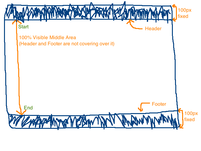
CSS を使用するとsticky header and footer、ページがscrolling or not. オンラインでいくつかのサンプルを見つけましたが、さらに欲しいのは、100% stretched area between header and footerブラウザのサイズに関係なく、中央のコンテンツ領域である必要があることです。

つまり、私が見つけたサンプルのほとんどは、ヘッダーとフッターを正しく固定しています..しかしthese are just floating、実際にはcovering the Top and Bottom parts of the 'middle' content area. それは私が本当に欲しいものではありません。

ここに画像の説明を入力

4

3 に答える 3

15

3 つの要素すべてに絶対位置を使用できます。

#header,#footer,#content { position:absolute; right:0;left:0}

#header{
   height:100px; top:0;
}
#footer{
  height:100px; bottom:0;
}
#content{
  top:100px;
  bottom:100px;
  overflow:hidden; /* use this if don't want any window scrollbars and use an inner element for scrolling*/
}

デモ: http://jsfiddle.net/RkX8B/

于 2013-01-28T07:37:59.500 に答える
2

おそらく「position: fixed;」を探しているでしょう。プロパティを設定し、ヘッダーを top: 0; に設定します。フッターから下へ: 0; そのヘッダーとフッターのスペースを考慮して、「コンテンツ領域」へのパディングを検討することもできます...

私の頭の上から、あなたは次のようなものを持っているでしょう:

header { position: fixed; top: 0; height: 100px; }
footer { position: fixed; bottom: 0; height: 100px; } 
#container {  padding: 100px 0; }

コンテナで何らかの背景を使用していて、それを引き延ばしたい場合、高さ: 100%; すべき...

しかし、この種のレイアウトを使用する良い方法を見つけたことはありません... =\

于 2013-01-27T01:01:18.667 に答える