3

ItemsPanel のサイズに応じてサイズを調整したいカスタム コントロール ListBox があります。アイテム パネルには、それに応じてアイテムを配置するカスタム コントロール WrapPanel があります。スクリーン ショットでわかるように、ListBox は親コントロールまたは availableSize に合わせてサイズを調整します。

そこで、アイテムをリストボックスに渡す ItemsSource プロパティを持つカスタム コントロール Grid を作成しようとしました。しかし、それもうまくいきませんでした。グリッドが配置されると、ListBox が配置され、グリッドが配置されます。

私の質問は、ItemsSource プロパティと、その子のコンテンツに応じてサイズを変更する ItemsPresenter を持つカスタム コントロールを作成する方法です。

ListBox カスタム コントロールのスクリーンショット

4

2 に答える 2

2

ListBox Horizo​​ntalAlignment を Left に、VerticalAlignment を Top に設定するだけです。これでうまくいくはずです。

簡単な例:

MainWindow.xaml

<Window x:Class="ListBoxFitItemsPanel.MainWindow"
        xmlns="http://schemas.microsoft.com/winfx/2006/xaml/presentation"
        xmlns:x="http://schemas.microsoft.com/winfx/2006/xaml"
        Title="MainWindow" Height="400" Width="400">
    <ListBox ScrollViewer.HorizontalScrollBarVisibility="Disabled" ScrollViewer.VerticalScrollBarVisibility="Disabled" Background="Red" HorizontalAlignment="Left" VerticalAlignment="Top" >
        <ListBox.ItemsPanel>
            <ItemsPanelTemplate>
                <WrapPanel Background="AntiqueWhite" Margin="5" />
            </ItemsPanelTemplate>
        </ListBox.ItemsPanel>

        <Rectangle Width="100" Height="100" Fill="LightSlateGray" Stroke="Black" StrokeThickness="1" Margin="5" />
        <Rectangle Width="100" Height="100" Fill="LightSlateGray" Stroke="Black" StrokeThickness="1" Margin="5" />
        <Rectangle Width="100" Height="100" Fill="LightSlateGray" Stroke="Black" StrokeThickness="1" Margin="5" />
        <Rectangle Width="100" Height="100" Fill="LightSlateGray" Stroke="Black" StrokeThickness="1" Margin="5" />
        <Rectangle Width="100" Height="100" Fill="LightSlateGray" Stroke="Black" StrokeThickness="1" Margin="5" />
        <Rectangle Width="100" Height="100" Fill="LightSlateGray" Stroke="Black" StrokeThickness="1" Margin="5" />
        <Rectangle Width="100" Height="100" Fill="LightSlateGray" Stroke="Black" StrokeThickness="1" Margin="5" />
        <Rectangle Width="100" Height="100" Fill="LightSlateGray" Stroke="Black" StrokeThickness="1" Margin="5" />
        <Rectangle Width="100" Height="100" Fill="LightSlateGray" Stroke="Black" StrokeThickness="1" Margin="5" />
    </ListBox>
</Window>

ここに画像の説明を入力

編集:バインディングシナリオでも機能します:

MainWindow.xaml

<Window x:Class="ListBoxFitItemsPanel.MainWindow"
        xmlns="http://schemas.microsoft.com/winfx/2006/xaml/presentation"
        xmlns:x="http://schemas.microsoft.com/winfx/2006/xaml"
        xmlns:local="clr-namespace:ListBoxFitItemsPanel"
        Title="MainWindow" Height="400" Width="400">
    <Window.Resources>
        <DataTemplate DataType="{x:Type local:Item}">
            <Rectangle Width="100" Height="100" Fill="LightSlateGray" Stroke="Black" StrokeThickness="1" Margin="5" />
        </DataTemplate>
    </Window.Resources>
    <ListBox ItemsSource="{Binding Items}" ScrollViewer.HorizontalScrollBarVisibility="Disabled" ScrollViewer.VerticalScrollBarVisibility="Disabled" Background="Red" HorizontalAlignment="Left" VerticalAlignment="Top" >
        <ListBox.ItemsPanel>
            <ItemsPanelTemplate>
                <WrapPanel Background="AntiqueWhite" Margin="5" />
            </ItemsPanelTemplate>
        </ListBox.ItemsPanel>
    </ListBox>
</Window>

MainWindow.xaml.cs

using System.Collections.Generic;
using System.Windows;

namespace ListBoxFitItemsPanel
{
    /// <summary>
    /// Interaction logic for MainWindow.xaml
    /// </summary>
    public partial class MainWindow : Window
    {
        public MainWindow()
        {
            InitializeComponent();
            DataContext = this;
        }

        public IEnumerable<Item> Items
        {
            get
            {
                for (int i = 0; i < 9; i++)
                {
                    yield return new Item();
                }
            }
        }
    }

    public class Item { }
}
于 2013-02-08T15:50:16.913 に答える
1

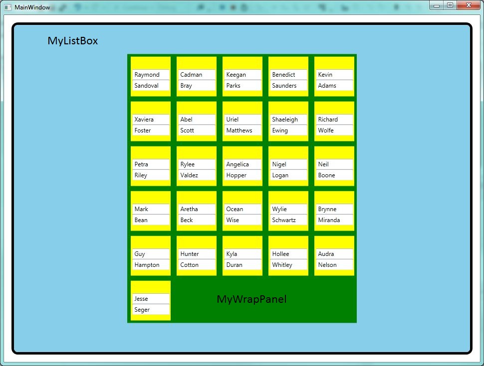
これは、私が望んでいた機能を得るために私がしなければならなかったことです。まず、SquareWrapPanel を作成する必要があります。ここで魔法が起こり、アイテムを思いどおりに配置できます。

protected override Size ArrangeOverride(Size finalSize)
    {
        return ArrangeByChildCount(finalSize);
    }

    private Size ArrangeByChildCount(Size finalSize)
    {

        double childWidth = 0;
        double childHeight = 0;


        foreach (UIElement e in Children)
        {
            e.Measure(finalSize);

            childWidth = e.DesiredSize.Width;
            childHeight = e.DesiredSize.Height;
        }

        if (Children.Count > 0)
        {
            int square = (int)Math.Sqrt(Children.Count);


            int rowCount = square + Children.Count % square;
            int columnCount = square;

            double height = rowCount * childHeight;
            double width = columnCount * childWidth;

            Size size = new Size(width, height);
            base.ArrangeOverride(size);
            return size;
        }
        else
        {
            return new Size(300, 300);
        }
    }

次に、ItemsControl を拡張したカスタム パネルを作成しました。そうすれば、アイテムのコレクションをそれにバインドできます。コードビハインドには何もありませんが、これが私が使用しなければならなかったスタイルです。

    <Style TargetType="{x:Type local:SquareItemsPanel}" BasedOn="{StaticResource {x:Type ItemsControl}}">
    <Setter Property="Template">
        <Setter.Value>
            <ControlTemplate TargetType="ItemsControl">
                <Border BorderBrush="Black" BorderThickness="2" CornerRadius="4">
                    <Expander x:Name="exp" Header="View">
                        <local:SquareWrapPanel IsItemsHost="True"/>
                    </Expander>
                </Border>
            </ControlTemplate>
        </Setter.Value>
    </Setter>
</Style>
于 2013-02-26T14:13:36.383 に答える