これは別のアプローチであり、私の意見では、マップや過剰な JS を使用するよりもはるかに優れています。<div>background-image を持つ要素の上に要素を配置し、HTML と CSS に面倒な作業を任せます。

JSFiddleで見る
HTML
HTML は、理解するのに十分きれいに見えるはずです。<div>クラスで を作成し、hotspot存在する特定のものに依存します。つまり、(.text数字を表示する)、.hover-popup(ホバー時に表示する)、.click-popup(内側.hover-popupにあり、クリックすると表示される)。
<div id="hotspot1" class="hotspot">
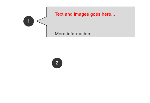
<div class="text">1</div>
<div class="hover-popup">
I was hovered!
<div class="click-popup">
I was clicked on!
</div>
</div>
</div>
<div id="hotspot2" class="hotspot">
<div class="text">2</div>
<div class="hover-popup">
I was hovered!
<div class="click-popup">
I was clicked on!
</div>
</div>
</div>
CSS
これは、ほとんどの魔法が発生する場所です。詳細については、コメントを参照してください。
/* These two position each hotspot */
#hotspot1 {
    left:15%; /* we could use px or position right or bottom also */
    top:20%;
}

#hotspot2 {
    left:35%;
    top:25%;
}

/* General styles on the hotspot */
.hotspot {
    border-radius:50%;
    width:40px;
    height:40px;
    line-height:40px;
    text-align:center;
    background-color:#CCC;
    position:absolute;
}

.hotspot .text {
    width:40px;
    height:40px;
}

/* Show the pointer on hover to signify a click event */
.hotspot .text:hover {
    cursor:pointer;
}

/* hide them by default and bring them to the front */
.hover-popup,
.click-popup {
    display:none;
    z-index:1;
}

/* show when clicked */
.hotspot.clicked .click-popup {
    display:block;
}

/* show and position when clicked */
.hotspot:hover .hover-popup {
    display:block;
    position:absolute;
    left:100%;
    top:0;
    width:300px;
    background-color:#BBB;
    border:1px solid #000;
}
JavaScript (jQuery を使用)
残念ながら、CSS には「クリックされた」状態がないため (チェックボックスによるハック以外では)、クリック部分に JavaScript を使用する必要があります。私がやりたいことをするのはとても簡単なので、私はjQueryを使用しています。
$(document).ready(function () {
    $('.hotspot').click(function () {
        $(this).toggleClass('clicked');
    });
});
矢印の作成
css-tricksで、 :beforeand/or:after疑似要素を使用して要素に矢印を付けるためのチュートリアルを見つけることができます。要素:afterを:before. しかし、そうです、これを行う方法に関する多くのリソース。