私が開発している Web ページ、Price Per Unit Calculator (HTML、CSS、および JavaScript/jQuery)で問題が発生しています: Android 2.3.3 の既定の Web ブラウザーで表示すると、単位の種類と表示単位のページがポップアップしません (ユーザーがメニューから項目を選択できるようにするため)。この問題は、Android エミュレーターと 2.3.3 を実行している Android フォンの両方で発生します。メニューは、私がテストした新しいバージョンの Android Web ブラウザー (エミュレーターでは 4.0.3 と 4.2)、および iOS 6 とコンピューター (テスト済みの Firefox および Chrome ブラウザー) で正常に動作します。
Android 2.3.3 Web ブラウザーでは、メニューをタップすると、Web ページのメニューが色付きの四角形で強調表示され、メニュー オプションが画面のリストにポップアップ表示されます。私のWebページでは、ページの上部にあるメニューの場合、長方形が表示されます(タップされたメニューよりも広い)が、メニューが含まれているdiv(行)の下部に達すると停止するようです.メニューオプションがポップアップします。このスクリーンショットのオレンジ色の四角形を参照してください。Web ページの下部にあるメニューは正常に機能します。
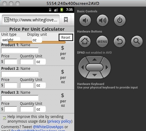
簡略化された HTML は次のとおりです。
<div class="header">
    <div class="global">
        <div id="unitTypeDiv" class="options col1 unit"><!-- left column-->
                <label for="unitType" class="label">Unit type</label><br>
    <select name="unitType" id="unitType" class="unitType_input" title="Unit type">
                    <option value="weight">weight</option>
                    <option value="volume">volume</option>
                    <option value="length">length</option>
                    <option value="area">area</option>
                </select>
            </div>

            <div id="displayUnitDiv" class="options col2 unit"><!-- center column-->
                <span id="displayUnitLabel"><label for="displayUnit" class="label">Display unit</label><br></span>
                <select name="displayUnit" id="displayUnit" class="displayUnit_input unit_input" title="Display unit">
                    <option value="oz">oz</option>
                    <option value="lb">lb</option>
                </select>
            </div>
        </div>   <!-- .global -->

    </div> <!-- .header -->
    <div id="products">

        <form method="post" name="priceper" id="priceper">

            <div class="product" id="product_0">
                <div class="name">
                    <label for="name_0" class="label"><span>Product 1:</span> Name<br></label>
                    <input name="name_0" type="text" id="name_0" title="Product 1">
                </div>
                <div class="unit row">
                    <label for="unit_0" class="label">Unit</label><br>
                    <select name="unit_0" id="unit_0" class="unit_input product_unit_input" title="Please choose a unit"> <!--replace with select (pop-up menu)-->
                        <option value="oz">oz</option>
                        <option value="lb">lb</option>
                    </select>
                </div>

            </div> <!--product_0-->

        </form>

    </div> <!-- products -->
編集:CSSは次のとおりです。
body {
    background-color: #ddd;
    color: #222;
    font-family: Helvetica;
    margin: 0;
    padding: 0;
}

/* HEADER STYLES */
    .header {
        position:fixed; /* Keep header (title) at top of page always */
        top: 0;
        width: 100%;
        z-index:99998; /* Bring to front */
        /*border: 1px dashed red;*/
    }
    .header h1 {
        padding: 0;
        text-align: center;
        text-shadow: 0px 1px 0px #fff;
        /*background-image: -webkit-gradient(linear, left top, left bottom,
                                           from(#ccc), to(red));*/ /* iPhone linear shading; not working*/
        /*border: 1px dashed red;*/
        margin-top: -3px;
        margin-bottom: -3px;
        background-color: #ccc;
        padding-top: 5px;
        padding-bottom:3px;
        text-align: center;
        border-bottom: 1px solid #666;
    }
    .header h1 a {
        color: #222;
        display: block;
        font-size: 20px;
        font-weight: bold;
        text-decoration: none;
    }
    .global {
        /*border: 1px dashed red;*/
        background-color: #eee; /* Background color */
        height: 43px;
        padding-top: 0px;
        z-index: 9999;
        /*border-bottom: 1px solid #666;*/
    }
    .col1 {     /* Unit type menu */
        float: left;
        margin-left: 5px;
        /*border: 1px dashed red;*/
    }
    .col2 {     /* Display unit menu */
        float: none;
        overflow: hidden;
        text-align:center;
        /*display: table-cell;*/
        /*border: 1px dashed green;*/
        position: absolute;
        /* center on browser window: put left at 50%, then offset left (margin-left) by half the width (half of 30% = 15%) */
        width: 50%;
        position: absolute;
        left: 50%;
        margin-left: -25%;
    }

/* PRODUCT STYLES */
    .product {
        padding-top: 2px;
        padding-bottom: 3px;
        padding-left: 5px;
        padding-right: 5px;
        background-color: #DCDCDC;
        border-bottom: 1px solid #999999;
        color: #222222;
    }
    #product_0 {
        margin-top: 100px;
    }