7

高さの問題があるコンテナー div 内の画像

そのため、ほとんどの画像が現在 CSS によって 100% 制御されているギャラリーがあります。ただし、min-height: 100% の設定では。私の画像では、一部が伸びます。問題のある写真はあまりありませんが、ユーザーが何をアップロードするかは制御できません。

とにかくjQueryで画像の高さを取得して要件を満たしているかどうかを確認できますか?そうでない場合は、高さの要件を満たすために画像の幅を増やしますが、すべての比率を維持しますか したがって、私は歪みを引き起こすことを避けますが、ギャップのない div を持つことでギャラリーをきれいに保ちます。

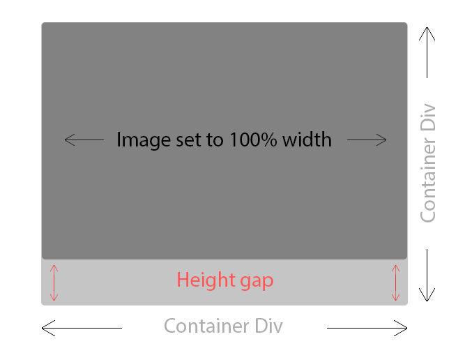
注: 提供されている画像はmin-height: 100%;、私の問題を確認できるように、私を削除したときに何が起こるかを示しています。

アップデート - - - - -

現時点ではうまくいくように見える解決策を見つけましたが、それは最善の試みではないかもしれませんが、別の答えを見つけました: 画像を比例的にサイズ変更する/アスペクト比を維持する方法?

コードを少しだけ微調整しただけで、画像がminHeight必要な要件を満たしていない場合は、それに応じて画像のサイズが変更されるようにminHeightなりました。テストではうまくいくようです。

**最後に更新********* 遊んだ後、コンテナ内で画像を絶対に配置する部分だけをサムスクリプトから抜粋しました。

$(window).load(function() {

    $('.thumbnail img').each(function() {
        var maxWidth = 320; // Max width for the image
        var minHeight = 270;    // Max height for the image
        var ratio = 0;  // Used for aspect ratio
        var width = $(this).width();    // Current image width
        var height = $(this).height();  // Current image height

        if(width > maxWidth){
            ratio = maxWidth / width;   // get ratio for scaling image
            $(this).css("width", maxWidth); // Set new width
            $(this).css("height", height * ratio);  // Scale height based on ratio
            height = height * ratio;    // Reset height to match scaled image
            width = width * ratio;    // Reset width to match scaled image
        }

        // Check if current height is larger than max
        if(height < minHeight){
            ratio = minHeight / height; // get ratio for scaling image
            $(this).css("height", minHeight);   // Set new height
            $(this).css("width", width * ratio);    // Scale width based on ratio
            width = width * ratio;    // Reset width to match scaled image
        }

        var $img = $(this),
        css = {
            position: 'absolute',
            marginLeft: '-' + ( parseInt( $img.css('width') ) / 2 ) + 'px',
            left: '50%',
            top: '50%',
            marginTop: '-' + ( parseInt( $img.css('height') ) / 2 ) + 'px'
        };

        $img.css( css );
   });

});

これはすべてのサムネイルをループし、それに応じてサイズを変更します。したがって、最小の高さが満たされていない場合、高さがサムネイル コンテナーに収まるまで画像が拡大されます。次に、下部は各画像を取得し、絶対に配置し、幅と高さを取得して2で割り、画像を中央に配置するために余白をどれだけマイナスするかを計算します. 私はまだこれを微調整していますが、現時点ではうまく機能しているようです。これが他の誰かに役立つことを願っています。

あるいは

同様の問題を抱えている人は誰でもこれを見つけました:http://joanpiedra.com/jquery/thumbs/これを正確に行うために自分で書き始めましたが、これがどれだけうまく機能するかを調べ、必要に応じて適応させます。

4

4 に答える 4

5

現時点ではうまくいくように見える解決策を見つけましたが、それは最善の試みではないかもしれませんが、別の答えを見つけました: 画像を比例的にサイズ変更する/アスペクト比を維持する方法?

私の調査結果で質問を更新しました

$(window).load(function() {
    $('.image-gallery-item-image-link img').each(function() {
        var maxWidth = 320; // Max width for the image
        var minHeight = 270;    // Max height for the image
        var ratio = 0;  // Used for aspect ratio
        var width = $(this).width();    // Current image width
        var height = $(this).height();  // Current image height

        if(width > maxWidth){
            ratio = maxWidth / width;   // get ratio for scaling image
            $(this).css("width", maxWidth); // Set new width
            $(this).css("height", height * ratio);  // Scale height based on ratio
            height = height * ratio;    // Reset height to match scaled image
            width = width * ratio;    // Reset width to match scaled image
        }

        // Check if current height is larger than max
        if(height < minHeight){
            ratio = minHeight / height; // get ratio for scaling image
            $(this).css("height", minHeight);   // Set new height
            $(this).css("width", width * ratio);    // Scale width based on ratio
            width = width * ratio;    // Reset width to match scaled image
        }

        var $img = $(this),
        css = {
            position: 'absolute',
            marginLeft: '-' + ( parseInt( $img.css('width') ) / 2 ) + 'px',
            left: '50%',
            top: '50%',
            marginTop: '-' + ( parseInt( $img.css('height') ) / 2 ) + 'px'
        };

        $img.css( css );
   });
});
于 2013-03-12T12:27:38.430 に答える
3

画像全体を表示する必要がない場合 (ギャラリーのサムネイルなど) は、css のみでこれを実現できます。風景タイプの写真をお持ちのようです。html

<div class="img-container">
<img src="path/to/img.png" alt="">
</div>

CSS:

div > img {
background-repeat: no-repeat;
background-position: center center;
background-attachment: fixed;
-webkit-background-size: cover;
-moz-background-size: cover;
-o-background-size: cover;
background-size: cover;
width:100%;
height:100%;

}

jquery:
$(document).ready(function(){
     $(".imgcontainer > img").each(function(){
       var thisimg = "url("+$(this).attr('src')+")";
       $(this).css({'background-image': thisimg });
       $(this).attr('src', '');
     });

}); 
于 2013-03-11T14:00:40.573 に答える
1

あなたが話しているのは誰のアスペクト比ですか?あなたのギャラリーの縦横比または画像の縦横比?1 つの寸法 (ここでは高さ) だけを変更しても、画像を正しい縦横比に保つことはできません。縦横比を維持するには、画像の高さと幅の両方を変更する必要があります。これを試してみたい場合は、とにかく:

var img = document.getElementById('imageid'); 
var width = img.clientWidth;
var height = img.clientHeight;
if(width >height)
    $(img).attr('style',"width=100%");
else
    $(img).attr('style',"height=100%");

私がやろうとしているのは、最大次元の css を 100% に設定することです。それはトリックを行います。

于 2013-03-11T14:01:39.547 に答える
0

それで、この質問が少し前に出されたことに気づきました。しかし、それ以来、要素のアスペクト比を流動的に維持するための甘い css のみの方法を見つけました。やってみて:

#targetElement {
    max-width: 100%;
}

#targetElement:after {
    content: '';
    width: 100%;
    padding-bottom: <aspect-ratio>%; // where (height / width)*100 = <aspect-ratio>
}

ええ、私は今このトリックを常に使用しています.JavaScriptを使用するよりもパフォーマンスが高く、冗長ではなく、JQueryを使用するよりもはるかに効率的です. これがどこかで誰かを助けることを願っています! あなたが LESS の人なら、Github にこれを行う mixin Gist があります。それはここに住んでいます:甘いARトリック

于 2014-05-02T21:22:16.467 に答える