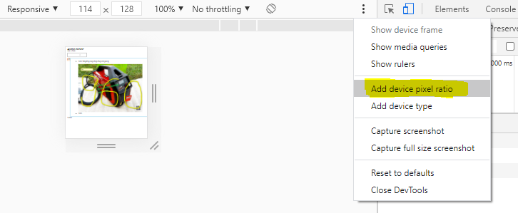
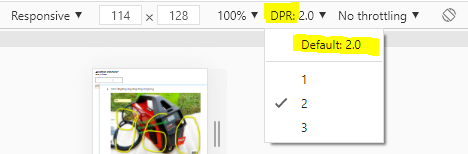
Google Chrome でさまざまな画面解像度をテストするのは簡単ですが、次の CSS メディア クエリの基礎となるさまざまなデバイス ピクセル比を開発者がどのようにテストできるのだろうかと思います。
/* Pixel ratio of 1. Background size is 100% (of a 100px image) */
#header { background: url(header.png); }

/* Pixel ratio of 1.5. Background-size is 1/1.5 = 66.67% (of a 150px image) */
@media only screen and (-moz-min-device-pixel-ratio: 1.5), only screen and (-o-min-device-pixel-ratio: 3/2), only screen and (-webkit-min-device-pixel-ratio: 1.5), only screen and (min-device-pixel-ratio: 1.5) {
    #header { background: url(headerRatio1_5.png); background-size: 66.67%; }

}

/* Pixel ratio of 2. Background-size is 1/2 = 50% (of a 200px image) */
@media only screen and (-moz-min-device-pixel-ratio: 2), only screen and (-o-min-device-pixel-ratio: 2/1), only screen and (-webkit-min-device-pixel-ratio: 2), only screen and (min-device-pixel-ratio: 2) {
    #header { background: url(headerRatio2.png); background-size: 50%; }

}
デバイスのピクセル比を模倣する方法やブラウザ拡張機能はありますか?