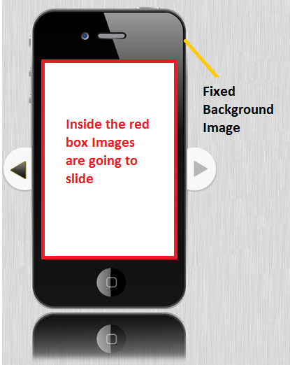
画像スライダーのプラグインを使用しました。正常に動作していますが、反応しません。つまり、ウィンドウのサイズを小さくしても、スライダーのサイズが変わらないということです。以下はスクリーンショットです:
以下はコードです:
<div id="main-content">
    <br/>
    <div id="slideshow">
        <ul class="slides">
            <li class="sl"><img class="ss" src="image/a.png" width="82%" alt="Splash Screen" /></li>
            <li class="sl"><img class="ss" src="image/b.png" width="82%" alt="Select Route" /></li>
            <li class="sl"><img class="ss" src="image/c.png" width="82%" alt="New Schedule" /></li>
            <li class="sl"><img class="ss" src="image/d.png" width="82%" alt="Created Routes" /></li>
            <li class="sl"><img class="ss" src="image/e.png" width="82%" alt="CR"/></li>
        </ul>
        <span class="arrow next"></span>
        <span class="arrow previous"></span>
    </div>
</div>
以下はcssです:
/*main content*/
#main-content {
    margin-left:auto;
    margin-right:auto;
    margin-top:35px;
    max-width:900px;
    border-top-left-radius:48px;
    border-top-right-radius:48px;
    border-bottom-left-radius:48px;
    border-bottom-right-radius:48px;
    padding-bottom:20px;
    min-height:1100px;
    background:url(res/back-img.png) repeat;
}

#slideshow{
    background:url(res/iphone_small.png) no-repeat;
    height:512px;
    /*margin:auto 30px;*/
    margin:40px 28px auto;
    position:relative;
}

#slideshow ul{
    height:55%;
    list-style:none outside none;
    overflow:hidden;
    position:absolute;
    top:12%;
    width:20%;
}

#slideshow li{
    position:absolute;
    display:none;
    z-index:10;
}

#slideshow li:first-child{
    display:block;
    z-index:1000;
}

#slideshow .slideActive{
    z-index:1000;
}

#slideshow canvas{
    display:none;
    position:absolute;
    z-index:100;
}

#slideshow .arrow{
    height:12.5%;
    width:5.1%;
    position:absolute;
    background:url('res/arrows.png') no-repeat;
    top:50%;
    margin-top:-55px;
    cursor:pointer;
    z-index:5000;
    margin-left:28.5%;
    margin-right:98%;
}

#slideshow .previous{ background-position:right top;right:0;}
#slideshow .previous:hover{ background-position:right bottom;}

#slideshow .next{ background-position:left top;left:0;}
#slideshow .next:hover{ background-position:left bottom;}
では、どうすればレスポンシブにできるのでしょうか。私はGoogleをよくやりましたが、方法がわかりません。誰でもこの問題を解決するのを手伝ってくれませんか..よろしくお願いします..