51

no を定義する Button と、定義するCornerRadius他の 2 つの Button が必要ですが、どうすればこれを達成できますか?

<Style TargetType="Button" x:Key="TabButton">
    <Setter Property="Background" Value="White" />
    <Setter Property="TextBlock.TextAlignment" Value="Center" />
    <Setter Property="Template">
        <Setter.Value>
            <ControlTemplate TargetType="Button">
                <Border CornerRadius="0" Background="White" BorderBrush="#ccc" BorderThickness="0,1,1,0" >
                    <ContentPresenter x:Name="contentPresenter" ContentTemplate="{TemplateBinding ContentTemplate}" Content="{TemplateBinding Content}" HorizontalAlignment="{TemplateBinding HorizontalContentAlignment}" Margin="{TemplateBinding Padding}" VerticalAlignment="{TemplateBinding VerticalContentAlignment}"/>
                </Border>
            </ControlTemplate>
        </Setter.Value>
    </Setter>
</Style>

<Style TargetType="Button" x:Key="TabButtonFirst" BasedOn="{StaticResource TabButton}">
    <Setter Property="CornerRadius" Value="3,0,0,0" />
</Style>

<Style TargetType="Button" x:Key="TabButtonLast" BasedOn="{StaticResource TabButton}">
    <Setter Property="CornerRadius" Value="0,0,0,3" />
</Style>
4

7 に答える 7

59

You're not limited to the dependency properties of the control you're templating. In this case, while Button does not have a CornerRadius property, Border does, so you can use Border.CornerRadius instead:

<Style TargetType="Button" x:Key="TabButton">
    <Setter Property="Background" Value="White" />
    <Setter Property="TextBlock.TextAlignment" Value="Center" />
    <Setter Property="Template">
        <Setter.Value>
            <ControlTemplate TargetType="Button">
                <Border CornerRadius="{TemplateBinding Border.CornerRadius}" 
                        Background="White" BorderBrush="#ccc" 
                        BorderThickness="0,1,1,0" >
                    <ContentPresenter x:Name="contentPresenter" 
                                      ContentTemplate="{TemplateBinding ContentTemplate}" 
                                      Content="{TemplateBinding Content}" 
                                      HorizontalAlignment="{TemplateBinding HorizontalContentAlignment}"
                                      Margin="{TemplateBinding Padding}" 
                                      VerticalAlignment="{TemplateBinding VerticalContentAlignment}"/>
                </Border>
            </ControlTemplate>
        </Setter.Value>
    </Setter>
</Style>

<Style TargetType="Button" x:Key="TabButtonFirst" BasedOn="{StaticResource TabButton}">
    <Setter Property="Border.CornerRadius" Value="3,0,0,0" />
</Style>

<Style TargetType="Button" x:Key="TabButtonLast" BasedOn="{StaticResource TabButton}">
    <Setter Property="Border.CornerRadius" Value="0,0,0,3" />
</Style>

With this approach, you no longer need to maintain multiple copies of your control template.

于 2015-10-06T10:36:41.557 に答える
39

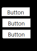
Nitesh がボタンに CornerRadius プロパティを持っていないと言ったので、最初のスタイルで示したように、これは Border のプロパティです。最初のスタイルを複製して CornerRadius を変更し、適切なスタイルに割り当てますボタン。

<Window x:Class="WpfApplication1.MainWindow"
        xmlns="http://schemas.microsoft.com/winfx/2006/xaml/presentation"
        xmlns:x="http://schemas.microsoft.com/winfx/2006/xaml"
        Title="MainWindow" Height="350" Width="525">
    <Window.Resources>
        <Style TargetType="Button" x:Key="TabButton">
            <Setter Property="Background" Value="White" />
            <Setter Property="TextBlock.TextAlignment" Value="Center" />
            <Setter Property="Template">
                <Setter.Value>
                    <ControlTemplate TargetType="Button">
                        <Border CornerRadius="0" Background="White" BorderBrush="#ccc" BorderThickness="0,1,1,0" >
                            <ContentPresenter x:Name="contentPresenter" ContentTemplate="{TemplateBinding ContentTemplate}" Content="{TemplateBinding Content}" HorizontalAlignment="{TemplateBinding HorizontalContentAlignment}" Margin="{TemplateBinding Padding}" VerticalAlignment="{TemplateBinding VerticalContentAlignment}"/>
                        </Border>
                    </ControlTemplate>
                </Setter.Value>
            </Setter>
        </Style>
        <Style TargetType="Button" x:Key="TabButtonFirst">
            <Setter Property="Background" Value="White" />
            <Setter Property="TextBlock.TextAlignment" Value="Center" />
            <Setter Property="Template">
                <Setter.Value>
                    <ControlTemplate TargetType="Button">
                        <Border CornerRadius="3,0,0,0" Background="White" BorderBrush="#ccc" BorderThickness="0,1,1,0" >
                            <ContentPresenter x:Name="contentPresenter" ContentTemplate="{TemplateBinding ContentTemplate}" Content="{TemplateBinding Content}" HorizontalAlignment="{TemplateBinding HorizontalContentAlignment}" Margin="{TemplateBinding Padding}" VerticalAlignment="{TemplateBinding VerticalContentAlignment}"/>
                        </Border>
                    </ControlTemplate>
                </Setter.Value>
            </Setter>
         </Style>
         <Style TargetType="Button" x:Key="TabButtonLast">
            <Setter Property="Background" Value="White" />
            <Setter Property="TextBlock.TextAlignment" Value="Center" />
            <Setter Property="Template">
                <Setter.Value>
                    <ControlTemplate TargetType="Button">
                        <Border CornerRadius="0,0,0,3" Background="White" BorderBrush="#ccc" BorderThickness="0,1,1,0" >
                            <ContentPresenter x:Name="contentPresenter" ContentTemplate="{TemplateBinding ContentTemplate}" Content="{TemplateBinding Content}" HorizontalAlignment="{TemplateBinding HorizontalContentAlignment}" Margin="{TemplateBinding Padding}" VerticalAlignment="{TemplateBinding VerticalContentAlignment}"/>
                        </Border>
                    </ControlTemplate>
                </Setter.Value>
            </Setter>
        </Style>
      </Window.Resources>
        <Grid Background="Black">
        <Button Style="{StaticResource TabButton}" Content="Button" Height="23" HorizontalAlignment="Left" Margin="12,72,0,0" Name="button1" VerticalAlignment="Top" Width="75" />
        <Button Style="{StaticResource TabButtonFirst}" Content="Button" Height="23" HorizontalAlignment="Left" Margin="10,43,0,0" Name="button2" VerticalAlignment="Top" Width="75" />
        <Button Style="{StaticResource TabButtonLast}" Content="Button" Height="23" HorizontalAlignment="Left" Margin="12,101,0,0" Name="button3" VerticalAlignment="Top" Width="75" />
    </Grid>
</Window>

ここに画像の説明を入力

于 2013-07-16T15:56:04.637 に答える
7

を使用する代わりに、ControlTemplate単純Style.Resourcesに境界線を使用してターゲットにすることができます:

<Style TargetType="Button" x:Key="TabButton">
  <Setter Property="Background" Value="White" />
  <Setter Property="TextBlock.TextAlignment" Value="Center" />
  <Style.Resources>
    <Style TargetType="Border">
      <Setter Property="CornerRadius" Value="3,0,0,0" />
    </Style>
  </Style.Resources>
</Style>
于 2020-06-16T13:15:16.637 に答える
1

CornerRadius 依存関係プロパティを含む独自のカスタム ボタン クラス (Button から継承) を作成します。そして、スタイルのターゲット タイプがこの新しいクラスになり、テンプレート バインディングを使用して角の半径を設定できます。

このアプローチでは、コントロール テンプレートの複数のコピーを維持する必要がないだけでなく、角の半径を変更するたびに新しいスタイルを作成する必要もありません。CornerRadius 依存関係プロパティに直接設定またはバインドするだけです。

したがって、コントロールのコードは次のようになります。

public class MyCustomButton : Button
{
    public static readonly DependencyProperty CornerRadiusProperty =
        DependencyProperty.Register("CornerRadius", typeof(CornerRadius), typeof(MyCustomButton), new FrameworkPropertyMetadata(new CornerRadius(0)));

    public CornerRadius CornerRadius
    {
        get { return (CornerRadius)GetValue(CornerRadiusProperty); }
        set { SetValue(CornerRadiusProperty, value); }
    }
}

そしてXAML:

<Style TargetType="MyCustomButton" x:Key="TabButton">
    <Setter Property="Background" Value="White" />
    <Setter Property="TextBlock.TextAlignment" Value="Center" />
    <Setter Property="Template">
        <Setter.Value>
            <ControlTemplate TargetType="MyCustomButton">
                <Border CornerRadius="{TemplateBinding CornerRadius}" Background="White" BorderBrush="#ccc" BorderThickness="0,1,1,0" >
                    <ContentPresenter x:Name="contentPresenter" ContentTemplate="{TemplateBinding ContentTemplate}" Content="{TemplateBinding Content}" HorizontalAlignment="{TemplateBinding HorizontalContentAlignment}" Margin="{TemplateBinding Padding}" VerticalAlignment="{TemplateBinding VerticalContentAlignment}"/>
                </Border>
            </ControlTemplate>
        </Setter.Value>
    </Setter>
</Style>

したがって、角の半径を必要としないボタンの場合、依存関係プロパティはデフォルトで 0 に設定されているため、何もする必要はありません。角の半径があるものについては、通常の Border の CornerRadius プロパティと同様に、依存関係プロパティを適切な値に設定するだけです。

于 2016-02-10T18:34:27.847 に答える