画像モデルに基づいて、要素にいくつかの css3 スタイルを追加しようとしています。
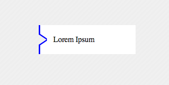
左側の青い枠線の透明な矢印の内側:
css3でしかできないの?
あなたがこれを行うことができる単一の要素で、私は仕事に行かなければなりません
<div>Lorem Ipsum</div>
スタイル:
   div{
        width:200px;
        height:60px;
        margin:100px;
        background-color:transparent;
        color:black;
        position:relative;
        text-indent:30px;
        line-height:60px;
        box-shadow:inset 20px 0 0 200px white;
        overflow:hidden;
        -webkit-box-shadow: inset -164px 0 0 20px white;
        -moz-box-shadow: inset -164px 0 0 20px white;
        box-shadow: inset -164px 0 0 20px white;
    }
    div:before{
        content: '';
    position: absolute;
    left: 0px;
    top: 4px;
    width: 14px;
    border-bottom: 3px solid blue;
    border-left: 3px solid blue;
    height: 18px;
        background-color:white;
    -webkit-transform: skew(0deg,34deg);
        -moz-transform: skew(0deg,34deg);
    transform: skew(0deg,34deg);
    }
    div:after{
    content: '';
    position: absolute;
        background-color:white;
    left: 0px;
    bottom: 4px;
    width: 14px;
    border-top: 3px solid blue;
    border-left: 3px solid blue;
    height: 18px;
    -webkit-transform: skew(0deg,-34deg);
        -moz-transform: skew(0deg,-34deg);
    transform: skew(0deg,-34deg);
    }
    body{
        background-color: #EEEEEE;
        khtml-background-size: 10px 10px;
    -webkit-background-size: 10px 10px;
    -moz-background-size: 10px 10px;
    -ms-background-size: 10px 10px;
    -o-background-size: 10px 10px;
    background-size: 10px 10px;
    background-image: -khtml-linear-gradient(135deg, rgba(255, 255, 255, .15) 25%, transparent 25%, transparent 50%, rgba(255, 255, 255, .15) 50%, rgba(255, 255, 255, .15) 75%, transparent 75%, transparent);
    background-image: -webkit-gradient(linear, left top, right bottom, color-stop(.25, rgba(255, 255, 255, .15)), color-stop(.25, transparent), color-stop(.5, transparent), color-stop(.5, rgba(255, 255, 255, .15)), color-stop(.75, rgba(255, 255, 255, .15)), color-stop(.75, transparent), to(transparent));
    background-image: -webkit-linear-gradient(135deg, rgba(255, 255, 255, .15) 25%, transparent 25%, transparent 50%, rgba(255, 255, 255, .15) 50%, rgba(255, 255, 255, .15) 75%, transparent 75%, transparent);
    background-image: -moz-linear-gradient(135deg, rgba(255, 255, 255, .15) 25%, transparent 25%, transparent 50%, rgba(255, 255, 255, .15) 50%, rgba(255, 255, 255, .15) 75%, transparent 75%, transparent);
    background-image: -ms-linear-gradient(135deg, rgba(255, 255, 255, .15) 25%, transparent 25%, transparent 50%, rgba(255, 255, 255, .15) 50%, rgba(255, 255, 255, .15) 75%, transparent 75%, transparent);
    background-image: -o-linear-gradient(135deg, rgba(255, 255, 255, .15) 25%, transparent 25%, transparent 50%, rgba(255, 255, 255, .15) 50%, rgba(255, 255, 255, .15) 75%, transparent 75%, transparent);
    background-image: linear-gradient(135deg, rgba(255, 255, 255, .15) 25%, transparent 25%, transparent 50%, rgba(255, 255, 255, .15) 50%, rgba(255, 255, 255, .15) 75%, transparent 75%, transparent);
        width:100%;
        height:100%;

    }
div の透明な境界線で三角形を作成する手法を使用します。少し役立つかもしれない2つの試み、
HTML
<div class="button">
    <div class="wrapper">
        <div class=" top-side "></div>
        <div class="arrow-right "></div>
        <div class="arrow-right2 "></div>
        <div class="bottom-side "></div>
    </div>
</div>
CSS
.button {
    width: 400px;
    background-color:orange;
}
.wrapper{
    background-color:blue;
    width:2px;
}
.arrow-right {
    width: 0;
    height: 0;
    border-top: 5px solid transparent;
    border-bottom: 5px solid transparent;
    border-left: 15px solid white;
    position:absolute;
    z-index:2;
}
.arrow-right2 {
    position:relative;
    top:-1px;
    z-index:1;
    width: 0;
    height: 0;
    border-top: 6px solid transparent;
    border-bottom: 6px solid transparent;
    border-left: 18px solid blue;
}
.top-side {
    height:7px;
    width:2px;
    background-color:blue;
}
.bottom-side {
    height:7px;
    width:2px;
    background-color:blue;
}
http://jsfiddle.net/FkPYb/1/もチェックしてください
それらを微調整することで、より良い結果が得られる場合があります。