以下のエフェクトをCSSでアーカイブできないか悩んでいます

これらの記事はそのような助けになることがわかりましたが、問題は、私の場合、タブの側面がまっすぐな垂直線ではなく斜めになっていることです。
http://css-tricks.com/tabs-with-round-out-borders/
http://css-tricks.com/better-tabs-with-round-out-borders/
することは可能ですか?
以下のエフェクトをCSSでアーカイブできないか悩んでいます
これらの記事はそのような助けになることがわかりましたが、問題は、私の場合、タブの側面がまっすぐな垂直線ではなく斜めになっていることです。
http://css-tricks.com/tabs-with-round-out-borders/
http://css-tricks.com/better-tabs-with-round-out-borders/
することは可能ですか?
純粋な CSS を使用した概念実証の例を次に示します。疑似要素 と を使用しrotateます。これはソース イメージにかなり近く、いくつかの作業を行うことでさらに近づけることができます。
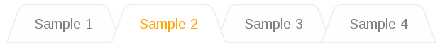
デモ: http://jsfiddle.net/csDP9/9/
HTML :
/* Reset ul styles */
body { font-family: sans-serif; }
ul {
    list-style: none;
    margin: 0;
    padding: 0;
}

ul {
    padding-left: 20px;
    z-index: 5;
}
ul li {
    color: grey;
    background: #fefefe;
    padding: 14px 24px 10px;
    margin: 0px -6px 0 10px;
    position: relative;
    float: left;
    text-align: center;
    z-index: 1;
}
ul li::before {
    content: '';
    display: block;
    position: absolute;
    top: 0; left: 0;
    width: 70%;
    height: 100%;
    border-style: solid;
    border-color: #eee;
    border-width: 2px 0 2px 2px;
    border-radius: 8px 0 0 0;
    -webkit-transform: skewX(-20deg);
       -moz-transform: skewX(-20deg);
         -o-transform: skewX(-20deg);
            transform: skewX(-20deg);
    background-color: inherit;
    z-index: -1;
}
ul li::after {
    content: '';
    display: block;
    position: absolute;
    top: 0; right: 0;
    width: 70%;
    height: 100%;
    border-style: solid;
    border-color: #eee;
    border-width: 2px 2px 2px 0;
    border-radius: 0 8px 0 0;
    -webkit-transform: skewX(20deg);
       -moz-transform: skewX(20deg);
         -o-transform: skewX(20deg);
            transform: skewX(20deg);
    background-color: inherit;
    z-index: -1;
}
ul li.active {
    color: orange;
    z-index: 10;
}
ul li.active::before,
ul li.active::after {
    background-color: #fff;
    border-bottom-color: #fff;
}
ul li:not([class='active']):hover::before,
ul li:not([class='active']):hover::after {
    background-color: #efefef;
}
<ul>
<li>Sample 1</li>
<li class="active">Sample 2</li>
<li>Sample 3</li>
<li>Sample 4</li>
</ul>CSSでは、例のようなタブを取得できなかったと思います。最善の解決策は、画像またはマトリックス変換を使用することです(他の人がすでに回答しているように)。
とにかく、単純なタブの場合、次を使用して対角線を作成できます。
.tabrow li:before {
    width: 0px;
    height: 0px;
    border-style: solid;
    border-width: 0 5px 26px 5px;
    border-color: transparent transparent #aaa transparent;
    position: absolute;
    content:" ";
    left:-5px;
    top:4px;
    z-index:-1;
}
.tabrow li:after {
    width: 0px;
    height: 0px;
    border-style: solid;
    border-width: 0 5px 26px 5px;
    border-color: transparent transparent #aaa transparent;
    position: absolute;
    content:" ";
    right:-5px;
    margin-top:4px;
    z-index:-1;
}
もちろん、これはまさにあなたが望んでいたものではありませんが、最初から始めることはできます。
CSS3 は角を丸くする効果を提供しますが、斜めのものは提供しません。おそらく、画像を使用する必要があります。