http://codepen.io/anon/pen/gubrp
上記のリンクでは、要素が固定サイズであり、行が大きくなると次のことが起こることに注意してください。
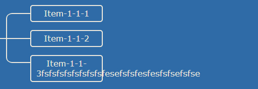
私が望むのは、CSS が下の JSfiddle のように動的であることです (ボックスとラインの両方)。すべてのボックスとラインを動的にし、固定サイズ/固定位置にしないようにするには、どのような変更を加える必要がありますか? ボックスと行の両方を変更する必要があることに注意してください。
以下は、最初の例の css コードです。
.root {
  position: relative;
}

.level {
  margin-left: 240px;
  position: relative;
}
.level:before {
  content: "";
  width: 50px;
  border-top: 2px solid #eee9dc;
  position: absolute;
  left: -98px; /*These fixed numbers are the problem but don't know how to solve it*/
  top: 50%;
  margin-top: 1px;
}

.item {
  min-height: 50px;
  position: relative;
}
.item:before {
  content: "";
  height: 100%;
  border-left: 2px solid #eee9dc;
  position: absolute;
  left: -48px; /*These fixed numbers are the problem but don't know how to solve it*/
}
.item:after {
  content: "";
  width: 46px;
  border-top: 2px solid #eee9dc;
  position: absolute;
  left: -46px; /*These fixed numbers are the problem but don't know how to solve it*/
  top: 50%;
  margin-top: 1px;
}

.item:first-child:before {
  width: 10px;
  height: 50%;
  top: 50%;
  margin-top: 2px;
  border-top-left-radius: 10px;
}
.item:first-child:after {
  height: 10px;
  border-top-left-radius: 10px;
}

.item:last-child:before {
  width: 10px;
  height: 50%;
  border-bottom-left-radius: 10px;
}
.item:last-child:after {
  height: 10px;
  border-top: none;
  border-bottom: 2px solid #eee9dc;
  border-bottom-left-radius: 10px;
  margin-top: -11px;
}

.title {
  width: 120px;
  padding: 5px 10px;
  line-height: 20px;
  text-align: center;
  border: 2px solid #eee9dc;
  border-radius: 5px;
  display: block;
  position: absolute;
  left: 0;
  top: 50%;
  margin-top: -15px;
}