3

これを解決するために何時間も費やしてきましたが、結果はありません。

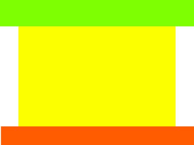
私が欲しいのは(理論的には)本当にシンプルです。ヘッダーが常に上部にあり、フッターが常に下部にあるフルスクリーン Web ページが必要です。内容は動的です。ページを超える場合は、フッターを押し下げて大きくする必要があります。水平方向に中央揃えされたコンテンツに 980 ピクセル幅の div が必要です。そのdivに背景色とは異なる色を付けたいです。コンテンツが 1 行のテキストのみの場合でも、div (背景色) をフッターとヘッダーの間の 100% のスペースにしたいと考えています。カラフルな例を作りました:

ここに画像の説明を入力

私がこれまでに持っているコード:

<html>
<head>
<style>
#container {
    height: 100%;
    width: 100%;
    background: green;
    position: absolute;
}
#header, #footer {
    height: 100px;
    width: 100%;
    background: red;
}
#body {
    height: 100%;
    width: 100%;
    background: blue;
}
#content {
    width: 980px;
    background: yellow;
}

</style>
<head>

<body>
<div id="container">
    <div id="header"></div>
    <div id="body">
    <div id="content">
        content
    </div>
    </div>
    <div id="footer"></div>
</div>
</body>
</html>

このコードは大丈夫とは言えません。まず第一に、コンテンツがページを超える場合、ページの下部にフッターを保持できません。次に、980px の中央の div を含める方法がわかりません。

4

3 に答える 3

1

コンテンツを中央に配置するには、 を使用しますmargin: 0 auto;。これにより、上下のマージンが 0 に設定され、左右のマージンが自動調整されます。最も可能性が高いのは、JavaScript を使用する必要があることです。フッターを常に固定するか、コンテンツの下部にフッターを配置します。

あなたが求めていることはあまり実用的ではありません。コンテンツが多い場合は、とにかくフッターが押し下げられます。ページのコンテンツが少ない場合は、フッターを下部に配置したいようです。

開始するためのコードをいくつか書きました。はJavaScript、必要な効果を提供します。CSS の高さのコメントを外すか、div に大量のコンテンツを追加すると、フッターが押し下げられます。

<html>
<head>
    <style>
        body, #body, #header, #footer { width: 100%;margin: 0; padding: 0; }
        #header { height: 100px; background: #7eff02; }
        #footer { height: 100px; background: #ff5c01; }
        #content { width: 980px; background: #fcff00; margin: 0 auto;
            /*height: 3000px;*/
        }
    </style>
    <script src="http://ajax.googleapis.com/ajax/libs/jquery/2.0.3/jquery.min.js"></script>
    <script>

        $(document).ready(function () {
            var headerHeight = $("#header").height();
            var footerHeight = $("#footer").height();

            var resizeTimer;
            $(window).resize(function () {
                clearTimeout(resizeTimer);
                resizeTimer = setTimeout(onWindowResize(), 100);
            });

            onWindowResize();

            function onWindowResize() {
                if ($("#content").height() < (window.innerHeight - headerHeight - footerHeight)) {
                    $("#content").css("height", (window.innerHeight - headerHeight - footerHeight));
                    $("#footer").css({ "position": "fixed", "bottom": "0" });
                }
                else {
                    $("#content").css("height", "");
                    $("#footer").css({ "position": "", "bottom": "" });
                }
            }
        });
    </script>
    <head>

        <body>
            <div id="container">
                <div id="header"></div>
                <div id="body">
                    <div id="content">
                        CONTENT
                    </div>
                </div>
                <div id="footer"></div>
            </div>
        </body>
</html>
于 2013-11-02T23:15:04.420 に答える
0

これを試して:

body {padding:100px 0;}
#header, #footer {position:fixed;width:100%;height:100px;}
#header {top:0;}
#footer {bottom:0;}
#container {width:980px;margin:0 auto;}

ただし、ヘッダーまたはフッターのコンテンツが設定された高さを超えると、別の問題が発生します。

于 2013-11-02T23:15:23.203 に答える
0

私もこの解決策を持っています: http://jsfiddle.net/AZE4K/

body {
    padding:0;
    margin:0;    
}

#header, #footer {
    position: fixed;
    width:100%;    
}

#header {
    left : 0;
    top : 0;
    background-color:red;
    height:100px;
}

#footer {   
    left : 0;
    bottom : 0;
    background-color:green;
    height:50px;
}

#content {
    background-color : #111111;
    color:#DDDDDD;
    width:95%;
    height : 1500px;
    margin:auto;
    margin-top : 100px;
    margin-bottom: 50px;
}
<div id="header"></div>
<div id="content">
    <h1>Some text</h1>
</div>
<div id="footer"></div>

于 2013-11-02T23:19:50.957 に答える