76

トップ ナビゲーションの有無にかかわらず、サイトに固定フッターがあることは非常に一般的です。Bootstrap には固定フッターを簡単に作成する機能がありますが、スティッキーフッターを作成する機能はありません。大きな違いがあります。

この質問をグーグルで検索すると、数千とまではいかなくても数百の開発者が同じ質問をしているが、良い答えがないことがわかります。

皮肉なことに、Bootstrap のドキュメントページ自体には、Bootstrap スタイルと固定されたトップ ナビゲーション バーの横に固定フッターがあります。ただし、これはすべてカスタム css であり、フレームワークの一部ではありません。Bootstrap フレームワーク内でうまく機能することは明らかなので、カスタム スタイリングを採用してリファクタリングすることは明白なルートですが、それは本来よりも面倒なことのように思えます。

Bootstrap のトップ ナビゲーション バーと望ましくない非粘着性のフッターを含むページの例については、この plunkrを参照してください。
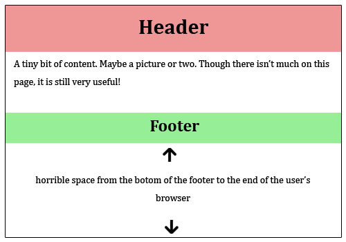
問題:

(Softlayer に感謝 -グラフィックを提供)
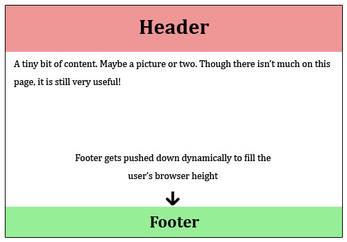
粘着性のないフッターはかなり醜い

望ましい解決策:

固定フッターは常に下部にあります

もちろん、フッターはレスポンシブで、クロスブラウザーにも対応している必要があります...

4

12 に答える 12

14

スティッキーフッターを機能させる簡単な方法を探していました。" を適用したところ、すぐclass="navbar-fixed-bottomに機能しました。注意すべきことは、モバイル デバイスのフッターの設定を調整することだけです。乾杯!

于 2015-07-09T14:37:39.833 に答える
2

上記のコメントの 1 つで robodo が言ったことについて詳しく説明します。非常に迅速で見栄えがよく、より重要なのは、ハックを含まない応答性の高い (高さを固定しない) アプローチは、フレックスボックスを使用することです。ブラウザのサポートに制限されていない場合、これは優れたソリューションです。

HTML

<body>
  <div class="site-content">
    Site content
  </div>
  <footer class="footer">
    Footer content
  </footer>
</body>

CSS

html {
  height: 100%;
}
body {
  min-height: 100%;
  display: flex;
  flex-direction: column;
}
.site-content {
  flex: 1;
}

ブラウザのサポートはこちらで確認できます: http://caniuse.com/#feat=flexbox

フレックスボックスを使用したより一般的な問題の解決策: https://github.com/philipwalton/solved-by-flexbox

于 2017-01-07T22:28:37.293 に答える
1

これまでに何を試したかはわかりませんが、非常に簡単です。これを行うだけです:http://plnkr.co/edit/kmEWh7?p=preview

html, body {
  height: 100%;
}

footer {
  position: absolute;
  bottom: 0;
}
于 2013-11-03T20:57:34.367 に答える
1

簡単に設定

position:absolute;
bottom:0;
width:100%;

あなたの.footerに

早くやれよ

于 2015-07-02T07:00:27.653 に答える
-1
   <style type="text/css">

     /* Sticky footer styles
     -------------------------------------------------- */

     html,
     body {
       height: 100%;
       /* The html and body elements cannot have any padding or margin. */
     }

     /* Wrapper for page content to push down footer */
     #wrap {
       min-height: 100%;
       height: auto !important;
       height: 100%;
       /* Negative indent footer by it's height */
       margin: 0 auto -60px;
     }

     /* Set the fixed height of the footer here */
     #push,
     #footer {
       height: 60px;
     }
     #footer {
       background-color: #f5f5f5;
     }

     /* Lastly, apply responsive CSS fixes as necessary */
     @media (max-width: 767px) {
       #footer {
         margin-left: -20px;
         margin-right: -20px;
         padding-left: 20px;
         padding-right: 20px;
       }
     }


     /* Custom page CSS
     -------------------------------------------------- */
     /* Not required for template or sticky footer method. */

     .container {
       width: auto;
       max-width: 680px;
     }
     .container .credit {
       margin: 20px 0;
     }

   </style>


<div id="wrap">

  <!-- Begin page content -->
  <div class="container">
    <div class="page-header">
      <h1>Sticky footer</h1>
    </div>
    <p class="lead">Pin a fixed-height footer to the bottom of the viewport in desktop browsers with this custom HTML and CSS.</p>
    <p>Use <a href="./sticky-footer-navbar.html">the sticky footer</a> with a fixed navbar if need be, too.</p>
  </div>

  <div id="push"></div>
</div>

<div id="footer">
  <div class="container">
    <p class="muted credit">Example courtesy <a href="http://martinbean.co.uk">Martin Bean</a> and <a href="http://ryanfait.com/sticky-footer/">Ryan Fait</a>.</p>
  </div>
</div>
于 2013-12-31T08:57:22.077 に答える