あなたがコメントしたように、ここで私の答えを参照してください。これはあなたが探しているものに似ています..
デモ(私がリンクした質問に答えたフィドルの修正版)
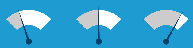
どこでアークをアニメーション化していますか? ここではプロパティで CSS3@keyframeを使用しており、要素を、transform、 の 3 つの部分で回転させています。残りは自明であり、アニメーションの合計時間を制御し、アニメーションを設定します。アニメーションが一貫した流れを得るためには、最後のものが重要です。0%50%100%animation-durationanimation-iteration-countinfiniteanimation-timing-function
デモ
.circle {
   -webkit-animation-duration: 5s;
   -webkit-animation-name: animation;
   -webkit-animation-iteration-count: infinite;
   -webkit-animation-timing-function: linear;

   -moz-animation-duration: 5s;
   -moz-animation-name: animation;
   -moz-animation-iteration-count: infinite;
   -moz-animation-timing-function: linear;

   animation-duration: 5s;
   animation-name: animation;
   animation-iteration-count: infinite;
   animation-timing-function: linear;
   width: 60px;
   height: 60px;
   border-style: solid;
   border-radius: 35px;
   border-width: 5px;
   border-color: #999 transparent transparent transparent;
}
.arc-top { border-color: #999 transparent transparent transparent;}

@-moz-keyframes animation {
    0% {-moz-transform: rotate(0);}
    50% {-moz-transform: rotate(180deg);}
    100% {-moz-transform: rotate(360deg);}
}

@-webkit-keyframes animation {
    0% {-webkit-transform: rotate(0);}
    50% {-webkit-transform: rotate(180deg);}
    100% {-webkit-transform: rotate(360deg);}
}

@keyframes animation {
    0% {transform: rotate(0);}
    50% {transform: rotate(180deg);}
    100% {transform: rotate(360deg);}
}