私はSwitch次のようになるためにカスタムザボタンを探しています:

これを達成する方法は?
私はSwitch次のようになるためにカスタムザボタンを探しています:
これを達成する方法は?
ただし、最善のアプローチを採用していない可能性がありますが、これは、いくつかSwitchのアプリで同様の UI を作成した方法です。ここにコードがあります -
<RadioGroup
        android:checkedButton="@+id/offer"
        android:id="@+id/toggle"
        android:layout_width="match_parent"
        android:layout_height="30dp"
        android:layout_marginBottom="@dimen/margin_medium"
        android:layout_marginLeft="50dp"
        android:layout_marginRight="50dp"
        android:layout_marginTop="@dimen/margin_medium"
        android:background="@drawable/pink_out_line"
        android:orientation="horizontal">

        <RadioButton
            android:layout_marginTop="1dp"
            android:layout_marginBottom="1dp"
            android:layout_marginLeft="1dp"
            android:id="@+id/search"
            android:background="@drawable/toggle_widget_background"
            android:layout_width="0dp"
            android:layout_height="match_parent"
            android:layout_weight="1"
            android:button="@null"
            android:gravity="center"
            android:text="Search"
            android:textColor="@color/white" />

        <RadioButton
            android:layout_marginRight="1dp"
            android:layout_marginTop="1dp"
            android:layout_marginBottom="1dp"
            android:id="@+id/offer"
            android:layout_width="0dp"
            android:layout_height="match_parent"
            android:layout_weight="1"
            android:background="@drawable/toggle_widget_background"
            android:button="@null"
            android:gravity="center"
            android:text="Offers"
            android:textColor="@color/white" />
    </RadioGroup>
pink_out_line.xml
<shape xmlns:android="http://schemas.android.com/apk/res/android"
    android:shape="rectangle">
    <corners android:radius="2dp" />
    <solid android:color="#80000000" />
    <stroke
        android:width="1dp"
        android:color="@color/pink" />
</shape>
toggle_widget_background.xml
<?xml version="1.0" encoding="UTF-8" standalone="no"?>
<selector xmlns:android="http://schemas.android.com/apk/res/android">
    <item android:drawable="@color/pink" android:state_checked="true" />
    <item android:drawable="@color/dark_pink" android:state_pressed="true" />
    <item android:drawable="@color/transparent" />
</selector>
そして、ここに出力があります-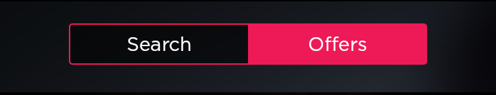
<Switch android:layout_width="wrap_content"
                    android:layout_height="wrap_content"
                    android:thumb="@drawable/custom_switch_inner_holo_light"
                    android:track="@drawable/custom_switch_track_holo_light"
                    android:textOn="@string/yes"
                    android:textOff="@string/no"/>
drawable/custom_switch_inner_holo_light.xml
<selector xmlns:android="http://schemas.android.com/apk/res/android">
    <item android:state_enabled="false" android:drawable="@drawable/custom_switch_thumb_disabled_holo_light" />
    <item android:state_pressed="true"  android:drawable="@drawable/custom_switch_thumb_pressed_holo_light" />
    <item android:state_checked="true"  android:drawable="@drawable/custom_switch_thumb_activated_holo_light" />
    <item                               android:drawable="@drawable/custom_switch_thumb_holo_light" />
</selector>
drawable/custom_switch_track_holo_light.xml
<selector xmlns:android="http://schemas.android.com/apk/res/android">
    <item android:state_focused="true"  android:drawable="@drawable/custom_switch_bg_focused_holo_light" />
    <item                               android:drawable="@drawable/custom_switch_bg_holo_light" />
</selector>
次の画像は 9.paths ドローアブルであり、異なる密度 (mdpi、hdpi、xhdpi、xxhdpi) である必要があります。例として、xxhdpi を指定します (必要に応じてサイズを変更できます)。
drawable/custom_switch_thumb_disabled_holo_light

drawable/custom_switch_thumb_pressed_holo_light

drawable/custom_switch_thumb_activated_holo_light

drawable/custom_switch_thumb_holo_light
drawable/custom_switch_bg_focused_holo_light

drawable/custom_switch_bg_holo_light

通常の Switch ウィジェットを使用して and を呼び出すsetTextOn()かsetTextOff()、android:textOnandandroid:textOff属性を使用できます。
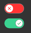
以下のコードを使用して、以下に示すようなカスタム スイッチ ボタンを作成します。
<androidx.appcompat.widget.SwitchCompat
        android:layout_width="wrap_content"
        android:layout_height="wrap_content"
        android:id="@+id/customSwitch"
        app:layout_constraintBottom_toBottomOf="parent"
        app:layout_constraintLeft_toLeftOf="parent"
        app:layout_constraintRight_toRightOf="parent"
        app:layout_constraintTop_toTopOf="parent"
        android:checked="false"
        app:track="@drawable/track"
        android:thumb="@drawable/thumb"
        android:text="" />
@drawable/トラック
<?xml version="1.0" encoding="utf-8"?>
<selector xmlns:android="http://schemas.android.com/apk/res/android">

    <item android:state_checked="false">
        <shape android:shape="rectangle">
            <solid android:color="#FF3333"/>
            <corners android:radius="100sp"/>
            <stroke android:color="#8e8e8e"
                android:width="1dp"/>
        </shape>
    </item>

    <item android:state_checked="true">
        <shape android:shape="rectangle">
            <solid android:color="@color/color_green"/>      <!--color name="color_green">#3bd391</color-->
            <corners android:radius="100sp"/>
        </shape>
    </item>
</selector>
@drawable/親指
<?xml version="1.0" encoding="utf-8"?>
<selector xmlns:android="http://schemas.android.com/apk/res/android">

    <item android:state_checked="false"
        android:drawable="@drawable/switch_thumb_false"/>

    <item android:state_checked="true"
        android:drawable="@drawable/switch_thumb_true"/>

</selector>
@drawable/switch_thumb_false
<?xml version="1.0" encoding="utf-8"?>
<layer-list xmlns:android="http://schemas.android.com/apk/res/android">

    <item
        android:bottom="4dp"
        android:top="4dp"
        android:left="4dp"
        android:right="4dp">

        <shape android:shape="oval">
            <solid android:color="#FFFFFF"/>
            <size android:height="3dp"
                android:width="3dp"/>
        </shape>
    </item>

    <item android:drawable="@drawable/ic_baseline_close_16"
        android:bottom="8dp"
        android:top="8dp"
        android:left="8dp"
        android:right="8dp"/>

</layer-list>
@drawable/switch_thumb_true
<?xml version="1.0" encoding="utf-8"?>
<layer-list xmlns:android="http://schemas.android.com/apk/res/android">

    <item
        android:bottom="4dp"
        android:top="4dp"
        android:left="4dp"
        android:right="4dp">

        <shape android:shape="oval">
            <solid android:color="#FFFFFF"/>
            <size android:height="3dp"
                android:width="3dp"/>
            <stroke android:width="1sp"
                android:color="#8e8e8e" />
        </shape>
    </item>


    <item android:drawable="@drawable/ic_baseline_correct_16"
        android:bottom="8dp"
        android:top="8dp"
        android:left="8dp"
        android:right="8dp"
        />


</layer-list>
@drawable/ic_baseline_correct_16
<vector xmlns:android="http://schemas.android.com/apk/res/android"
    android:width="16dp"
    android:height="16dp"
    android:viewportWidth="24"
    android:viewportHeight="24"
    android:tint="#008F28"
    android:alpha="0.9">
    <path
        android:fillColor="#FF000000"
        android:pathData="M9,16.2L4.8,12l-1.4,1.4L9,19 21,7l-1.4,-1.4L9,16.2z"/>
</vector>
@drawable/ic_baseline_close_16
<vector
    android:height="16dp"
    android:tint="#FF0000"
    android:viewportHeight="24"
    android:viewportWidth="24"
    android:width="16dp"
    xmlns:android="http://schemas.android.com/apk/res/android">
    <path android:fillColor="@android:color/white" android:pathData="M19,6.41L17.59,5 12,10.59 6.41,5 5,6.41 10.59,12 5,17.59 6.41,19 12,13.41 17.59,19 19,17.59 13.41,12z"/>
</vector>