7

下のプロットの信頼区間の外側にあるデータポイントを、帯域内のデータポイントとは異なる色にする必要があります。データポイントが信頼区間内にあるかどうかを記録するために、データセットに別の列を追加する必要がありますか?例を挙げていただけますか?

信頼区間でプロット

データセットの例:

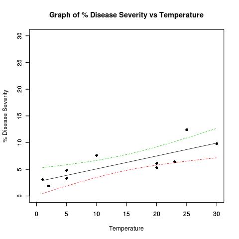
## Dataset from http://www.apsnet.org/education/advancedplantpath/topics/RModules/doc1/04_Linear_regression.html

## Disease severity as a function of temperature

# Response variable, disease severity
diseasesev<-c(1.9,3.1,3.3,4.8,5.3,6.1,6.4,7.6,9.8,12.4)

# Predictor variable, (Centigrade)
temperature<-c(2,1,5,5,20,20,23,10,30,25)

## For convenience, the data may be formatted into a dataframe
severity <- as.data.frame(cbind(diseasesev,temperature))

## Fit a linear model for the data and summarize the output from function lm()
severity.lm <- lm(diseasesev~temperature,data=severity)

# Take a look at the data
plot(
  diseasesev~temperature,
  data=severity,
  xlab="Temperature",
  ylab="% Disease Severity",
  pch=16,
  pty="s",
  xlim=c(0,30),
  ylim=c(0,30)
)
title(main="Graph of % Disease Severity vs Temperature")
par(new=TRUE) # don't start a new plot

## Get datapoints predicted by best fit line and confidence bands
## at every 0.01 interval
xRange=data.frame(temperature=seq(min(temperature),max(temperature),0.01))
pred4plot <- predict(
                        lm(diseasesev~temperature),
                        xRange,
                        level=0.95,
                        interval="confidence"
                    )

## Plot lines derrived from best fit line and confidence band datapoints
matplot(
  xRange,
  pred4plot,
  lty=c(1,2,2),   #vector of line types and widths
  type="l",       #type of plot for each column of y
  xlim=c(0,30),
  ylim=c(0,30),
  xlab="",
  ylab=""
)
4

3 に答える 3

10

さて、これはggplot2でかなり簡単だと思いましたが、stat_smooth/geom_smoothの信頼限界がどのように計算されるのかわからないことに気付きました。

次のことを考慮してください。

library(ggplot2)
pred <- as.data.frame(predict(severity.lm,level=0.95,interval="confidence"))
dat <- data.frame(diseasesev,temperature, 
    in_interval = diseasesev <=pred$upr & diseasesev >=pred$lwr ,pred)
ggplot(dat,aes(y=diseasesev,x=temperature)) +
stat_smooth(method='lm')  + geom_point(aes(colour=in_interval)) +
    geom_line(aes(y=lwr),colour=I('red')) + geom_line(aes(y=upr),colour=I('red'))

これにより、次のものが生成されます。 代替テキストhttp://ifellows.ucsd.edu/pmwiki/uploads/Main/strangeplot.jpg

stat_smoothによって計算された信頼区間が、predictから直接計算された帯域(つまり、赤い線)と矛盾する理由がわかりません。誰かがこれに光を当てることができますか?

編集:

理解した。ggplot2は、1.96 *標準誤差を使用して、すべての平滑化方法の間隔を描画します。

pred <- as.data.frame(predict(severity.lm,se.fit=TRUE,
        level=0.95,interval="confidence"))
dat <- data.frame(diseasesev,temperature, 
    in_interval = diseasesev <=pred$fit.upr & diseasesev >=pred$fit.lwr ,pred)
ggplot(dat,aes(y=diseasesev,x=temperature)) +
    stat_smooth(method='lm')  + 
    geom_point(aes(colour=in_interval)) +
    geom_line(aes(y=fit.lwr),colour=I('red')) + 
    geom_line(aes(y=fit.upr),colour=I('red')) +
    geom_line(aes(y=fit.fit-1.96*se.fit),colour=I('green')) + 
    geom_line(aes(y=fit.fit+1.96*se.fit),colour=I('green'))
于 2010-04-22T00:50:01.553 に答える
6

最も簡単な方法はTRUE/FALSE、データポイントが信頼区間内にあるかどうかを示す値のベクトルを計算することです。プロットコマンドが実行される前にすべての計算が完了するように、例を少し再シャッフルします。これにより、プログラムロジックが明確に分離され、この一部を関数にパッケージ化した場合に悪用される可能性があります。 。

最初の部分はほとんど同じですが、 lm()insidepredict()への追加の呼び出しをseverity.lm変数に置き換えました。線形モデルが既に格納されている場合、線形モデルを再計算するために追加の計算リソースを使用する必要はありません。

## Dataset from 
#  apsnet.org/education/advancedplantpath/topics/
#    RModules/doc1/04_Linear_regression.html

## Disease severity as a function of temperature

# Response variable, disease severity
diseasesev<-c(1.9,3.1,3.3,4.8,5.3,6.1,6.4,7.6,9.8,12.4)

# Predictor variable, (Centigrade)
temperature<-c(2,1,5,5,20,20,23,10,30,25)

## For convenience, the data may be formatted into a dataframe
severity <- as.data.frame(cbind(diseasesev,temperature))

## Fit a linear model for the data and summarize the output from function lm()
severity.lm <- lm(diseasesev~temperature,data=severity)

## Get datapoints predicted by best fit line and confidence bands
## at every 0.01 interval
xRange=data.frame(temperature=seq(min(temperature),max(temperature),0.01))
pred4plot <- predict(
  severity.lm,
  xRange,
  level=0.95,
  interval="confidence"
)

次に、元のデータポイントの信頼区間を計算し、テストを実行して、ポイントが区間内にあるかどうかを確認します。

modelConfInt <- predict(
  severity.lm,
  level = 0.95,
  interval = "confidence"
)

insideInterval <- modelConfInt[,'lwr'] < severity[['diseasesev']] &
  severity[['diseasesev']] < modelConfInt[,'upr']

次に、プロットを実行します。最初plot()に、例で使用したように、高レベルのプロット関数を実行しますが、間隔内のポイントのみをプロットします。points()次に、間隔外のすべてのポイントを異なる色でプロットする低レベル関数をフォローアップします。最後に、matplot()使用した信頼区間を入力するために使用されます。ただし、呼び出す代わりにpar(new=TRUE)、引数add=TRUEを高レベルの関数に渡して、低レベルの関数のように動作させることを好みます。

使用par(new=TRUE)することは、プロット機能を汚いトリックでプレイするようなものです。これは、予期しない結果をもたらす可能性があります。add引数は、プロットを再描画するのではなく、プロットに情報を追加するように多くの関数によって提供されます。可能な限りこの引数を利用し、最後の手段として操作にフォールバックすることをお勧めしますpar()

# Take a look at the data- those points inside the interval
plot(
  diseasesev~temperature,
  data=severity[ insideInterval,],
  xlab="Temperature",
  ylab="% Disease Severity",
  pch=16,
  pty="s",
  xlim=c(0,30),
  ylim=c(0,30)
)
title(main="Graph of % Disease Severity vs Temperature")

# Add points outside the interval, color differently
points(
  diseasesev~temperature,
  pch = 16,
  col = 'red',
  data = severity[ !insideInterval,]
)

# Add regression line and confidence intervals
matplot(
  xRange,
  pred4plot,
  lty=c(1,2,2),   #vector of line types and widths
  type="l",       #type of plot for each column of y
  add = TRUE
)
于 2010-04-22T00:55:03.590 に答える
4

私はそのアイデアが好きで、そのための関数を作ろうとしました。もちろん、完璧にはほど遠いです。コメントは大歓迎です

diseasesev<-c(1.9,3.1,3.3,4.8,5.3,6.1,6.4,7.6,9.8,12.4)
# Predictor variable, (Centigrade)
temperature<-c(2,1,5,5,20,20,23,10,30,25)

## For convenience, the data may be formatted into a dataframe
severity <- as.data.frame(cbind(diseasesev,temperature))

## Fit a linear model for the data and summarize the output from function lm()
severity.lm <- lm(diseasesev~temperature,data=severity)

# Function to plot the linear regression and overlay the confidence intervals   
ci.lines<-function(model,conf= .95 ,interval = "confidence"){
  x <- model[[12]][[2]]
  y <- model[[12]][[1]]
  xm<-mean(x)
  n<-length(x)
  ssx<- sum((x - mean(x))^2)
  s.t<- qt(1-(1-conf)/2,(n-2))
  xv<-seq(min(x),max(x),(max(x) - min(x))/100)
  yv<- coef(model)[1]+coef(model)[2]*xv

  se <- switch(interval,
        confidence = summary(model)[[6]] * sqrt(1/n+(xv-xm)^2/ssx),
        prediction = summary(model)[[6]] * sqrt(1+1/n+(xv-xm)^2/ssx)
              )
  # summary(model)[[6]] = 'sigma'

  ci<-s.t*se
  uyv<-yv+ci
  lyv<-yv-ci
  limits1 <- min(c(x,y))
  limits2 <- max(c(x,y))

  predictions <- predict(model, level = conf, interval = interval)

  insideCI <- predictions[,'lwr'] < y & y < predictions[,'upr']

  x_name <- rownames(attr(model[[11]],"factors"))[2]
  y_name <- rownames(attr(model[[11]],"factors"))[1]

  plot(x[insideCI],y[insideCI],
  pch=16,pty="s",xlim=c(limits1,limits2),ylim=c(limits1,limits2),
  xlab=x_name,
  ylab=y_name,
  main=paste("Graph of ", y_name, " vs ", x_name,sep=""))

  abline(model)

  points(x[!insideCI],y[!insideCI], pch = 16, col = 'red')

  lines(xv,uyv,lty=2,col=3)
  lines(xv,lyv,lty=2,col=3)
}

次のように使用します。

ci.lines(severity.lm, conf= .95 , interval = "confidence")
ci.lines(severity.lm, conf= .85 , interval = "prediction")
于 2010-04-22T12:08:59.873 に答える