CSSで破線のボーダーストローク間の長さと距離を制御することは可能ですか?
以下の例は、ブラウザによって表示が異なります。
div {
border: dashed 4px #000;
padding: 20px;
display: inline-block;
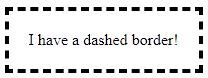
}<div>I have a dashed border!</div>大きな違い: IE 11 / Firefox / Chrome
破線の境界線の外観をより細かく制御できる方法はありますか?
CSSで破線のボーダーストローク間の長さと距離を制御することは可能ですか?
以下の例は、ブラウザによって表示が異なります。
div {
border: dashed 4px #000;
padding: 20px;
display: inline-block;
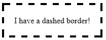
}<div>I have a dashed border!</div>大きな違い: IE 11 / Firefox / Chrome
破線の境界線の外観をより細かく制御できる方法はありますか?
ネイティブの破線枠のプロパティ値では、破線自体を制御することはできません...そのため、このborder-imageプロパティを使用してください!
border-image互換性:優れたブラウザー サポート(IE 11 および最新のすべてのブラウザー) を提供します。通常の境界線は、古いブラウザーのフォールバックとして設定できます。
これらの境界線は、まったく同じクロスブラウザーで表示されます!
この例は幅 15 ピクセル、高さ 15 ピクセルで、ギャップは現在 5 ピクセル幅です。透明度のある .png です。
フォトショップで拡大するとこんな感じ。
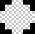
これは、スケーリングすると次のようになります。

より広い/より短いギャップまたはストロークを作成するには、イメージ内のギャップまたはストロークを拡張/短縮します。
10px のギャップが広い画像を次に示します。
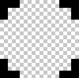 正しくスケーリング =
border-image-sourceを定義します。
border-image-source:url("http://i.stack.imgur.com/wLdVc.png");
オプション- border-image-widthを定義します。
border-image-width: 1;
デフォルト値は 1 です。ピクセル値、パーセンテージ値、または別の倍数 (1x、2x、3x など) で設定することもできます。border-widthこれは、任意のセットをオーバーライドします。
border-image-sliceを定義します。
この例では、画像の上、右、下、左の境界線の太さは 2px で、それらの外側に隙間がないため、スライス値は 2 です。
border-image-slice: 2;
スライスは次のようになります。上、右、下、左から 2 ピクセルです。
border-image-repeat を定義します。
この例では、パターンが div の周りで均等に繰り返されるようにします。したがって、次のように選択します。
border-image-repeat: round;
速記の書き方
上記のプロパティは、個別に設定することも、border-imageを使用して簡単に設定することもできます。
border-image: url("http://i.stack.imgur.com/wLdVc.png") 2 round;
border: dashed 4px #000フォールバックに注意してください。サポートされていないブラウザーは、この境界線を受け取ります。
.bordered {
display: inline-block;
padding: 20px;
/* Fallback dashed border
- the 4px width here is overwritten with the border-image-width (if set)
- the border-image-width can be omitted below if it is the same as the 4px here
*/
border: dashed 4px #000;
/* Individual border image properties */
border-image-source: url("http://i.stack.imgur.com/wLdVc.png");
border-image-slice: 2;
border-image-repeat: round;
/* or use the shorthand border-image */
border-image: url("http://i.stack.imgur.com/wLdVc.png") 2 round;
}
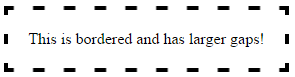
/*The border image of this one creates wider gaps*/
.largeGaps {
border-image-source: url("http://i.stack.imgur.com/LKclP.png");
margin: 0 20px;
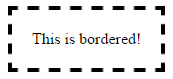
}<div class="bordered">This is bordered!</div>
<div class="bordered largeGaps">This is bordered and has larger gaps!</div>プロパティに加えてborder-image、ストロークの長さとそれらの間の距離を制御して破線の境界線を作成する方法が他にもいくつかあります。それらについて以下に説明します。
pathまたはpolygon要素を使用してプロパティを設定することにより、破線の境界線を作成できますstroke-dasharray。プロパティは 2 つのパラメーターを取り、1 つはダッシュのサイズを定義し、もう 1 つはそれらの間のスペースを決定します。
長所:
border-radius絡みがあっても、うまく機能します。この回答pathでは、 をcirclelike に置き換える(または)を円に変換するだけです。path短所:
vector-effect='non-scaling-stroke'が、このプロパティに対するブラウザーのサポートは IE ではありません。.dashed-vector {
position: relative;
height: 100px;
width: 300px;
}
svg {
position: absolute;
top: 0px;
left: 0px;
height: 100%;
width: 100%;
}
path{
fill: none;
stroke: blue;
stroke-width: 5;
stroke-dasharray: 10, 10;
}
span {
position: absolute;
top: 0px;
left: 0px;
padding: 10px;
}
/* just for demo */
div{
margin-bottom: 10px;
transition: all 1s;
}
div:hover{
height: 100px;
width: 400px;
}<div class='dashed-vector'>
<svg viewBox='0 0 300 100' preserveAspectRatio='none'>
<path d='M0,0 300,0 300,100 0,100z' />
</svg>
<span>Some content</span>
</div>
<div class='dashed-vector'>
<svg viewBox='0 0 300 100' preserveAspectRatio='none'>
<path d='M0,0 300,0 300,100 0,100z' vector-effect='non-scaling-stroke'/>
</svg>
<span>Some content</span>
</div>複数のlinear-gradient背景画像を使用して適切に配置し、破線の境界線効果を作成できます。これは a でも実行できますが、repeating-linear-gradient各グラデーションを一方向にのみ繰り返す必要があるため、繰り返しグラデーションを使用するため、あまり改善されません。
.dashed-gradient{
  height: 100px;
  width: 200px;
  padding: 10px;
  background-image: linear-gradient(to right, blue 50%, transparent 50%), linear-gradient(to right, blue 50%, transparent 50%), linear-gradient(to bottom, blue 50%, transparent 50%), linear-gradient(to bottom, blue 50%, transparent 50%);
  background-position: left top, left bottom, left top, right top;
  background-repeat: repeat-x, repeat-x, repeat-y, repeat-y;
  background-size: 20px 3px, 20px 3px, 3px 20px, 3px 20px;
}

.dashed-repeating-gradient {
  height: 100px;
  width: 200px;
  padding: 10px;
  background-image: repeating-linear-gradient(to right, blue 0%, blue 50%, transparent 50%, transparent 100%), repeating-linear-gradient(to right, blue 0%, blue 50%, transparent 50%, transparent 100%), repeating-linear-gradient(to bottom, blue 0%, blue 50%, transparent 50%, transparent 100%), repeating-linear-gradient(to bottom, blue 0%, blue 50%, transparent 50%, transparent 100%);
  background-position: left top, left bottom, left top, right top;
  background-repeat: repeat-x, repeat-x, repeat-y, repeat-y;
  background-size: 20px 3px, 20px 3px, 3px 20px, 3px 20px;
}

/* just for demo */

div {
  margin: 10px;
  transition: all 1s;
}
div:hover {
  height: 150px;
  width: 300px;
}
<script src="https://cdnjs.cloudflare.com/ajax/libs/prefixfree/1.0.7/prefixfree.min.js"></script>
<div class='dashed-gradient'>Some content</div>
<div class='dashed-repeating-gradient'>Some content</div>長所:
短所:
border-radius背景は に基づいて湾曲しないため、 が関与する場合は使用できませんborder-radius。代わりにクリップされます。疑似要素を使用して小さなバー (ダッシュの形) を作成し、複数のbox-shadowバージョンを作成して、以下のスニペットのように境界線を作成できます。
ダッシュが正方形の場合は単一の疑似要素で十分ですが、長方形の場合は、上下の境界線用に 1 つの疑似要素が必要になり、左右の境界線用に別の疑似要素が必要になります。これは、上の境界線のダッシュの高さと幅が左側のものと異なるためです。
長所:
短所:
border-radius、それらの配置は、円 (および場合によっては ) 上のポイントを見つける必要があるため、非常にトリッキーになりますtransform。.dashed-box-shadow{
position: relative;
height: 120px;
width: 120px;
padding: 10px;
}
.dashed-box-shadow:before{ /* for border top and bottom */
position: absolute;
content: '';
top: 0px;
left: 0px;
height: 3px; /* height of the border top and bottom */
width: 10px; /* width of the border top and bottom */
background: blue; /* border color */
box-shadow: 20px 0px 0px blue, 40px 0px 0px blue, 60px 0px 0px blue, 80px 0px 0px blue, 100px 0px 0px blue, /* top border */
0px 110px 0px blue, 20px 110px 0px blue, 40px 110px 0px blue, 60px 110px 0px blue, 80px 110px 0px blue, 100px 110px 0px blue; /* bottom border */
}
.dashed-box-shadow:after{ /* for border left and right */
position: absolute;
content: '';
top: 0px;
left: 0px;
height: 10px; /* height of the border left and right */
width: 3px; /* width of the border left and right */
background: blue; /* border color */
box-shadow: 0px 20px 0px blue, 0px 40px 0px blue, 0px 60px 0px blue, 0px 80px 0px blue, 0px 100px 0px blue, /* left border */
110px 0px 0px blue, 110px 20px 0px blue, 110px 40px 0px blue, 110px 60px 0px blue, 110px 80px 0px blue, 110px 100px 0px blue; /* right border */
}<div class='dashed-box-shadow'>Some content</div>短いもの:いいえ、そうではありません。代わりに画像を操作する必要があります。
Css render はブラウザー固有のものであり、微調整についてはわかりません。Ham の推奨に従って画像を操作する必要があります。参照: http://www.w3.org/TR/CSS2/box.html#border-style-properties