Android用のXMLでの形状の定義のドキュメントを見つけるのにいくつか問題があります。XMLファイルに単色で塗りつぶされた単純な円を定義して、レイアウトファイルに含めたいと思います。
残念ながら、android.comのドキュメントにはShapeクラスのXML属性が含まれていません。ArcShapeを使用して円を描く必要があると思いますが、円弧から円を作成するために必要なサイズ、色、または角度を設定する方法についての説明はありません。
Android用のXMLでの形状の定義のドキュメントを見つけるのにいくつか問題があります。XMLファイルに単色で塗りつぶされた単純な円を定義して、レイアウトファイルに含めたいと思います。
残念ながら、android.comのドキュメントにはShapeクラスのXML属性が含まれていません。ArcShapeを使用して円を描く必要があると思いますが、円弧から円を作成するために必要なサイズ、色、または角度を設定する方法についての説明はありません。
これは、Androidで描画可能な単純な円です。
<?xml version="1.0" encoding="utf-8"?>
<shape
    xmlns:android="http://schemas.android.com/apk/res/android"
    android:shape="oval">

   <solid
       android:color="#666666"/>

   <size
       android:width="120dp"
        android:height="120dp"/>
</shape>
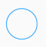
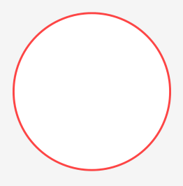
これをビューの背景として設定します
<shape xmlns:android="http://schemas.android.com/apk/res/android"
    android:shape="oval">
    <stroke
        android:width="1dp"
        android:color="#78d9ff"/>
</shape>
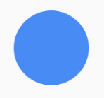
実線で使用する場合:
<shape xmlns:android="http://schemas.android.com/apk/res/android"
    android:shape="oval">
    <solid
        android:color="#48b3ff"/>
</shape>
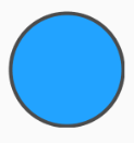
ストロークでソリッド:
<shape xmlns:android="http://schemas.android.com/apk/res/android"
    android:shape="oval">
    <solid android:color="#199fff"/>
    <stroke
        android:width="2dp"
        android:color="#444444"/>
</shape>
注:oval図形を円として表示するには、これらの例では、この図形を背景として使用しているビューが正方形であるか、図形タグのプロパティheightとwidthプロパティを同じ値に設定する必要があります。
シンプルサークルのコード
<?xml version="1.0" encoding="utf-8"?>
<shape xmlns:android="http://schemas.android.com/apk/res/android" android:shape="oval">
        <solid android:color="#9F2200"/>
        <stroke android:width="2dp" android:color="#fff" />
        <size android:width="80dp" android:height="80dp"/>
</shape>
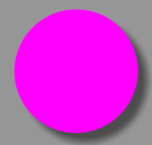
次のようにVectorDrawableを使用できます。
<?xml version="1.0" encoding="utf-8"?>
<vector xmlns:android="http://schemas.android.com/apk/res/android"
    android:width="200dp"
    android:height="200dp"
    android:viewportHeight="64"
    android:viewportWidth="64">

    <path
        android:fillColor="#ff00ff"
        android:pathData="M22,32
        A10,10 0 1,1 42,32
        A10,10 0 1,1 22,32 Z" />
</vector>
上記のxmlは次のようにレンダリングされます:
AndroidSDKのサンプルを見てください。ApiDemosプロジェクトにはいくつかの例があります。
/ ApiDemos / res / drawable /
グラデーションで塗りつぶされた円の場合、次のようになります。
<?xml version = "1.0" encoding = "utf-8"?>
<shape xmlns:android = "http://schemas.android.com/apk/res/android" android:shape = "oval">
    <gradient android:startColor = "#FFFF0000" android:endColor = "#80FF00FF"
            android:angle = "270" />
</ shape>
このようなサークルが必要な場合
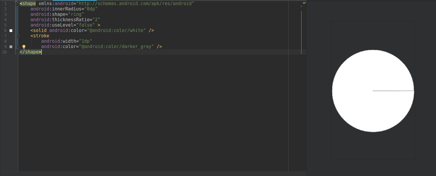
以下のコードを使用してみてください。
<shape xmlns:android="http://schemas.android.com/apk/res/android"
    android:innerRadius="0dp"
    android:shape="ring"
    android:thicknessRatio="2"
    android:useLevel="false" >
    <solid android:color="@android:color/white" />
    <stroke
        android:width="1dp"
        android:color="@android:color/darker_gray" />
</shape>
<?xml version="1.0" encoding="utf-8"?>
<shape
    xmlns:android="http://schemas.android.com/apk/res/android"
    android:shape="oval">

    <!-- fill color -->
    <solid android:color="@color/white" />

    <!-- radius -->
    <stroke
        android:width="1dp"
        android:color="@color/white" />

    <!-- corners -->
    <corners
        android:radius="2dp"/>
</shape>
プレマテリアルの簡単なcircle_background.xmlは次のとおりです。
<?xml version="1.0" encoding="utf-8"?>
<selector xmlns:android="http://schemas.android.com/apk/res/android">
    <item android:state_pressed="true">
        <shape android:shape="oval">
            <solid android:color="@color/color_accent_dark" />
        </shape>
    </item>
    <item>
        <shape android:shape="oval">
            <solid android:color="@color/color_accent" />
        </shape>
    </item>
</selector>
'android:background="@drawable/circle_background"ボタンのレイアウト定義の属性で使用できます
res / drawble / circle_shape.xml
<?xml version="1.0" encoding="utf-8"?>
<selector xmlns:android="http://schemas.android.com/apk/res/android">
    <item>

        <shape android:shape="oval">
            <solid android:color="#e42828"/>
            <stroke android:color="#3b91d7" android:width="5dp"/>
            <!-- Set the same value for both width and height to get a circular shape -->
            <size android:width="250dp" android:height="250dp"/>
        </shape>
    </item>
</selector>
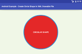
AndroidXMLドローアブルファイルの円の形
<?xml version="1.0" encoding="utf-8"?>
<shape xmlns:android="http://schemas.android.com/apk/res/android"
    android:shape="oval">
    <solid android:color="@android:color/white" />
    <stroke
        android:width="1.5dp"
        android:color="@android:color/holo_red_light" />
    <size
        android:width="120dp"
        android:height="120dp" />
</shape>
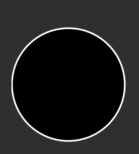
スクリーンショット
<?xml version="1.0" encoding="utf-8"?>
<shape
    xmlns:android="http://schemas.android.com/apk/res/android"
    android:shape="oval">

    <stroke
        android:width="10dp"
        android:color="@color/white"/>

    <gradient
        android:startColor="@color/red"
        android:centerColor="@color/red"
        android:endColor="@color/red"
        android:angle="270"/>

    <size
        android:width="250dp"
        android:height="250dp"/>
</shape>
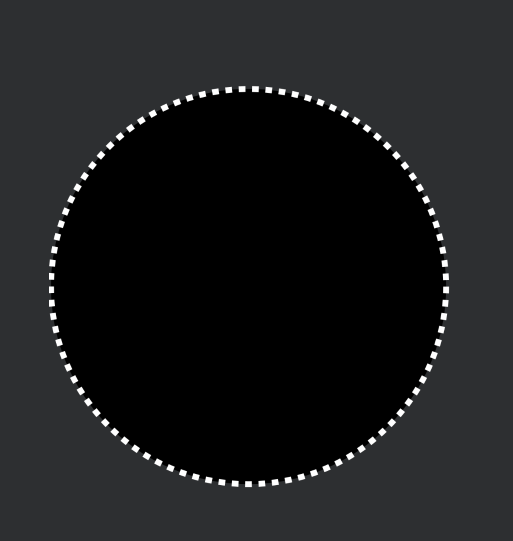
以下のコードをダッシュで試してください。
<?xml version="1.0" encoding="utf-8"?><shape xmlns:android="http://schemas.android.com/apk/res/android"
android:shape="oval">
<size
    android:width="@dimen/_60sdp"
    android:height="@dimen/_60sdp" />

<solid android:color="@color/black" />

<stroke
    android:width="@dimen/_1sdp"
    android:color="@color/white"
    android:dashWidth="@dimen/_1sdp"
    android:dashGap="@dimen/_1sdp" />
ダッシュなしでコードを試す
<?xml version="1.0" encoding="utf-8"?><shape xmlns:android="http://schemas.android.com/apk/res/android"
android:shape="oval">

<size
    android:width="@dimen/_60sdp"
    android:height="@dimen/_60sdp" />

<solid android:color="@color/black" />

<stroke
    android:width="@dimen/_1sdp"
    android:color="@color/white"
     />
あなたはこれを試すことができます-
<?xml version="1.0" encoding="utf-8"?>
<shape
    xmlns:android="http://schemas.android.com/apk/res/android"
    android:shape="ring"
    android:innerRadiusRatio="700"
    android:thickness="100dp"
    android:useLevel="false">

    <solid android:color="#CCC" />

</shape>
また、を調整することで円の半径を調整できますandroid:thickness。
これを使ってみることができます
<?xml version="1.0" encoding="utf-8"?>
<layer-list xmlns:android="http://schemas.android.com/apk/res/android" >

<item>
    <shape
        android:innerRadius="0dp"
        android:shape="ring"
        android:thicknessRatio="2"
        android:useLevel="false" >
        <solid android:color="@color/button_blue_two" />
    </shape>
</item>
これをテキストビューに使用している場合は、幅と高さのアスペクト比を気にする必要はありません。
なんらかの理由でConstraintLayout内に円を描くことができず、上記の回答を使用できませんでした。
完璧に機能したのは、「Alt+7」を押すと出力されるテキストを含む単純なTextViewです。
 <TextView
            android:layout_width="wrap_content"
            android:layout_height="wrap_content"
            android:textColor="#0075bc"
            android:textSize="40dp"
            android:text="•"></TextView>
カスタムドローアブルを作成して、円の色と半径を動的に変更できます
import android.graphics.Canvas;
import android.graphics.ColorFilter;
import android.graphics.Paint;
import android.graphics.PixelFormat;
import android.graphics.drawable.Drawable;

import androidx.annotation.NonNull;
import androidx.annotation.Nullable;

public class CircleDrawable extends Drawable {

    private Paint circlePaint;
    private int fillColor;
    private int strokeColor;
    private float radius;

    public CircleDrawable(int fillColor, int strokeColor, float radius) {
        this.fillColor = fillColor;
        this.strokeColor = strokeColor;
        this.radius = radius;
        circlePaint=new Paint(Paint.ANTI_ALIAS_FLAG);
    }

    @Override
    public void draw(@NonNull Canvas canvas) {
        int x=getBounds().centerX();
        int y=getBounds().centerY();
        //draw fill color circle
        circlePaint.setStyle(Paint.Style.FILL);
        circlePaint.setColor(fillColor);
        canvas.drawCircle(x,y,radius,circlePaint);
        // draw stroke circle
        circlePaint.setStyle(Paint.Style.STROKE);
        circlePaint.setColor(strokeColor);
        circlePaint.setStrokeWidth(5);
        canvas.drawCircle(x,y,radius,circlePaint);
    }

    @Override
    public void setAlpha(int alpha) {
        circlePaint.setAlpha(alpha);
    }

    @Override
    public void setColorFilter(@Nullable ColorFilter colorFilter) {
         circlePaint.setColorFilter(colorFilter);
    }

    @Override
    public int getOpacity() {
        return PixelFormat.TRANSLUCENT;
    }
}
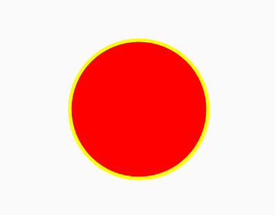
UIからこれを設定して、円の形を取得します
imageView.setImageDrawable(new CircleDrawable(Color.RED,Color.YELLOW,100));
出力は次のようになります
<?xml version="1.0" encoding="utf-8"?>
<selector xmlns:android="http://schemas.android.com/apk/res/android">
    <item>
        <shape android:shape="oval">
            <solid android:color="@color/text_color_green"/>
            <!-- Set the same value for both width and height to get a circular shape -->
            <size android:width="250dp" android:height="250dp"/>
        </shape>
    </item>
</selector>
使用するだけ
ShapeDrawable circle = new ShapeDrawable( new OvalShape() );