1

私は下の画像に見られるレイアウトをやろうとしています: ワイド画面レイアウト

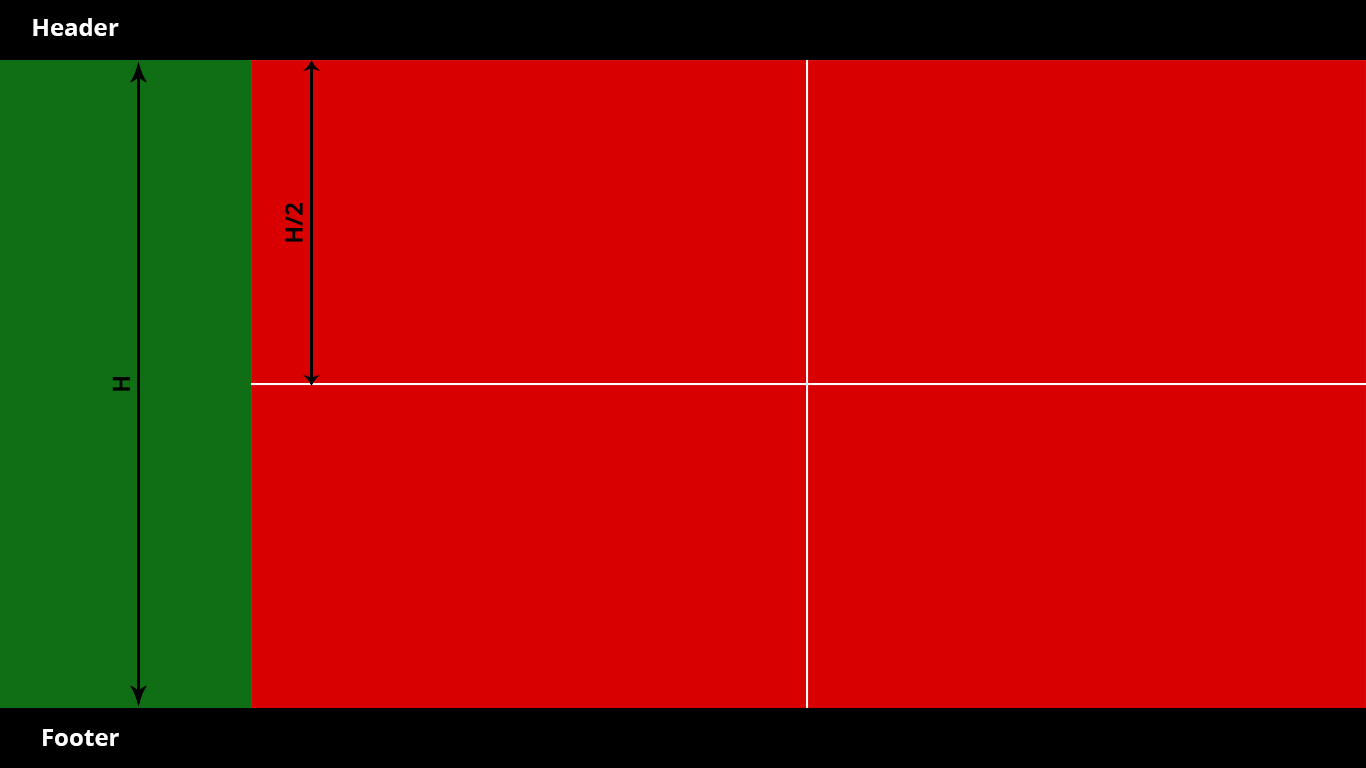
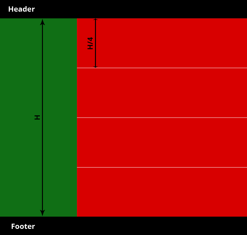
全画面表示で、ヘッダーとフッターの高さは固定(60px)、緑色のサイドバーの幅は 200px です。サイドバーと右側のセクションの両方が、y 軸上の使用可能なスペース全体を占有します。

ワイド画面の場合、右側を 2 つずつ表示する 4 つの等しいボックスに分割します。

中型および小型の画面 (< 768px) の場合、下の画像のように、4 つの等しいボックスを 1 つずつ 4 で表示したいと考えています。

ここに画像の説明を入力

私が持っているHTML:

    <div id="wrapper">
      <div id="header">Header</div>
      <div id="content">
        <div id="left"></div>
        <div id="right">
            <div class="red_box"></div>
            <div class="red_box"></div>
            <div class="red_box"></div>
            <div class="red_box"></div>
        </div>
      </div>
      <div id="footer">Footer</div>
    </div>

私が持っているCSS:

html {
  height: 100%;
}

body {
  height: 100%;
  position: relative;
}

#wrapper {
  -webkit-box-sizing: border-box;
  -moz-box-sizing: border-box;
  box-sizing: border-box;
  height: 100%;
  padding: 60px 0;
  position: relative;  
}

#header {
  width: 100%;
  height: 60px;
  background: #171717;
  position: absolute;
  top: 0;
  left: 0;
  -webkit-box-sizing: border-box;
  -moz-box-sizing: border-box;
  box-sizing: border-box;
}

#content {
  -webkit-box-sizing: border-box;
  -moz-box-sizing: border-box;
  box-sizing: border-box;
  height:100%;
  background: gray;
  display: flex;
}

#left {
  background: green;
  width: 200px;
  flex: 0 0 200px;
}

#right {
  background: red;
  width: 100%;
  position: relative;
}

#footer {
  width: 100%;
  height: 60px;
  background: #171717;
  bottom: 0;
  left: 0;
  -webkit-box-sizing: border-box;
  -moz-box-sizing: border-box;
  box-sizing: border-box;
}

可能であれば、 display:tableと display:table-cellを使用せずに、これらの赤いボックスのスタイルを設定して 2 つのレイアウトを実現するにはどうすればよいですか?

ありがとうございました!

4

1 に答える 1

1

Aさんは解決策を見つけました。ここにあります:

html {
  height: 100%;
}

body {
  height: 100%;
  position: relative;
  color: white;
  font-family: Arial, sans-serif;
}

body * {
  -webkit-box-sizing: border-box;
  -moz-box-sizing: border-box;
  box-sizing: border-box;
}

#wrapper {
  height: 100%;
  padding: 60px 0;
  position: relative;
}

#header {
  width: 100%;
  height: 60px;
  background: #171717;
  position: absolute;
  top: 0;
  left: 0;
}

#content {
  height: 100%;
  display: flex;
}

#left {
  background: green;
  width: 200px;
  flex: 0 0 200px;
}

#right {
  background: blue;
  width: 100%;
  position: relative;
  display: flex;
  flex-wrap: wrap;
}

.red_box {
  flex: 0 0 50%;
  background: red;
  border: 1px solid #111;
  border-bottom: none;
  text-align: center;
}

#footer {
  width: 100%;
  height: 60px;
  background: #171717;
  bottom: 0;
  left: 0;
}

@media (max-width: 768px) {
  .red_box {
    flex: 0 0 100%;
  }
}
<div id="wrapper">
  <div id="header">Header</div>
  <div id="content">
    <div id="left"></div>
    <div id="right">
      <div class="red_box">1</div>
      <div class="red_box">2</div>
      <div class="red_box">3</div>
      <div class="red_box">4</div>
    </div>
  </div>
  <div id="footer">Footer</div>
</div>

于 2015-09-18T13:47:56.710 に答える