確かに nav-justify クラスがありません。今のところ、TB3 のコードに基づいて自分で追加できます。
SCSS コード
// Justified button groups
// ----------------------
.btn-group-justified {
display: table;
width: 100%;
table-layout: fixed;
border-collapse: separate;
.btn,
.btn-group {
float: none;
display: table-cell;
width: 1%;
.btn {
width: 100%;
}
.dropdown-menu {
left: auto;
}
}
}
コンパイルされた CSS コード
.btn-group-justified {
display: table;
width: 100%;
table-layout: fixed;
border-collapse: separate; }
.btn-group-justified .btn,
.btn-group-justified .btn-group {
float: none;
display: table-cell;
width: 1%; }
.btn-group-justified .btn .btn,
.btn-group-justified .btn-group .btn {
width: 100%; }
.btn-group-justified .btn .dropdown-menu,
.btn-group-justified .btn-group .dropdown-menu {
left: auto; }
HTML
 <div class="btn-group btn-group-justified" role="group" aria-label="Justified button group">
   <a class="btn btn-primary" href="#" role="button">Left</a>
   <a class="btn btn-primary" href="#" role="button">Middle</a>
   <a class="btn btn-primary" href="#" role="button">Right</a>
 </div>
上記の HTML コードは、下の図のようになります。

ボーダーの処理
- ボタンを正当化するために使用される特定の HTML および CSS (つまり
display: table-cell) により、それらの間の境界線が 2 重になっています。通常のボタン グループでmargin-left: -1pxは、境界線を削除する代わりに積み重ねるために使用されます。ただし、marginでは動作しませんdisplay: table-cell。その結果、Bootstrap のカスタマイズによっては、境界線を削除したり、色を変更したりすることが必要になる場合があります。
ボタンとして機能するリンク
- 要素がボタンとして機能するために使用される場合
<a>(現在のページ内の別のドキュメントまたはセクションに移動するのではなく、ページ内機能をトリガーする場合)、それらにも適切な を与える必要がありますrole="button"。
ドロップダウン
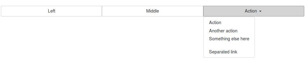
ドロップダウン ボタンには次の HTML コードを使用します。
 <div class="btn-group btn-group-justified" role="group" aria-label="Justified button group with nested dropdown">
   <a class="btn btn-secondary" href="#" role="button">Left</a>
   <a class="btn btn-secondary" href="#" role="button">Middle</a>
    <div class="btn-group">
      <button type="button" class="btn btn-secondary dropdown-toggle" data-toggle="dropdown" aria-haspopup="true" aria-expanded="false">
        Action
      </button>
      <div class="dropdown-menu">
        <a class="dropdown-item" href="#">Action</a>
        <a class="dropdown-item" href="#">Another action</a>
        <a class="dropdown-item" href="#">Something else here</a>
        <div class="dropdown-divider"></div>
        <a class="dropdown-item" href="#">Separated link</a>
      </div>
    </div>
 </div>
ドロップダウン ボタンを含む位置合わせされたボタン グループは、次の図のようになります。
エレメント<button>付き
- 両端揃えボタン グループを
<button>要素で使用するには、各ボタンをボタン グループでラップする必要があります。ほとんどのブラウザーは、要素の正当化のために CSS を適切に適用しません<button>が、ボタンのドロップダウンをサポートしているため、これを回避できます。
HTML
 <div class="btn-group btn-group-justified" role="group" aria-label="Justified button group">
   <div class="btn-group" role="group">
     <button type="button" class="btn btn-secondary">Left</button>
   </div>
   <div class="btn-group" role="group">
     <button type="button" class="btn btn-secondary">Middle</button>
   </div>
   <div class="btn-group" role="group">
     <button type="button" class="btn btn-secondary">Right</button>
  </div>
 </div>
要素でボタン グループを正当化するために使用される上記の HTML コード<button>は、下の図に示すようになります。
