EditText角が丸いものを作る方法はありますか?
331212 次
8 に答える
618
CommonsWareによって書かれた方法よりも簡単な方法があります。描画方法を指定する描画可能なリソースを作成するだけEditTextです。
<?xml version="1.0" encoding="utf-8"?>
<!--  res/drawable/rounded_edittext.xml -->
<shape xmlns:android="http://schemas.android.com/apk/res/android"
    android:shape="rectangle"
    android:padding="10dp">

    <solid android:color="#FFFFFF" />
    <corners
        android:bottomRightRadius="15dp"
        android:bottomLeftRadius="15dp"
        android:topLeftRadius="15dp"
        android:topRightRadius="15dp" />
</shape>
次に、レイアウトでこのドローアブルを参照します。
<?xml version="1.0" encoding="utf-8"?>
<LinearLayout xmlns:android="http://schemas.android.com/apk/res/android"
    android:orientation="vertical"
    android:layout_width="fill_parent"
    android:layout_height="fill_parent">

    <EditText
        android:layout_width="fill_parent"
        android:layout_height="wrap_content"
        android:padding="5dip"
        android:background="@drawable/rounded_edittext" />
</LinearLayout>
次のようなものが得られます:
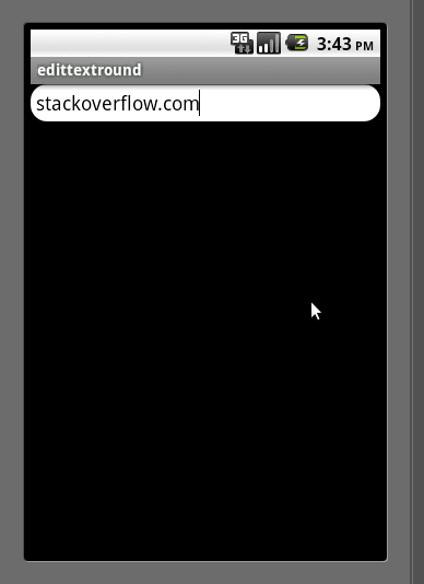
編集
マークのコメントに基づいて、私はあなたがあなたのために異なる状態を作成することができる方法を追加したいと思いますEditText:
<?xml version="1.0" encoding="utf-8"?>
<!-- res/drawable/rounded_edittext_states.xml -->
<selector xmlns:android="http://schemas.android.com/apk/res/android">
    <item
        android:state_pressed="true"
        android:state_enabled="true"
        android:drawable="@drawable/rounded_focused" />
    <item
        android:state_focused="true"
        android:state_enabled="true"
        android:drawable="@drawable/rounded_focused" />
    <item
        android:state_enabled="true"
        android:drawable="@drawable/rounded_edittext" />
</selector>
これらは状態です:
<?xml version="1.0" encoding="utf-8"?>
<!-- res/drawable/rounded_edittext_focused.xml -->
<shape xmlns:android="http://schemas.android.com/apk/res/android"
    android:shape="rectangle" android:padding="10dp">

    <solid android:color="#FFFFFF"/>
    <stroke android:width="2dp" android:color="#FF0000" />
    <corners
        android:bottomRightRadius="15dp"
        android:bottomLeftRadius="15dp"
        android:topLeftRadius="15dp"
        android:topRightRadius="15dp" />
</shape>
そして...今、は次のEditTextようになります:
<?xml version="1.0" encoding="utf-8"?>
<LinearLayout xmlns:android="http://schemas.android.com/apk/res/android"
    android:orientation="vertical"
    android:layout_width="fill_parent"
    android:layout_height="fill_parent">

    <EditText
        android:layout_width="fill_parent"
        android:layout_height="wrap_content"
        android:text="@string/hello"
        android:background="@drawable/rounded_edittext_states"
        android:padding="5dip" />
</LinearLayout>
于 2010-09-05T15:44:11.597 に答える
134
これは、1つのXMLファイルでの同じソリューション(いくつかの追加のボーナスコードを含む)です。
<?xml version="1.0" encoding="utf-8"?>
<!--  res/drawable/edittext_rounded_corners.xml -->
<selector xmlns:android="http://schemas.android.com/apk/res/android">

<item android:state_pressed="true" android:state_focused="true">
    <shape>
        <solid android:color="#FF8000"/>
        <stroke
            android:width="2.3dp"
            android:color="#FF8000" />
         <corners
            android:radius="15dp" />
    </shape>
</item>

<item android:state_pressed="true" android:state_focused="false">
    <shape>
        <solid android:color="#FF8000"/>
        <stroke
            android:width="2.3dp"
            android:color="#FF8000" />
        <corners
            android:radius="15dp" />
    </shape>
</item>

<item android:state_pressed="false" android:state_focused="true">
    <shape>
        <solid android:color="#FFFFFF"/>
        <stroke
            android:width="2.3dp"
            android:color="#FF8000" />
        <corners
            android:radius="15dp" />
    </shape>
</item>

<item android:state_pressed="false" android:state_focused="false">
    <shape>
        <gradient
            android:startColor="#F2F2F2"
            android:centerColor="#FFFFFF"
            android:endColor="#FFFFFF"
            android:angle="270"
        />
        <stroke
            android:width="0.7dp"
            android:color="#BDBDBD" />
        <corners
            android:radius="15dp" />
    </shape>
</item>

<item android:state_enabled="true">
    <shape>
        <padding
                android:left="4dp"
                android:top="4dp"
                android:right="4dp"
                android:bottom="4dp"
            />
    </shape>
</item>

</selector>
次に、background属性をedittext_rounded_corners.xmlファイルに設定します。
<EditText  android:id="@+id/editText_name"
      android:background="@drawable/edittext_rounded_corners"/>
于 2011-08-01T08:22:55.710 に答える
40
これを試してみてください
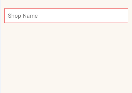
rounded_edittext.xmlDrawableにファイルを作成します<?xml version="1.0" encoding="utf-8"?> <shape xmlns:android="http://schemas.android.com/apk/res/android" android:shape="rectangle" android:padding="15dp"> <solid android:color="#FFFFFF" /> <corners android:bottomRightRadius="0dp" android:bottomLeftRadius="0dp" android:topLeftRadius="0dp" android:topRightRadius="0dp" /> <stroke android:width="1dip" android:color="#f06060" /> </shape>EditTextxmlファイルの背景を適用します<EditText android:id="@+id/edit_expiry_date" android:layout_width="match_parent" android:layout_height="wrap_content" android:padding="10dip" android:background="@drawable/rounded_edittext" android:hint="@string/shop_name" android:inputType="text" />このような出力が得られます
于 2015-08-20T11:07:56.277 に答える
20
Norfeldtの答えをありがとう。内側の影の効果を高めるために、グラデーションを少し変更しました。
<item android:state_pressed="false" android:state_focused="false">
    <shape>
        <gradient
            android:centerY="0.2"
            android:startColor="#D3D3D3"
            android:centerColor="#65FFFFFF"
            android:endColor="#00FFFFFF"
            android:angle="270"
            />
        <stroke
            android:width="0.7dp"
            android:color="#BDBDBD" />
        <corners
            android:radius="15dp" />
    </shape>
</item>
明るい背景のレイアウトで見栄えがします。
于 2016-07-02T06:34:12.740 に答える
7
私の考えでは、それはすでに角を曲がっています。
それらをより丸くしたい場合は、次のことを行う必要があります。
- 背景を構成する9パッチのPNG画像をすべて複製
EditTextします(SDKにあります)。 - それぞれを変更して、角を丸くします
- これらの背景を1つに結合するXML
StateListDrawableリソースのクローンを作成し、より丸みのある9パッチのPNGファイルを指すように変更します。EditTextDrawable - その新しいものをウィジェット
StateListDrawableの背景として使用しますEditText
于 2010-09-05T15:31:46.003 に答える
5
他の答えに追加するだけで、丸みを帯びた角を実現するための最も簡単な解決策は、Edittextの背景として以下を設定することであることがわかりました。
<?xml version="1.0" encoding="utf-8"?>
<shape xmlns:android="http://schemas.android.com/apk/res/android">

    <solid android:color="@android:color/white"/>
    <corners android:radius="8dp"/>

</shape>
于 2019-03-09T12:04:48.557 に答える
5
マテリアルコンポーネントライブラリを使用すると、を使用してカスタム形状MaterialShapeDrawableを描画できます。
あなたEditTextができること:
    <EditText
        android:id="@+id/edittext"
        ../>
次に、:を作成しMaterialShapeDrawableます
float radius = getResources().getDimension(R.dimen.default_corner_radius);

EditText editText = findViewById(R.id.edittext);
//Apply the rounded corners
ShapeAppearanceModel shapeAppearanceModel = new ShapeAppearanceModel()
                .toBuilder()
                .setAllCorners(CornerFamily.ROUNDED,radius)
                .build();

MaterialShapeDrawable shapeDrawable =
            new MaterialShapeDrawable(shapeAppearanceModel);
//Apply a background color
shapeDrawable.setFillColor(ContextCompat.getColorStateList(this,R.color.white));
//Apply a stroke
shapeDrawable.setStroke(2.0f, ContextCompat.getColor(this,R.color.colorAccent));

ViewCompat.setBackground(editText,shapeDrawable);
ライブラリのバージョン1.1.0が必要です。
于 2019-12-23T11:28:59.577 に答える
3
コーナーだけをカーブさせて端全体をカーブさせたくない場合は、以下のコードを使用してください。
<?xml version="1.0" encoding="utf-8"?>
<shape xmlns:android="http://schemas.android.com/apk/res/android" >

    <corners android:radius="10dp" />

    <padding
        android:bottom="3dp"
        android:left="0dp"
        android:right="0dp"
        android:top="3dp" />

    <gradient
        android:angle="90"
        android:endColor="@color/White"
        android:startColor="@color/White" />

    <stroke
        android:width="1dp"
        android:color="@color/Gray" />

</shape>
の4つの角度のみをカーブさせEditTextます。
于 2014-02-17T04:40:54.997 に答える