7

私はWPF3.5SP1を使用していますが、次のようなことを実現したいと考えています(ガラス部分は既に完了しています)。


(出典:ggpht.com

出典


出典

テキストの周りにきれいなぼかしが見られるので、非常に読みやすくなっています。また、正しいアプローチはAPIを使用することDrawThemeTextExであり、推奨されるシステムオプションを使用してぼかしをレンダリングすることもわかりました。ただし、WPFを使用して同じ効果を実現するにはどうすればよいですか?

役立つリソースを含むこれらのリンクを見つけることができました:
Aeroガラスの背景のWPFテキストを読みやすくする方法は?
ガラス表面の光るラベルコントロール

彼らはTextBlockを複製し、それにブラー効果を設定することによってそれを行います。ただし、これは実際の解決策ではありません。外観は次のとおりです。

結果の効果を上の画像と比較すると、解決策がまだ遠いことがわかります。では、WPFを使用して目的の効果を適切に取得するにはどうすればよいですか?DrawThemeTextEx結果が非常に似ている限り、エミュレーション(APIを使用しない)で問題ありません。

ありがとうございました。

4

4 に答える 4

7
    <TextBlock ...>
        <TextBlock.Effect>
            <DropShadowEffect BlurRadius="10" Color="White" ShadowDepth="0" />
        </TextBlock.Effect>
    </TextBlock>
于 2011-02-11T18:52:52.053 に答える
7

ルークの要求に従って、私XAMLDecoratorsを含めます:

<Decorator>
    <Decorator.Effect>
        <DropShadowEffect BlurRadius="7" Color="White" ShadowDepth="0" />
    </Decorator.Effect>
    <Decorator>
        <Decorator.Effect>
            <DropShadowEffect BlurRadius="7" Color="White" ShadowDepth="0" />
        </Decorator.Effect>
        <Decorator>
            <Decorator.Effect>
                <DropShadowEffect BlurRadius="7" Color="White" ShadowDepth="0" />
            </Decorator.Effect>

            <ContentPresenter ContentTemplate="{TemplateBinding ContentTemplate}"
                    Content="{TemplateBinding Content}" ContentStringFormat="{TemplateBinding ContentStringFormat}" 
                    HorizontalAlignment="{TemplateBinding HorizontalContentAlignment}" RecognizesAccessKey="True" 
                    VerticalAlignment="{TemplateBinding VerticalContentAlignment}" />
        </Decorator>
    </Decorator>
</Decorator>

前述のXAMLを使用してControlTemplateforを作成し、テキストを光らせる必要があるすべての場所で使用しました。Label

于 2011-05-26T23:23:41.447 に答える
2

これらの線に沿って、テキストの後ろにわずかにぼやけた長方形がある場合はどうでしょうか。私はこれを数回使用しました。ぼかしがより広い領域をカバーするので、読みやすくなると思います。

            <Grid>
                <Rectangle Fill="#8FFFFFFF"
                           Stroke="{x:Null}"
                           StrokeThickness="0"
                           VerticalAlignment="Center"
                           Width="{Binding ActualWidth, ElementName=PART_Title, Mode=Default}"
                           Height="{Binding ActualHeight, ElementName=PART_Title, Mode=Default}"
                           RadiusX="2"
                           RadiusY="2">
                    <Rectangle.Effect>
                        <BlurEffect Radius="10" />
                    </Rectangle.Effect>
                </Rectangle>

                <TextBlock x:Name="PART_Title"
                           Text="{Binding Title}"
                           Foreground="Black"
                           TextWrapping="NoWrap"
                           TextTrimming="CharacterEllipsis" />
            </Grid>
于 2011-02-11T18:33:54.310 に答える
1

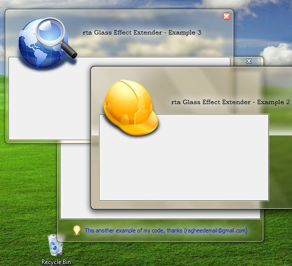
パヤの答えにあるデコレータの実装に問題があったので、ガラス効果を表示する任意のラベルに適用できる、すぐに使用できる完全なスタイルのリソースでデコレータをラップする方法を示します。また、無効にするとラベルを暗くし、配置や境界線などを保持します。

<Style x:Key="GlassLabelStyle" TargetType="{x:Type Label}">
    <Setter Property="Template">
        <Setter.Value>
            <ControlTemplate TargetType="{x:Type Label}">
                <Border BorderBrush="{TemplateBinding BorderBrush}" 
                BorderThickness="{TemplateBinding BorderThickness}" 
                Background="{TemplateBinding Background}" 
                Padding="{TemplateBinding Padding}" SnapsToDevicePixels="True">
                    <Grid>
                        <Decorator>
                            <Decorator.Effect>
                                <DropShadowEffect BlurRadius="7" Color="White" ShadowDepth="0" />
                            </Decorator.Effect>
                            <Decorator>
                                <Decorator.Effect>
                                    <DropShadowEffect BlurRadius="7" Color="White" ShadowDepth="0" />
                                </Decorator.Effect>
                                <Decorator>
                                    <Decorator.Effect>
                                        <DropShadowEffect BlurRadius="7" Color="White" ShadowDepth="0" />
                                    </Decorator.Effect>
                                    <ContentPresenter ContentTemplate="{TemplateBinding ContentTemplate}" 
                    Content="{TemplateBinding Content}" ContentStringFormat="{TemplateBinding ContentStringFormat}" 
                    HorizontalAlignment="{TemplateBinding HorizontalContentAlignment}" RecognizesAccessKey="True" 
                    SnapsToDevicePixels="{TemplateBinding SnapsToDevicePixels}" 
                    VerticalAlignment="{TemplateBinding VerticalContentAlignment}">
                                    </ContentPresenter>
                                </Decorator>
                            </Decorator>
                        </Decorator>
                    </Grid>
                </Border>
                <ControlTemplate.Triggers>
                    <Trigger Property="IsEnabled" Value="False">
                        <Setter Property="Foreground" Value="{DynamicResource {x:Static SystemColors.GrayTextBrushKey}}"/>
                        <Setter Property="Opacity" Value="0.5"/>
                    </Trigger>
                </ControlTemplate.Triggers>
            </ControlTemplate>
        </Setter.Value>
    </Setter>
</Style>

スタイルがウィンドウまたはアプリリソースにある場合は、次のように適用できます。

<Label Style="{StaticResource GlassLabelStyle}"

また、TextBoxでも問題が発生しました。この問題では、コントロールが無効になっていると背景色を変更できないため(白に戻り続けるだけです)、テンプレート全体を上書きする必要があることがわかりました。(https://stackoverflow.com/a/3752517/88409)を参照してください。これがすぐに使えるスタイルで、無効にするとテキストボックスが半透明になり(ガラスの上で見栄えが良くなります)、有効にすると背景が半透明の白になり、境界線がより目立ちます。

<SolidColorBrush x:Key="DisabledBackgroundBrush" Color="#01000000" />
<SolidColorBrush x:Key="DisabledBorderBrush" Color="#40000000" />
<SolidColorBrush x:Key="DisabledForegroundBrush" Color="#88ffffff" />

<Style x:Key="TextBoxStyle" TargetType="{x:Type TextBox}">
    <Setter Property="Background" Value="#88ffffff"/>
    <Setter Property="BorderBrush" Value="Black"/>
    <Setter Property="Template">
        <Setter.Value>
            <ControlTemplate TargetType="TextBox">
                <Border Name="Bd" BorderThickness="{TemplateBinding BorderThickness}" 
                                    BorderBrush="{TemplateBinding BorderBrush}" 
                                    Background="{TemplateBinding Background}" 
                                    SnapsToDevicePixels="true">
                    <ScrollViewer Name="PART_ContentHost" Background="{TemplateBinding Background}" 
                                SnapsToDevicePixels="{TemplateBinding SnapsToDevicePixels}" />
                </Border>
                <ControlTemplate.Triggers>
                    <Trigger Property="IsEnabled" Value="False">
                        <Setter Value="{StaticResource DisabledBackgroundBrush}" Property="Background" />
                        <Setter Value="{StaticResource DisabledBorderBrush}" Property="BorderBrush"/>
                        <Setter Value="{StaticResource DisabledForegroundBrush}" Property="Foreground" />
                        <Setter TargetName="PART_ContentHost" Property="Background" Value="{StaticResource DisabledBackgroundBrush}"/>
                        <Setter TargetName="PART_ContentHost" Property="BorderBrush" Value="{StaticResource DisabledBackgroundBrush}"/>
                    </Trigger>
                </ControlTemplate.Triggers>
            </ControlTemplate>
        </Setter.Value>
    </Setter>
</Style>
于 2014-02-13T23:09:40.567 に答える