15

4つのメディアクエリがあります。1、3、4番目の作品ですが、2番目の作品は活性化していないようです。

480x720(2番目のメディアクエリ)がデフォルトで最初のメディアクエリになっているのはなぜですか?

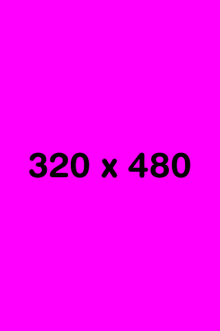
@media screen and (max-width: 320px) and (orientation: portrait) { body{background:#F0F;} }
@media screen and (min-width: 321px) and (max-width: 480px) and (orientation: portrait) { body{background:#F00;} }
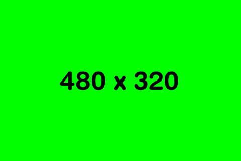
@media screen and (max-width: 480px) and (orientation: landscape) { body{background:#0F0;} }
@media screen and (min-width: 481px) and (max-width: 800px) and (orientation: landscape) { body{background:#FF0;} }

期待されること:

最初のメディアクエリCSS出力 2番目のメディアクエリCSS出力 3番目のメディアクエリCSS出力 4番目のメディアクエリCSS出力

実際に何が起こっているのか:

2番目のメディアクエリが失敗する 最初のメディアクエリパス 3番目のメディアクエリパス 4番目のメディアクエリパス

480x720(2番目のメディアクエリ)がデフォルトで最初のメディアクエリになっているのはなぜですか?

4

7 に答える 7

25

I am a newbie on android and CSS.

I resolved the android not giving they real size with one line in the header of my index.html file:

<meta name="viewport" content="width=device-width" />

From then on, my CSS files did what I expected!

于 2012-12-19T21:18:42.957 に答える
13

だから私はたくさんの研究をした後、私はこの結論に達しました、彼らが480px x 720px(800pxまたは854px)であると言うAndroid携帯電話は実際にはそうではありません、彼らは要素をより大きく見せるために高い画面密度を使用するので実際には320pxxXXXで動作します、ただし、必要に応じて、ユーザーは解像度を低いスペックに変更できます。メディアクエリが機能しなかった理由は、サイズが問題のデバイスに関連していなかったためです。

SDKを使用している場合は、画面密度を160に変更して、幅480ピクセルに対応しました。

そして、SDKと2xハンドセットでこれをテストしたことを確認できます。

注:これは私の個人的な経験であり、他のユーザーとは異なる場合があります

于 2011-05-19T09:12:39.997 に答える
9

私はあなたがのラインに沿ってあなたのメディアクエリでデバイス解像度の検出を行う必要があると思います

@media (-webkit-min-device-pixel-ratio: 1.5),  
       (-o-min-device-pixel-ratio: 3/2),  
       (min--moz-device-pixel-ratio: 1.5),  
       (min-device-pixel-ratio: 1.5) {  
       /* high resolution styles */  
}  

モバイルのベストプラクティスに関するDavidCalhounの優れた記事を確認してください。

于 2011-11-18T04:11:48.430 に答える
8

Androidプラットフォーム用のCordovaアプリケーションで作業しているときに、同じ問題が発生していました。最後の回答のおかげで、メディアクエリとデバイス画面の幅の違いがどこにあるかを調べようとしました。

私は最初に試しました:

@media only screen and (max-device-width: 480px) { ... }

HTCDesireHDのようなデバイスに合わせるために| サムスンギャラクシーS。しかし、サムスンギャラクシーノートのために特定の修正もしなければならなかったので、私は使用しました:

@media only screen and (min-device-width: 481px) { ... }

But those resolutions, as said before, are not really used like that in the web view, the pixel density has the values changed.

So I wanted to know how many pixels in width were recognized in both DHD and SGS, and then in SGN :

window.innerWidth

For the 480px width phones, I had actually 320px recognized. For the 800px Galaxy Note, I only had 500px recognized. When I saw that, I adjusted my media queries and it worked.

于 2012-10-12T08:22:38.757 に答える
2

here are a few things I have found in my experience and it may be due to the higher resolution detection. My favorite test phone is 320px(max-device-width) X 480px(max-device-width) in portrait view. But depending on which mobile browser I use the max-width can be up to 850px!! Opera mobile uses 850px as its default max-width, even though its on a device of max-device-width 320px. Better yet; the built in Andriod browser on this device has a default max-width of 550px. Dolphin defaults to the same max-width, 550px. I don't usually test on FireFox mobile but since it is a gecko based browser like Opera, I wouldn't be surprised if it falls into the 850px range. Does anybody know or tested it?

i typically use a 3 condition media query when addressing 320 X 480 devices.

@media all and (max-width:850px) and (max-width:550px) and (max-device-width:320px) {..}

also i usually place this meta tag in my header on the main pageenter code here

<meta name="viewport" content="width=device-width, initial-scale=1.0" />

The following didnt seem to help me, that's when I did some more research and figured out the info above. <meta name="viewport" content="width=device-width" /> Hope it helps someone else.

于 2013-02-20T18:30:02.883 に答える
1

Since cell phones are an ever-growing black hole of resolution confusion, you need to tell them to identify themselves. You also need to set the scaling to 1 and take away user scaling. When I put this in my code, it does the trick for me.

このスニペットをHTMLの先頭の<meta character...>タグの下の行に挿入します。

<!-- Check Device Width so Media Queries will work -->
<meta name="viewport" content="width=device-width, initial-scale=1.0, maximum-scale=1.0, user-scalable=no" />
于 2015-09-07T17:54:18.730 に答える
0
  1. Convert all px values to em values by dividing them by 16 (so 16px will become 1 em). This makes sure, that sized have the correct proportion regardless on which font is used.
  2. Add to your meta viewport: target-densitydpi=medium-dpi. This makes sure, that the em- sizes behave equally on all (most?) devices
于 2014-06-16T14:27:04.370 に答える