ページの隅を下に折りたたんだかのように、div の左上隅を「カット」しようとしています。
純粋なCSSでやりたいのですが、方法はありますか?
親要素の背景が無地の場合、疑似要素を使用して効果を作成できます。
div {
    height: 300px;
    background: red;
    position: relative;
}

div:before {
    content: '';
    position: absolute;
    top: 0; right: 0;
    border-top: 80px solid white;
    border-left: 80px solid red;
    width: 0;
}<div></div>PS 今後border-corner-shapeはまさにあなたが探しているものです。残念なことに、仕様から外れて、実際のブラウザーに組み込まれることはありません :(
透明なカット アウト エッジが必要な場合は、回転した疑似要素を の背景として使用し、divそれを配置して目的のコーナーを切り取ることができます。
body {
background: url(http://i.imgur.com/k8BtMvj.jpg);
background-size: cover;
}
div {
position: relative;
width: 50%;
margin: 0 auto;
overflow: hidden;
padding: 20px;
text-align: center;
}
div:after {
content: '';
position: absolute;
width: 1100%; height: 1100%;
top: 20px; right: -500%;
background: rgba(255,255,255,.8);
transform-origin: 54% 0;
transform: rotate(45deg);
z-index: -1;
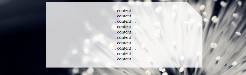
}<div>
... content ...<br/>... content ...<br/>... content ...<br/>... content ...<br/>... content ...<br/>... content ...<br/>... content ...<br/>... content ...<br/>... content ...<br/>... content ...<br/>
</div>このソリューションは変換を使用するため、必要なベンダー プレフィックスを追加する必要があることに注意してください。詳細については、canIuseを参照してください。
右下のエッジを切り取るには、疑似要素の top、transform、および transform-origin プロパティを次のように変更できます。
body {
  background: url(http://i.imgur.com/k8BtMvj.jpg);
  background-size: cover;
}
div {
  position: relative;
  width: 50%;
  margin: 0 auto;
  overflow: hidden;
  padding: 20px;
  text-align: center;
}
div:after {
  content: '';
  position: absolute;
  width: 1100%; height: 1100%;
  bottom: 20px; right: -500%;
  background: rgba(255,255,255,.8);
  transform-origin: 54% 100%;
  transform: rotate(-45deg);
  z-index: -1;
}
<div>
... content ...<br/>... content ...<br/>... content ...<br/>... content ...<br/>... content ...<br/>... content ...<br/>... content ...<br/>... content ...<br/>... content ...<br/>... content ...<br/>
</div>クリップパスを使用することは、新しい、有望な代替手段です。ますますサポートされ始めており、現在では十分に文書化されています。SVG を使用して形状を作成するため、箱から出してすぐに反応します。
div {
  width: 200px;
  min-height: 200px;
  -webkit-clip-path: polygon(0 0, 0 100%, 100% 100%, 100% 25%, 75% 0);
  clip-path: polygon(0 0, 0 100%, 100% 100%, 100% 25%, 75% 0);
  background: lightblue;
}
<div>
<p>Some Text</p>
</div>web-tiki の変換の答えに代わるものがあります。
body {
  background: lightgreen;
}
div {
  width: 200px;
  height: 200px;
  background: transparent;
  position: relative;
  overflow: hidden;
}
div.bg {
  width: 200%;
  height: 200%;
  background: lightblue;
  position: absolute;
  top: 0;
  left: -75%;
  transform-origin: 50% 50%;
  transform: rotate(45deg);
  z-index: -1;
}
<div>
<div class="bg"></div>
<p>Some Text</p>
</div>transform: skew(45deg)CSSを使用してカット コーナー効果を生成する別の方法を次に示します。形状自体には、次のように 3 つの要素 (1 つの実要素と 2 つの疑似要素) が含まれます。
div要素にはoverflow: hidden左の境界線があり、生成されます。:before高さの 20% であり、傾斜変換が適用されている疑似要素。この要素は、上部に境界線、右側にカット (斜め) 境界線を生成します。:after高さ (基本的には残りの高さ) の 80% であり、右の境界線の残りの部分である下の境界線を生成する疑似要素。生成される出力はレスポンシブで、上部に透明なカットが生成され、透明な背景がサポートされます。
div {
  position: relative;
  height: 100px;
  width: 200px;
  border-left: 2px solid beige;
  overflow: hidden;
}
div:after,
div:before {
  position: absolute;
  content: '';
  width: calc(100% - 2px);
  left: 0px;
  z-index: -1;
}
div:before {
  height: 20%;
  top: 0px;
  border: 2px solid beige;
  border-width: 2px 3px 0px 0px;
  transform: skew(45deg);
  transform-origin: right bottom;
}
div:after {
  height: calc(80% - 4px);
  bottom: 0px;
  border: 2px solid beige;
  border-width: 0px 2px 2px 0px;
}
.filled:before, .filled:after {
  background-color: beige;
}

/* Just for demo */

div {
  float: left;
  color: beige;
  padding: 10px;
  transition: all 1s;
  margin: 10px;
}
div:hover {
  height: 200px;
  width: 300px;
}
div.filled{
  color: black;
}
body{
 background-image: radial-gradient(circle, #3F9CBA 0%, #153346 100%);
}
<div class="cut-corner">Some content</div>
<div class="cut-corner filled">Some content</div>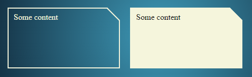
linear-gradient以下は、背景画像を使用してカット コーナー効果を生成する別の方法です。3 つのグラデーション イメージ (以下に示す) の組み合わせが使用されます。
生成される出力はレスポンシブで、透明なカットを生成し、余分な要素 (リアルまたは疑似) を必要としません。欠点は、このアプローチが機能するのは、背景 (塗りつぶし) が単色であり、境界線を作成するのが非常に難しい場合のみです (ただし、スニペットに見られるように、まだ可能です)。
.cut-corner {
  height: 100px;
  width: 200px;
  background-image: linear-gradient(to bottom left, transparent 50%, beige 50%), linear-gradient(beige, beige), linear-gradient(beige, beige);
  background-size: 25px 25px, 100% 100%, 100% 100%;
  background-position: 100% 0%, -25px 0%, 100% 25px;
  background-repeat: no-repeat;
}
.filled {
  background-image: linear-gradient(black, black), linear-gradient(black, black), linear-gradient(black, black), linear-gradient(black, black), linear-gradient(to bottom left, transparent calc(50% - 1px), black calc(50% - 1px), black calc(50% + 1px), beige calc(50% + 1px)), linear-gradient(beige, beige), linear-gradient(beige, beige);
  background-size: 2px 100%, 2px 100%, 100% 2px, 100% 2px, 25px 25px, 100% 100%, 100% 100%;
  background-position: 0% 0%, 100% 25px, -25px 0%, 0px 100%, 100% 0%, -25px 0%, 100% 25px;
}

/* Just for demo */

*{
  box-sizing: border-box;
  }
div {
  float: left;
  color: black;
  padding: 10px;
  transition: all 1s;
  margin: 10px;
}
div:hover {
  height: 200px;
  width: 300px;
}
body{
 background-image: radial-gradient(circle, #3F9CBA 0%, #153346 100%);
}
<div class="cut-corner">Some content</div>
<div class="cut-corner filled">Some content</div>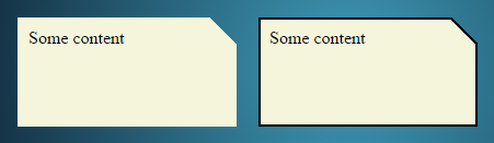
を使用できますlinear-gradient。親に背景画像があり、その上に灰色の背景と犬の耳のような左隅で座るdiv必要があるとしましょう。div次のようなことができます。
.parent-div { background: url('/image.jpg'); }
.child-div {
   background: #333;
   background: linear-gradient(135deg, transparent 30px, #333 0);
}
参考文献:
このコードでは、長方形の各辺の角を切り取ることができます。
div {
  display:block;
  height: 300px;
  width: 200px;
  background: url('http://lorempixel.com/180/290/') no-repeat;
  background-size:cover;

  -webkit-clip-path: polygon(10px 0%, calc(100% - 10px) 0%, 100% 10px, 100% calc(100% - 10px), calc(100% - 10px) 100%, 10px 100%, 0% calc(100% - 10px), 0% 10px);
  clip-path: polygon(10px 0%, calc(100% - 10px) 0%, 100% 10px, 100% calc(100% - 10px), calc(100% - 10px) 100%, 10px 100%, 0% calc(100% - 10px), 0% 10px);
}
http://jsfiddle.net/2bZAW/5552/
切り取った要素の背景色が異なるという問題がありました。そして、右上隅と左下隅だけが必要でした。
body {
background-color: rgba(0,0,0,0.3)
}
.box {
position: relative;
display: block;
background: blue;
text-align: center;
color: white;
padding: 15px;
margin: 50px;
}
.box:before,
.box:after {
content: "";
position: absolute;
left: 0;
right: 0;
bottom: 100%;
border-bottom: 15px solid blue;
border-left: 15px solid transparent;
border-right: 15px solid transparent;
}
.box:before{
border-left: 15px solid blue;
}
.box:after{
border-right: 15px solid blue;
}
.box:after {
bottom: auto;
top: 100%;
border-bottom: none;
border-top: 15px solid blue;
}
/* Active box */
.box.active{
background: white;
color: black;
}
.active:before,
.active:after {
border-bottom: 15px solid white;
}
.active:before{
border-left: 15px solid white;
}
.active:after{
border-right: 15px solid white;
}
.active:after {
border-bottom: none;
border-top: 15px solid white;
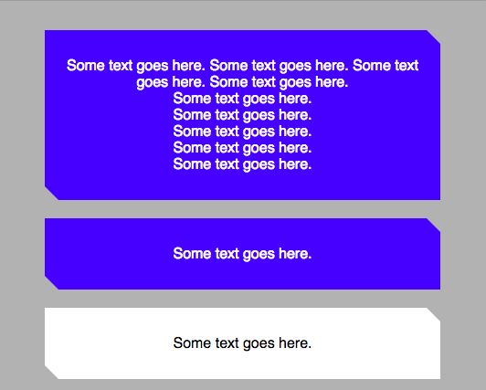
}<div class="box">
Some text goes here. Some text goes here. Some text goes here. Some text goes here.<br/>Some text goes here.<br/>Some text goes here.<br/>Some text goes here.<br/>Some text goes here.<br/>Some text goes here.<br/>
</div>
<div class="box">
Some text goes here.
</div>
<div class="box active">
Some text goes here.
<span class="border-bottom"></span>
</div>
<div class="box">
Some text goes here.
</div>ジョセフのコードを少し編集すると、要素は無地の背景を必要としません。
div {
    height: 300px;
    background: url('http://images2.layoutsparks.com/1/190037/serene-nature-scenery-blue.jpg');
    position: relative;
}

div:before {
    content: '';
    position: absolute;
    top: 0; right: 0;
    border-top: 80px solid white;
    border-left: 80px solid rgba(0,0,0,0);
    width: 0;
}
http://jsfiddle.net/2bZAW/1921/
この「rgba(0,0,0,0)」の使用により、内側の「コーナー」を非表示にすることができます。
4 番目のパラメーター 'a' ( 0 < a < 1 ) を編集して、より多くの '角を折り曲げた' 効果の影を作成することもできます。
http://jsfiddle.net/2bZAW/1922/ (影付き)
注: RGBA カラー値は、IE9 以降、Firefox 3 以降、Chrome、Safari、Opera 10 以降でサポートされています。
Joshep のコードを少し変更することで...必要に応じて、右隅が折りたたまれたように見えるこのコードを使用できます。
div {
    height: 300px;
    background: red;
    position: relative;
}

div:before {
    content: '';
    position: absolute;
    top: 0; right: 0;
    border-top: 80px solid white;
    border-left: 80px solid blue;
    width: 0;
}