CSSだけで中空円を切り取ることはできますか?
これは私たち全員ができることです:
しかし、私たちはこれを行うことができますか?
円は中空で透明でなければなりません。したがって、問題は、塗りつぶされたカラー サークルをdiv.
CSSだけで中空円を切り取ることはできますか?
これは私たち全員ができることです:
しかし、私たちはこれを行うことができますか?
円は中空で透明でなければなりません。したがって、問題は、塗りつぶされたカラー サークルをdiv.
2 つの異なるテクニックを使用して、透明なカットアウト サークルを作成できます。
次の例では、インライン svgを使用しています。最初のスニペットはmask 要素を使用して透明な円を切り取っており、2 番目の中空の円はpath 要素で作成されています。円は 2 つの円弧コマンドで作成されます。
mask 要素を使用:
body{background:url('https://farm9.staticflickr.com/8760/17195790401_ceeeafcddb_o.jpg');background-size:cover;}<svg viewbox="0 0 100 50" width="100%">
<defs>
<mask id="mask" x="0" y="0" width="80" height="30">
<rect x="5" y="5" width="90" height="40" fill="#fff"/>
<circle cx="50" cy="25" r="15" />
</mask>
</defs>
<rect x="0" y="0" width="100" height="50" mask="url(#mask)" fill-opacity="0.7"/>
</svg>パス要素が 1 つの場合:
body{background: url('https://farm9.staticflickr.com/8760/17195790401_ceeeafcddb_o.jpg');background-size:cover;}
svg{
  display:block;
  width:70%;
  height:auto;
  margin:0 auto;
}
path{
  transition:fill .5s;
  fill:#E3DFD2;
}
path:hover{
  fill:pink;
}
<svg viewbox="-10 -1 30 12">
<path d="M-10 -1 H30 V12 H-10z M 5 5 m -5, 0 a 5,5 0 1,0 10,0 a 5,5 0 1,0 -10,0z"/>
</svg>この場合に SVG を使用する主な利点は次のとおりです。
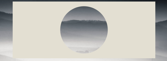
でdivを作成し、overflow:hidden;その中にborder-radiusで丸い疑似要素を作成します。巨大なボックス シャドウと背景なしを指定します。
div{
    position:relative;
    width:500px; height:200px;
    margin:0 auto;
    overflow:hidden;
}
div:after{
    content:'';
    position:absolute;
    left:175px; top:25px;
    border-radius:100%;
    width:150px; height:150px;
    box-shadow: 0px 0px 0px 2000px #E3DFD2;
}

body{background: url('https://farm9.staticflickr.com/8760/17195790401_ceeeafcddb_o.jpg');background-size:cover;}<div></div>ボックス シャドウのブラウザ サポートは IE9+です canIuseを参照してください
同じアプローチは、ボックス シャドウの代わりに境界線を使用することです。IE8 のようなボックス シャドウをサポートしていないブラウザをサポートする必要がある場合は興味深いことです。手法は同じですが、円を div の中心に保つために、上と左の値で補正する必要があります。
body{
    background: url('https://farm9.staticflickr.com/8760/17195790401_ceeeafcddb_o.jpg');
    background-size:cover;
}
div{
    position:relative;
    width:500px; height:200px;
    margin:0 auto;
    overflow:hidden;
}
div:after{
    content:'';
    position:absolute;
    left:-325px; top:-475px;
    border-radius:100%;
    width:150px; height:150px;
    border:500px solid #E3DFD2;
}<div></div>これは、放射状グラデーションの背景とポインターイベントを使用して実行できます (テキスト選択など、円レイヤーを介して背後でマウス操作を可能にするため)。デモページとスクリーンショットは次のとおりです。
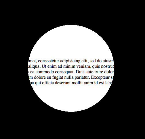
そして、これはそのためのコードです:
<!DOCTYPE html>

<html>
<head>
<meta charset="UTF-8">
<style type="text/css" media="screen">
body {
  margin: 0;
  padding: 0;
}

.underneath {
  padding: 0;
  margin: 265px 0 0 0;
  width: 600px;
}

.overlay {
  top: 0;
  left: 0;
  position: absolute;
  width: 600px;
  height: 600px;
  background: -moz-radial-gradient(transparent 150px, rgba(0,0,0,1) 150px);
  background: -webkit-radial-gradient(transparent 150px, rgba(0,0,0,1) 150px);
  background: -ms-radial-gradient(transparent 150px, rgba(0,0,0,1) 150px);
  background: -o-radial-gradient(transparent 150px, rgba(0,0,0,1) 150px);
  pointer-events: none; /* send mouse events beneath this layer */
}
</style>
</head>
<body>

<p class="underneath">
  Lorem ipsum dolor sit amet, consectetur adipisicing elit, sed do eiusmod tempor
  incididunt ut labore et dolore magna aliqua. Ut enim ad minim veniam, quis
  nostrud exercitation ullamco laboris nisi ut aliquip ex ea commodo consequat.
  Duis aute irure dolor in reprehenderit in voluptate velit esse cillum dolore
  eu fugiat nulla pariatur. Excepteur sint occaecat cupidatat non proident, sunt
  in culpa qui officia deserunt mollit anim id est laborum.
</p>

<div class="overlay"></div>

</body>
</html>
web-tiki の回答を参照して、いつでも div を中央に配置できることを追加しtranslate(-50%,-50%)たいので、borderブラウザのサポートが優れている - プロパティを使用しても問題ありません。
div{
    position:relative;
    width:500px;
    height:200px;
    margin:0 auto;
    overflow:hidden;
}
div:after{
    content:'';
    position:absolute;
    left:50%;
    top: 50%;
    transform: translate(-50%,-50%);
    border-radius:50%;
    width:150px; height:150px;
    border: 1000px solid rebeccapurple;
}

body{background: url('https://farm9.staticflickr.com/8760/17195790401_ceeeafcddb_o.jpg');background-size:cover;}<div></div>このテクニックを使えば、本当にクリエイティブになれます。
document.addEventListener( "DOMContentLoaded", function(){
	setInterval(function(){
		if(document.getElementById("moving").style.height === "500px"){
			document.getElementById("moving").style.height = "0px";
		} else {
			document.getElementById("moving").style.height = "500px";
		}
	}, 2000);
});
#container {
width: 500px;
margin: 0 auto;
border: 1px solid black;
overflow:hidden;
position: relative;
}
#circle{
position:relative;
height:150px;
margin:0 auto;
clear:left;
overflow:hidden;
}
#circle::before, #circle::after {
content:'';
border-radius:50%;
position: absolute;
left: 50%;
top: 50%;
transform: translate(-50%,-50%);
}
#circle::before {
height: 140px;
width: 140px;
background: rebeccapurple;
}
#circle::after{
width:150px;
height:150px;
border: 2000px solid rebeccapurple;
}
#line {
margin: 0 auto;
width: 6px;
height: 200px;
position: relative;
}
#line::before, #line::after {
content: " ";
background-color: rebeccapurple;
height: 200px;
width:2000px;
position:absolute;
}
#line::before {
right: 100%;
}
#line::after {
left: 100%;
}
#moving {
height: 0px;
width: 100%;
background: blue;
transition: 2s height;
position: absolute;
top: 0px;
z-index: -1;
}
body{
background: url('https://farm9.staticflickr.com/8760/17195790401_ceeeafcddb_o.jpg');background-size:cover;
}<div id="container">
<div id="circle"></div>
<div id="line"></div>
<div id="circle"></div>
<div id="moving"></div>
</div>css マスクと追加の svg 画像を使用して実行できます。
ブラウザのサポートは弱いですが

body {
  background: url(https://data.whicdn.com/images/50959200/original.jpg);
  background-size: cover;
  background-position: center;
}

.circle {
  width: 150px;
  height: 150px;
  background: black;
  border-radius: 50%;
  -webkit-mask: url(https://svgshare.com/i/GLf.svg);
  -webkit-mask-size: 125%; /* change it */
  -webkit-mask-position: center;
  margin: 20px auto;
}
<div class="circle"></div>