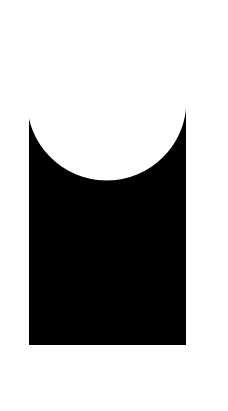
CSS3だけで半円の透明な切り抜きを作りたいです。唯一の要件は、形状を形成するすべての要素が黒または透明でなければならないことです。
半円は透明で背景が透けて見えるようにする必要があるため、その上に白い円がある黒い長方形は使用できません。
希望の形状 :
CSS3だけで半円の透明な切り抜きを作りたいです。唯一の要件は、形状を形成するすべての要素が黒または透明でなければならないことです。
半円は透明で背景が透けて見えるようにする必要があるため、その上に白い円がある黒い長方形は使用できません。
希望の形状 :
CSS :after次のような疑似プロパティを使用して実行できる場合があります。
body {
  background: green;
}

.rect {
  height: 100px;
  width: 100px;
  background: rgba(0, 0, 0, 0.5);
  position: relative;
  margin-top: 100px;
  margin-left: 100px;
}

.circle {
  display: block;
  width: 100px;
  height: 50px;
  top: -50px;
  left: 0;
  overflow: hidden;
  position: absolute;
}

.circle:after {
  content: '';
  width: 100px;
  height: 100px;
  -moz-border-radius: 100px;
  -webkit-border-radius: 100px;
  border-radius: 100px;
  background: rgba(0, 0, 0, 0);
  position: absolute;
  top: -100px;
  left: -40px;
  border: 40px solid rgba(0, 0, 0, 0.5);
}
<div class="rect"> <span class="circle"></span></div>ボックス シャドウを使用して、透明な切り抜き円を作成できます。
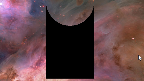
body {
  background: url(http://i.imgur.com/qi5FGET.jpg) no-repeat;
  background-size: cover;
}
div {
  display: inline-block;
  width: 300px; height: 300px;
  position: relative;
  overflow: hidden;
}
div:before {
  content: '';
  position: absolute;
  bottom: 50%;
  width: 100%; height: 100%;
  border-radius: 100%;
  box-shadow: 0px 300px 0px 300px #000;
}
.transparent {
  opacity: 0.5;
}
<div></div>
<div class="transparent"></div>
これは、パーセンテージの長さで応答できます。
body {
  background: url(http://lorempixel.com/output/people-q-c-640-480-1.jpg) no-repeat;
  background-size: cover;
}
div {
  width: 40%; height: 300px;
  position: relative;
  overflow: hidden;
}
div:before {
  content: '';
  position: absolute;
  bottom: 50%;
  width: 100%; height: 100%;
  border-radius: 100%;
  box-shadow: 0px 300px 0px 300px #000;
}
.transparent {
  opacity: 0.5;
}
<div class="transparent"></div>SVG の使用:
SVG を使用した代替ソリューションを次に示します (ただし、タグ付けしていません)。SVG を使用する利点は次のとおりです。
SVG は <= IE8 ではサポートされていませんが、box-shadow はサポートされていますが、フォールバックを提供できます。
svg {
  height: 150px;
  width: 150px;
}
polygon {
  fill: black;
}

/* Just for demo */

body {
  background-image: radial-gradient(circle, #3F9CBA 0%, #153346 100%);
}
<!-- Sample 1 - Using Clip Path -->
<svg viewBox='0 0 100 100' preserveAspectRatio='none'>
<defs>
<clipPath id='clipper'>
<path d='M0,0 a50,50 0 1,0 100,0 l 0,100 -100,0' />
</clipPath>
</defs>
<polygon points='0,0 100,0 100,100 0,100' clip-path='url(#clipper)' />
</svg>
<!-- Sample 2 - Using Path -->
<svg viewBox='0 0 100 100' preserveAspectRatio='none'>
<pattern id='bg' width='100' height='100' patternUnits='userSpaceOnUse'>
<image xlink:href='http://lorempixel.com/100/100/nature/1' height='100' width='100' />
</pattern>
<path d='M0,0 a50,50 0 1,0 100,0 l 0,100 -100,0 0,-100' fill='url(#bg)' />
</svg>CSS の使用:
CSS にもclip-path仕様があり、以下のスニペットのようなものを試すことができます。
.shape {
  position: relative;
  width: 100px;
  height: 100px;
  background-color: purple;
}
.shape:after {
  position: absolute;
  content: '';
  top: 0px;
  left: 0px;
  height: 100%;
  width: 100%;
  background: white;
  -webkit-clip-path: ellipse(50% 20% at 50% 0%);
  clip-path: ellipse(50% 20% at 50% 5%);
}

.shape.image{
  background: url(http://lorempixel.com/100/100);
}

#shape-2 {
  width: 100px;
  height: 100px;
  background-color: purple;
  -webkit-clip-path: ellipse(50% 20% at 50% 20%);
  clip-path: ellipse(50% 20% at 50% 20%);
}

/* Just for demo */

.shape{
  float: left;
  margin: 20px;
}
#shape-2 {
  margin: 150px 20px 0px;
}
<div class="shape"></div>
<div class="shape image"></div>
<br/>
<div id="shape-2"></div>しかし、SVG クリップ パスとは異なり、純粋な CSS バージョン (つまり、インラインまたは外部 SVG を使用しない) は、path. 形状のみをサポートするため、この場合、clip-path親で を直接使用すると、楕円が生成されます (スニペットに示されているように)。これを克服するには、クリップ パスを子 (または疑似要素) に配置する必要があります。これは、クリップされた領域が透明ではないことを意味します。
キャンバスの使用:
キャンバスでも同じことができます。キャンバス コマンドは SVG とよく似ており、その利点もよく似ています。ただし、Canvas はラスター ベースであるため、SVG ほどスケーリングしません。
window.onload = function() {
  /* Canvas example with path */
  var canvas = document.getElementById('canvas');
  if (canvas.getContext) {
    var ctx = canvas.getContext('2d');
    var img = new Image();
    img.src = 'http://lorempixel.com/150/300';
    ctx.beginPath();
    ctx.moveTo(110, 0);
    ctx.arc(60, 0, 50, 0, 3.14, false);
    ctx.lineTo(10, 145);
    ctx.lineTo(110, 145);
    ctx.closePath();
    ctx.fill();
    /* Use below for using image as a fill */
    /*img.onload = function(){
        var ptrn = ctx.createPattern(img,'no-repeat');
        ctx.fillStyle = ptrn;
        ctx.fill();
    }*/
  }

  /* Canvas example with clip path */
  var canvasClip = document.getElementById('canvas-clip');
  if (canvasClip.getContext) {
    var ctxClip = canvasClip.getContext('2d');
    ctxClip.beginPath();
    ctxClip.moveTo(10, 145);
    ctxClip.lineTo(10, 0);
    ctxClip.arc(60, 0, 50, 0, Math.PI * 2, true);
    ctxClip.lineTo(110, 145);
    ctxClip.lineTo(10, 145);
    ctxClip.clip();
    ctxClip.fillStyle = 'tomato';
    ctxClip.fill();
  }
}
canvas {
height: 150px;
width: 300px;
}
/* Just for demo */
body {
background-image: radial-gradient(circle, #3F9CBA 0%, #153346 100%);
}<canvas id='canvas'></canvas>
<canvas id='canvas-clip'></canvas>マスクの使用:
この形状は、CSS (または) SVG マスクを使用して作成することもできます。CSS マスクのサポートは非常に貧弱で、現在 Webkit を利用したブラウザーでのみ機能しますが、SVG マスクはサポートがはるかに優れており、IE9+ で機能するはずです。
/* CSS Mask */

.shape {
  width: 150px;
  height: 150px;
  background-color: black;
  -webkit-mask-image: radial-gradient(circle closest-corner at 50% 0%, transparent 98%, white 99%);
  mask-image: radial-gradient(circle closest-corner at 50% 0%, transparent 98%, white 99%);
}

/* End of CSS Mask */

svg {
  height: 150px;
  width: 150px;
}
polygon#shape {
  fill: black;
  mask: url(#masker);
}
/* Just for demo */

body {
  background-image: radial-gradient(circle, #3F9CBA 0%, #153346 100%);
}
<!-- CSS Mask -->
<div class='shape'></div>
<!-- SVG Mask -->
<svg viewBox='0 0 100 100' preserveAspectRatio='none'>
<defs>
<mask id='masker' x='0' y='0' width='100' height='100'>
<polygon points='0,0 100,0 100,100 0,100' fill='#fff' />
<circle r='50' cx='50' cy='0' fill='#000' />
</mask>
</defs>
<polygon points='0,0 100,0 100,100 0,100' id='shape' />
</svg>放射状グラデーションを使用すると、非常に簡単に実行できます。
結果:
HTML :
<div class='shape'></div>
関連するCSS :
.shape {
  margin: 0 auto;
  width: 10em; height: 16em;
  /* WebKit browsers, old syntax */
  background: -webkit-radial-gradient(50% 0, circle, transparent 30%, black 30%);

  /* IE10, current versions of Firefox and Opera */
  background: radial-gradient(circle at 50% 0, transparent 30%, black 30%);
}
互換性の詳細については、 http://caniuse.com/#feat=css-gradientsを参照してください。
カイルセブノークスはいくつかの良い仕事をしました。そして、私はそれを基に構築しました。http://jsfiddle.net/FcaVX/1/をチェックしてください
基本的に、円の白いdivを折りたたんで、白い境界線を付けました。OPの質問では、形状を構成する色の要素について話しました。その国境については何もありませんよね?
レスポンシブ画像の下部にのみ角を丸くする必要がありました。@sandeep fiddle から始めて、自分のニーズに合わせて改善しました。
            .rect
            {
                height: 85vh;
                    position: relative;
                background-color: red;
                width: 60vw;
            }

            .circle-helper{
                display: block;
                width: 100%;
                padding-bottom: 50%;
                bottom: 0;
                left: 0;
                overflow: hidden;
                position: absolute;
                background-color: transparent;

                    }
            .circle{
                display: block;
                width: 100%;
                padding-bottom: 100%;
                // height: 500px;
                bottom: 0;
                left: 0;
                overflow: hidden;
                position: absolute;
                background-color: transparent;
            }

            .circle:after{
                box-sizing: content-box;
                content: '';
                width: 100%;
                height: 100%;
                -moz-border-radius: 50%;
                -webkit-border-radius: 50%;
                border-radius: 50%;
                background: rgba(0,0,0,0);
                position: absolute;
                transform: translate(-50%, -50%);
                top: 50%;
                left: 50%;
                border: 300px solid blue;
                }
                top: 50%
                left: 50%
                border: 300px solid blue
現在、私が考えることができる唯一の方法は、幅が 1 ピクセルの黒い div をさまざまな高さで並べて使用することです。このように技術的には可能ですが、ひどく眉をひそめるべきです。また; 1x1 ピクセルの div を追加して手動でアンチエイリアシングを行うという問題を解決したい場合を除き、アンチエイリアシングはありません。
これをどのように使用したいかの例を挙げていただければ、より役立つかもしれません。黒/透明のみにする必要があるのはなぜですか? omarello が述べたように、ほとんどの状況での最善の解決策は、おそらく透明な単純な GIF または PNG 画像です。