私の目標は、モバイル (幅 480px 未満) で表示したときに見栄えのするレスポンシブ テーブル デザインを作成することです。
テーブルに次のマークアップがあります。
<table class="table eventlist">
<thead>
<tr>
<th>Date</th>
<th>Time</th>
<th>Duration</th>
<th>Location</th>
<th>Cost</th>
</tr>
</thead>
<tr>
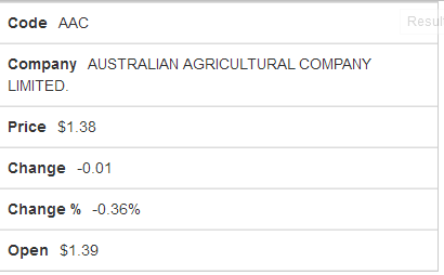
<td data-title="Code">AAC</td>
<td data-title="Company">AUSTRALIAN AGRICULTURAL COMPANY LIMITED.</td>
<td data-title="Price" class="numeric">$1.38</td>
<td data-title="Change" class="numeric">-0.01</td>
<td data-title="Change %" class="numeric">-0.36%</td>
<td data-title="Open" class="numeric">$1.39</td>
</tr>
</table>
そして、次の CSS:
/* Landscape phones and down */
 @media (max-width: 480px) {
    /* Force table to not be like tables anymore */
    table, thead, tbody, th, td, tr {
        display: block;
    }
    /* Hide table headers (but not display: none;, for accessibility) */
    thead tr {
        position: absolute;
        top: -9999px;
        left: -9999px;
        display:none;
    }
    tr {
        border: 1px solid #ccc;
    }
    td {
        /* Behave  like a "row" */
        border: none;
        border-bottom: 1px solid #eee;
        position: relative;
        padding-left: 50%;
        white-space: normal;
        text-align:right;
    }
    td:before {
        padding-right: 10px;
        white-space: nowrap;
        text-align:left;
        font-weight: bold;
    }
    /*
    Label the data
    */
    td:before {
        content: attr(data-title);
    }
}
私のテーブルは次のようになります。
これはユーザーフレンドリーなレスポンシブデザインであると思いますか?
行を編集するにはどうすればよいですか:
    td:before {
        content: attr(data-title);
    }
<th>列の を読み取るように?
これが実際の例です: JS Fiddle