これは Rectangle では不可能です。ただし、Canvasを使用できます。プロセスを説明します。
ステップ 1: 単色
いくつかの「レイヤー」があるため、それらすべてを含むアイテムを作成する必要があります。フラットな色から始めて、Z オーダーに従ってレイヤーを追加します。
import QtQuick 2.3
import QtQuick.Controls 1.2
import QtQuick.Controls.Styles 1.2

ApplicationWindow {
    id: window
    color: "#cccccc"
    width: 200
    height: 200

    Button {
        id: button
        width: Math.min(window.width, window.height) - 20
        height: width * 0.3
        anchors.centerIn: parent
        text: "Button"

        readonly property real radius: height / 5

        style: ButtonStyle {
            background: Item {
                Canvas {
                    anchors.fill: parent

                    onPaint: {
                        var ctx = getContext("2d");
                        ctx.reset();

                        ctx.beginPath();
                        ctx.lineWidth = height * 0.1;
                        ctx.roundedRect(ctx.lineWidth / 2, ctx.lineWidth / 2,
                            width - ctx.lineWidth, height - ctx.lineWidth, button.radius, button.radius);
                        ctx.strokeStyle = "grey";
                        ctx.stroke();
                        ctx.fillStyle = "#00c0f5";
                        ctx.fill();
                    }
                }
            }

            label: Label {
                text: button.text
                color: "white"
                font.pixelSize: button.height * 0.5
                horizontalAlignment: Text.AlignHCenter
                verticalAlignment: Text.AlignVCenter
            }
        }
    }
}
キャンバス アイテムはボタンを埋める必要があるため、 と記述しanchors.fill: parentます。
次に、キャンバスに描画するために使用する 2D コンテキストを取得します。reset()各ペイントの前にキャンバスをクリアするも呼び出します。
ボタンの角は丸くなっているので、読み取り専用radiusプロパティを定義し、目的の値 (この場合はボタンの高さの 20%) に設定します。
次に、 を呼び出しますbeginPath()。これにより、新しいパスが開始され、以前のパスも閉じられます。
ストロークの線幅をボタンの高さの 10% に設定します。
Canvas は内部的にQPainterを使用します。QPainter は、ターゲットの内側を 50%、外側を 50% ストロークします。角の丸い四角形を描画するときは、これを考慮する必要があります。そうしないと、ストロークがキャンバスの外に隠れてしまいます。これを行うには、線幅の半分に等しい余白で四角形を描画します。
角丸四角形のパスが定義されると、ストロークと塗りつぶしが必要なパスが残ります。
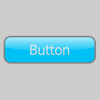
このステップの結果は次のとおりです。

ステップ 2: ラベル
ボタンの輝きの下にテキストを配置したいので、次に定義する必要があります。
import QtQuick 2.3
import QtQuick.Controls 1.2
import QtQuick.Controls.Styles 1.2

ApplicationWindow {
    id: window
    color: "#cccccc"
    width: 200
    height: 200

    Button {
        id: button
        width: Math.min(window.width, window.height) - 20
        height: width * 0.3
        anchors.centerIn: parent
        text: "Button"

        readonly property real radius: height / 5

        style: ButtonStyle {
            background: Item {
                Canvas {
                    anchors.fill: parent

                    onPaint: {
                        var ctx = getContext("2d");
                        ctx.reset();

                        ctx.beginPath();
                        ctx.lineWidth = height * 0.1;
                        ctx.roundedRect(ctx.lineWidth / 2, ctx.lineWidth / 2,
                            width - ctx.lineWidth, height - ctx.lineWidth, button.radius, button.radius);
                        ctx.strokeStyle = "grey";
                        ctx.stroke();
                        ctx.fillStyle = "#00c0f5";
                        ctx.fill();
                    }
                }

                Label {
                    text: button.text
                    color: "white"
                    font.pixelSize: button.height * 0.5
                    anchors.centerIn: parent
                }
            }

            label: null
        }
    }
}
labelスタイルのコンポーネントが に設定されていることに注意してくださいnull。これは、テキストを他のすべての上に配置したくないためです。コンポーネントがあればButtonStyle、foregroundこれは必要ありません。代わりに、Label アイテムを の子として追加しbackgroundます。
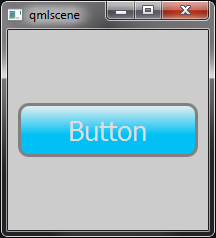
このコードの視覚的な結果は、前の手順と同じです。
ステップ 3: シャイン効果
キャンバスは、線形、放射状、および円錐状のグラデーションを描画できます。線形グラデーションを使用して、ボタンに「輝き」効果を描画します。
import QtQuick 2.3
import QtQuick.Controls 1.2
import QtQuick.Controls.Styles 1.2

ApplicationWindow {
    id: window
    color: "#cccccc"
    width: 200
    height: 200

    Button {
        id: button
        width: Math.min(window.width, window.height) - 20
        height: width * 0.3
        anchors.centerIn: parent
        text: "Button"

        readonly property real radius: height / 5

        style: ButtonStyle {
            background: Item {
                Canvas {
                    anchors.fill: parent

                    onPaint: {
                        var ctx = getContext("2d");
                        ctx.reset();

                        ctx.beginPath();
                        ctx.lineWidth = height * 0.1;
                        ctx.roundedRect(ctx.lineWidth / 2, ctx.lineWidth / 2,
                            width - ctx.lineWidth, height - ctx.lineWidth, button.radius, button.radius);
                        ctx.strokeStyle = "grey";
                        ctx.stroke();
                        ctx.fillStyle = "#00c0f5";
                        ctx.fill();
                    }
                }

                Label {
                    text: button.text
                    color: "white"
                    font.pixelSize: button.height * 0.5
                    anchors.centerIn: parent
                }

                Canvas {
                    anchors.fill: parent
                    onPaint: {
                        var ctx = getContext("2d");
                        ctx.reset();

                        ctx.beginPath();
                        ctx.lineWidth = height * 0.1;
                        ctx.roundedRect(ctx.lineWidth / 2, ctx.lineWidth / 2,
                            width - ctx.lineWidth, height - ctx.lineWidth, button.radius, button.radius);
                        ctx.moveTo(0, height * 0.4);
                        ctx.bezierCurveTo(width * 0.25, height * 0.6, width * 0.75, height * 0.6, width, height * 0.4);
                        ctx.lineTo(width, height);
                        ctx.lineTo(0, height);
                        ctx.lineTo(0, height * 0.4);
                        ctx.clip();

                        ctx.beginPath();
                        ctx.roundedRect(ctx.lineWidth / 2, ctx.lineWidth / 2,
                            width - ctx.lineWidth, height - ctx.lineWidth,
                            button.radius, button.radius);
                        var gradient = ctx.createLinearGradient(0, 0, 0, height);
                        gradient.addColorStop(0, "#bbffffff");
                        gradient.addColorStop(0.6, "#00ffffff");
                        ctx.fillStyle = gradient;
                        ctx.fill();
                    }
                }
            }

            label: null
        }
    }
}
ステップ 1 と同じ角丸長方形を描画しますが、今回は上から下に透明なグラデーションで塗りつぶします。

良さそうに見えますが、まだ十分ではありません。光沢効果はボタンの途中で停止します。Canvas でそれを実現するには、グラデーションの四角形を描画する前にクリッピングを行う必要があります。Canvas でのクリッピングは、定義した形状を使用することを除いて、Photoshopの「減法」長方形マーキー ツールに似ていると考えることができます。
運が良く、輝きの曲線が凹状だった場合は、グラデーションの四角形を描画する前に、次の行を追加するだけで済みます。
ctx.beginPath();
ctx.roundedRect(ctx.lineWidth / 2, ctx.lineWidth / 2, width - ctx.lineWidth, height - ctx.lineWidth,
    button.radius, button.radius);
ctx.moveTo(0, height / 2);
ctx.ellipse(-width / 2, height / 2, width * 2, height);
ctx.clip();

代わりに、bezierCurveTo()を使用して手動で曲線を描画します。
渡す値を決定するのは簡単ではないため、Craig Buckler のCanvas Bézier Curve ExamplebezierCurveTo()のような優れたツールを使用して必要な曲線を見つけることをお勧めします。これにより、求めているものが見つかるまで曲線を操作できますが、何よりも、これらの曲線を作成するコードが提供されます。逆にコードを編集して曲線をリアルタイムで表示したい場合は、HTML5 Canvas Bezier Curve Tutorialを確認してください。
以下に、視覚化を容易にするためにクリッピング パスをストロークする小さな例を作成しました。
import QtQuick 2.3
import QtQuick.Controls 1.2
import QtQuick.Controls.Styles 1.2

ApplicationWindow {
    id: window
    color: "#cccccc"
    width: 200
    height: 200

    Button {
        id: button
        width: Math.min(window.width, window.height) - 20
        height: width * 0.3
        anchors.centerIn: parent
        text: "Button"

        readonly property real radius: height / 5

        style: ButtonStyle {
            background: Item {
                Rectangle {
                    anchors.fill: parent
                    color: "transparent"
                    border.color: "black"
                    opacity: 0.25
                }

                Canvas {
                    anchors.fill: parent
                    onPaint: {
                        var ctx = getContext("2d");
                        ctx.reset();

                        var cornerRadius = height / 5;

                        ctx.beginPath();
                        ctx.moveTo(0, height * 0.4);
                        ctx.bezierCurveTo(width * 0.25, height * 0.6, width * 0.75, height * 0.6, width, height * 0.4);
                        ctx.lineTo(width, height);
                        ctx.lineTo(0, height);
                        ctx.lineTo(0, height * 0.4);
                        ctx.strokeStyle = "red";
                        ctx.stroke();
                    }
                }
            }

            label: null
        }
    }
}

赤い領域の反対側が、輝きを描く領域です。
したがって、クリッピングを行うコードは次のとおりです。
import QtQuick 2.3
import QtQuick.Controls 1.2
import QtQuick.Controls.Styles 1.2

ApplicationWindow {
    id: window
    color: "#cccccc"
    width: 200
    height: 200

    Button {
        id: button
        width: Math.min(window.width, window.height) - 20
        height: width * 0.3
        anchors.centerIn: parent
        text: "Button"

        readonly property real radius: height / 5

        style: ButtonStyle {
            background: Item {
                Canvas {
                    anchors.fill: parent

                    onPaint: {
                        var ctx = getContext("2d");
                        ctx.reset();

                        ctx.beginPath();
                        ctx.lineWidth = height * 0.1;
                        ctx.roundedRect(ctx.lineWidth / 2, ctx.lineWidth / 2,
                            width - ctx.lineWidth, height - ctx.lineWidth, button.radius, button.radius);
                        ctx.strokeStyle = "grey";
                        ctx.stroke();
                        ctx.fillStyle = "#00c0f5";
                        ctx.fill();
                    }
                }

                Label {
                    text: button.text
                    color: "#ddd"
                    font.pixelSize: button.height * 0.5
                    anchors.centerIn: parent
                }

                Canvas {
                    anchors.fill: parent
                    onPaint: {
                        var ctx = getContext("2d");
                        ctx.reset();

                        ctx.beginPath();
                        ctx.lineWidth = height * 0.1;
                        ctx.roundedRect(ctx.lineWidth / 2, ctx.lineWidth / 2,
                            width - ctx.lineWidth, height - ctx.lineWidth, button.radius, button.radius);
                        ctx.moveTo(0, height * 0.4);
                        ctx.bezierCurveTo(width * 0.25, height * 0.6, width * 0.75, height * 0.6, width, height * 0.4);
                        ctx.lineTo(width, height);
                        ctx.lineTo(0, height);
                        ctx.lineTo(0, height * 0.4);
                        ctx.clip();

                        ctx.beginPath();
                        ctx.roundedRect(ctx.lineWidth / 2, ctx.lineWidth / 2,
                            width - ctx.lineWidth, height - ctx.lineWidth,
                            button.radius, button.radius);
                        var gradient = ctx.createLinearGradient(0, 0, 0, height);
                        gradient.addColorStop(0, "#bbffffff");
                        gradient.addColorStop(0.6, "#00ffffff");
                        ctx.fillStyle = gradient;
                        ctx.fill();
                    }
                }
            }

            label: null
        }
    }
}

ボタンはパーツのように見え、クリックできますが、マウスの操作を視覚的に示すものはありません。それも付け加えましょう。
ステップ 4: インタラクティブに見せる
これを実現するには、わずか 2 行のコードしか必要ありません。最初の行は、シャイン キャンバスを部分的に透明にします。
opacity: !button.pressed ? 1 : 0.75
2 つ目は、ボタンがホバーされたときにテキストの明るさを増加させます。
color: button.hovered && !button.pressed ? "white" : "#ddd"
これをさらに進めて、スタイルを独自の QML ファイルに分離し、色のプロパティを提供して、さまざまな色のボタンを便利に許可することができます。